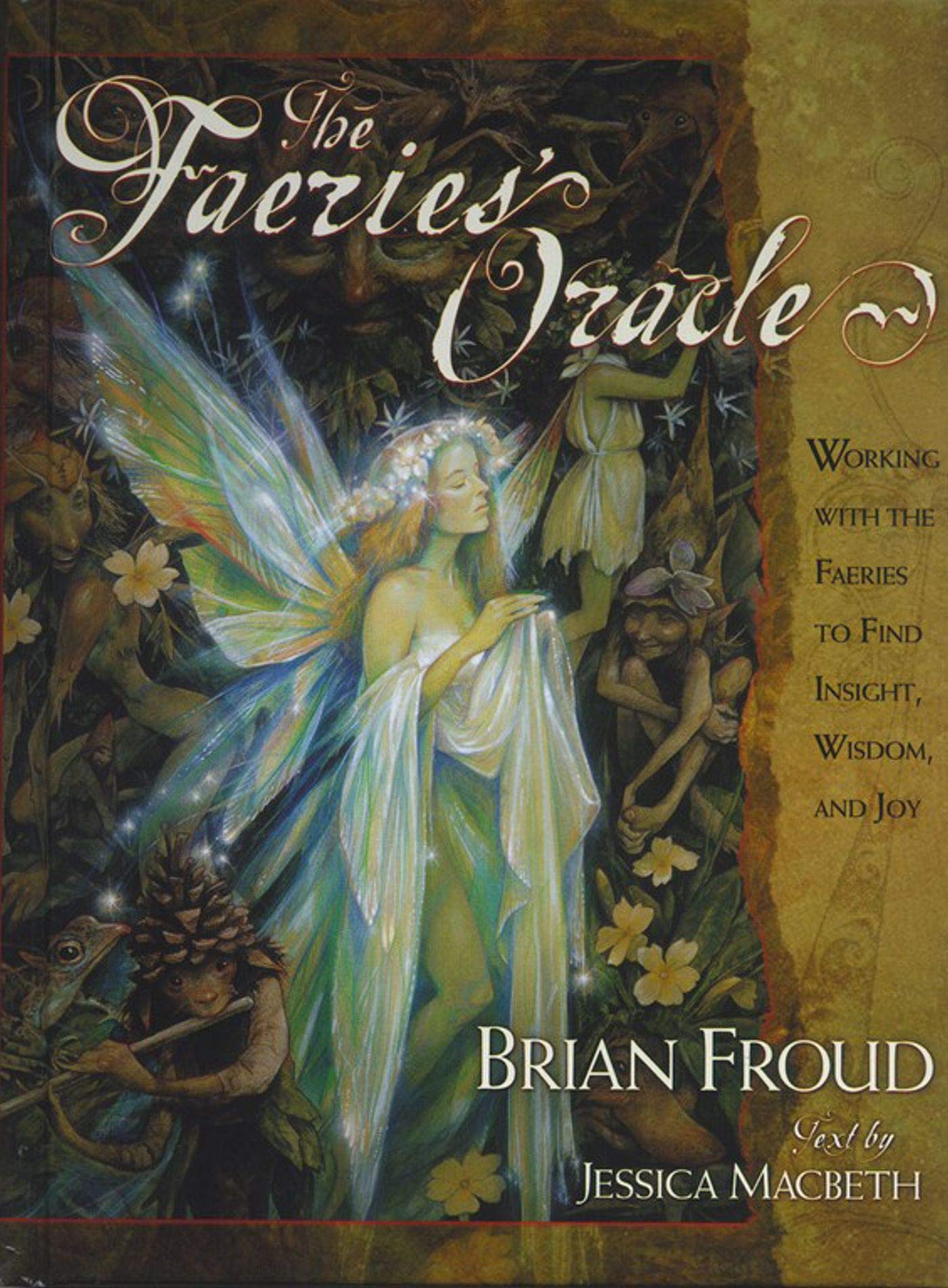
 For children of the 1980s, and even beyond, Brian Froud should need no introduction, being responsible for the creature and conceptual design of two quintessentially 80s fantasy movies, Labyrinth and The Dark Crystal, as well as the latter’s 2019 prequel series on Netflix. In addition to his role in those films, Froud works principally as an illustrator, producing a variety of books on faeries and goblins, including the satirical Lady Cottington series of pressed faeries albums in collaboration with Terry Jones.
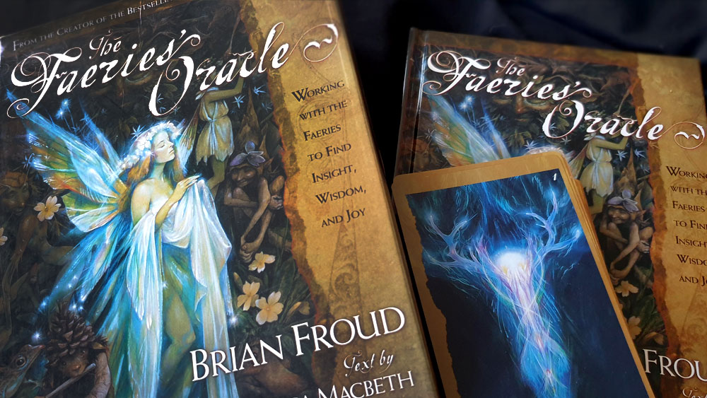
The Faeries’ Oracle draws upon one of these books, 1998’s Good Faeries/Bad Faeries, which Froud explains came as the result of wanting to create a faery-themed oracle deck (described more specifically later in the book as a “human tarot with faery in it”). After spending weeks to research and complete just a single card, Froud realised it would take him a life time to complete an entire deck in this manner, so he instead decided to include every faery image he thenceforth created in a future deck, thereby allowing the faeries themselves to shape its form and direction. This decade of work was first collected in Good Faeries/Bad Faeries, which Froud describes as a book through which the various faeries gave glimpses of their world and provided clues as to how humans might communicate with them.
This attitude speaks to how Froud, despite his relatively mainstream status as a designer for big budget fantasy movies, identifies himself as a trafficker not in the dreams of Hollywood but in the reality of faery; as someone who very much believes in the faery as literal beings and their realm as an actual, if insubstantial, place. As co-author Jessica Macbeth writes, Froud is someone who lives at the boundary between Faery and this world, using his artwork to act as an ambassador across realms. It is worth noting that the term faery is used here as a catchall definition under which all manner of otherworld creatures, and not just the fae, can be counted. Thus, for Froud and Macbeth, faery encompasses elves, gnomes, domestic spirits of various stripes, otherworldly folk both small and large, and even, oh crumbs, angels. As a place, Faery is defined as a world that sits alongside our own, almost but not quite in synchronisation, overlapping in some situations and operating on a different level of energy.
Froud is not the only one to pursue this personal and literal approach to the faery and Macbeth does likewise, describing the selection of the images for the deck as a process in which these creatures were intimately involved. She details how the images from Froud’s decade of work, about 120 paintings, were laid out before her to determine who amongst them would be included in the deck. They, that is the faeries, directed her to arrange the images in stacks, rows and circles, until after many hours they appear to have objected to the implicit hierarchy that such systems lent themselves to. Throughout this account, Macbeth refers to things that various faeries said, so while the literalness of her description could be open to interpretation, and the specifics are never mentioned, it creates an impression of a very active, near physical intersection with the otherworld.
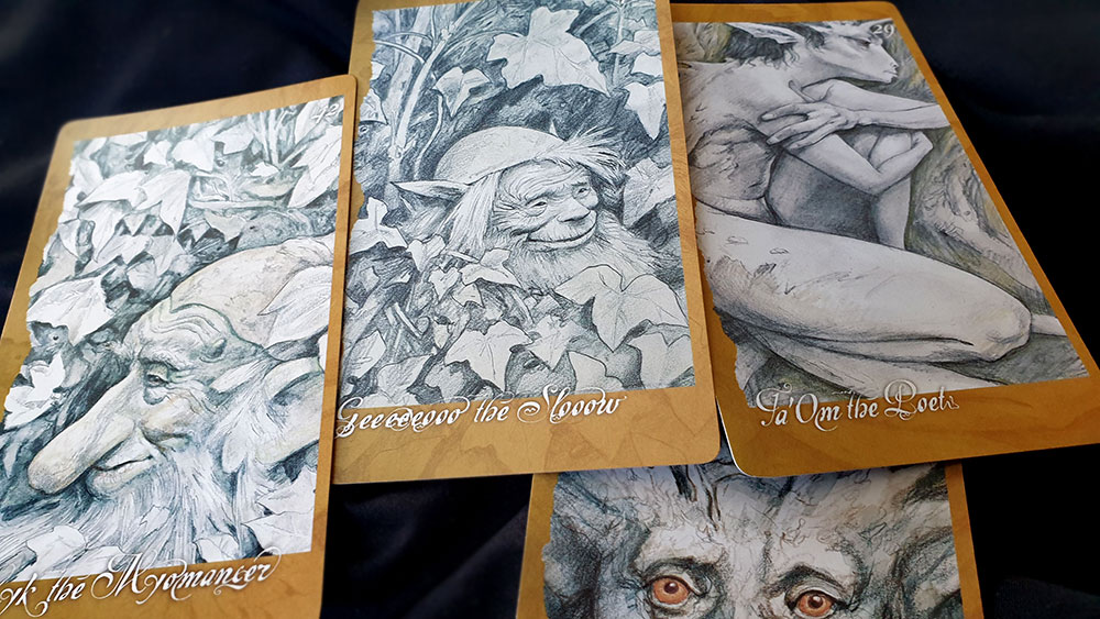
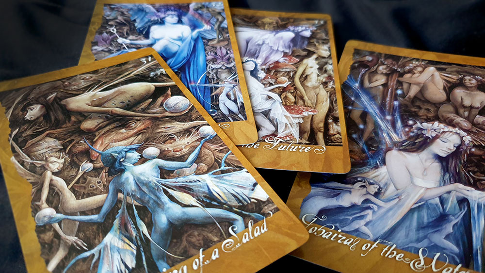
Froud’s card designs do reflect the decade-long process of image accumulation. While they are always in his indubitable and unique style, there are a variety of techniques and minor changes in composition that might not have been there if the approach had been more focused on the end goal. Thus, although the majority of the images are rendered in rich, colourful oils, the cards for Myk the Myomancer, Geeeeeooo the Slow and The Oak Men, for example, stand out in a jarring manner with their sketched grey pencil lines. They also appear to be taken from a single source image, meaning that the figures feel unnaturally cropped, as if they were never made to stand on their own or to fit into the dimensions of the card. This is particularly true of another of the pencil cards, Ta’Om the Poet, who is cropped on all sides, as if he’s been crammed into a prison-like frame, his head suffering worst of all when the border shears off the tips of his pointed ears and horns. The same sense of detail shots from a wider painting occurs amongst the cards in the low thirties (including the exquisitely, though inexplicably, named UnDressing of a Salad), which each share a similar background of a tangled brown mass of figures and foliage, against which a few hero figures stand out. Similarly disappointing is the artwork used for card 51, The Topsie Turvets, which will be familiar to anyone who handles the deck for a few seconds as it is also employed as the backing design on all the cards.
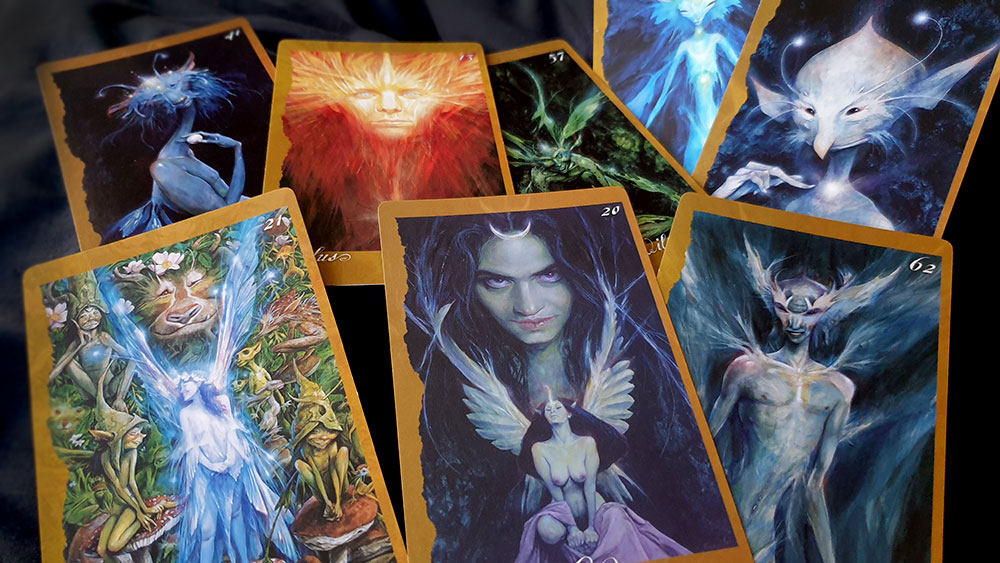
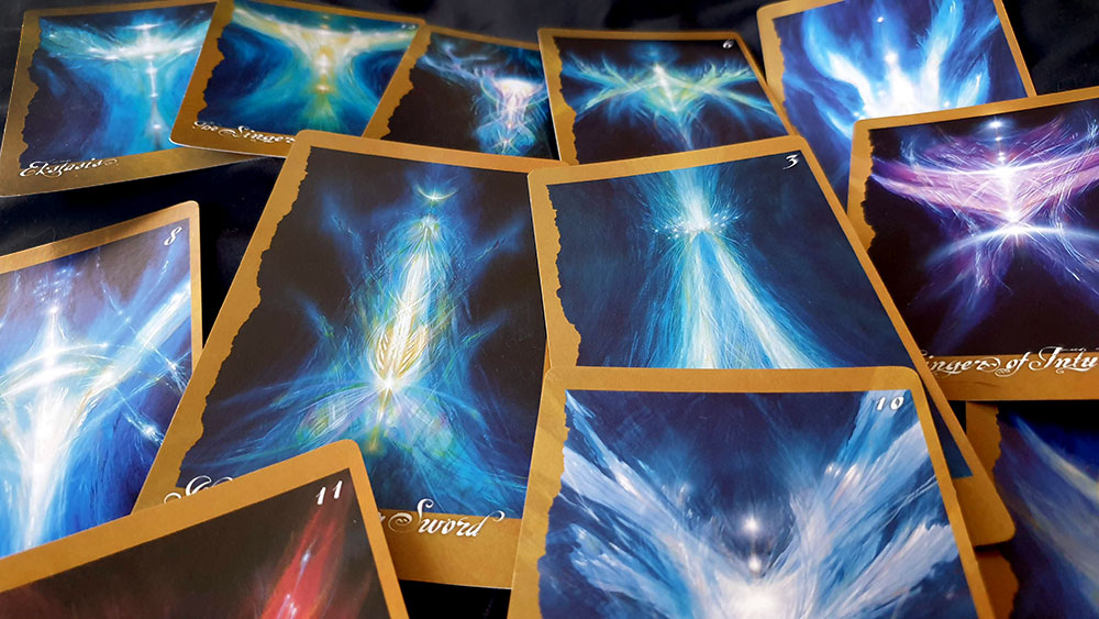
Other variations of art styles are less noticeable, with a kinship between some that have a polished and pastoral quality, and others, such as the Singer cards and similar, which are more abstract, imbued with an angelic and celestial feeling due to the white highlights that convey a sense of fae luminescence. The most successful cards are those where figures stand alone, looking out at the viewer, surrounded by unearthly glows and spots of phosphorescence. It is these cards that give a real sense of beings leaking through from the fae realm to communicate with you.
As is evident in the names of some of the faery, there is a Froudian sense of humour that permeates this deck, with many of the figures being cute, whimsical and basically little scamps. However, there is a depth to the cosmology that Froud is a conduit for, with these humorous characters being joined by more unknowable, ineffable ones, along with figures of profound elemental power and beings of clear mythological significance. Macbeth’s explanation of each card is detailed, with biographies of each faery and sometimes a back story about the painting they come from. Somewhat lacking, though, is a consistent explanation as to how this information was received and how these faeries were named, whether they were transmitted to Froud, or to Macbeth, or how much is drawn from traditional sources.
Based on feedback on Amazon.com, it would appear that recent versions of The Faeries’ Oracle use poor card stock and have other production issues, but this original edition presents the cards at 3 by 5 inches on a sturdy stock whose weight is comparable to a set of playing cards. They sit comfortably in the hand, not too big to shuffle but not too small as to do a disservice to the artwork, which is framed in copper with a ragged edge on the left and a hard edge on the right The number of each card appears in the top right, while the name sits at the bottom, overlapping art and border, and rendered in a script face that, whilst charming and mysterious, occasionally risks veering into inscrutability with all of its spirals and filigree.
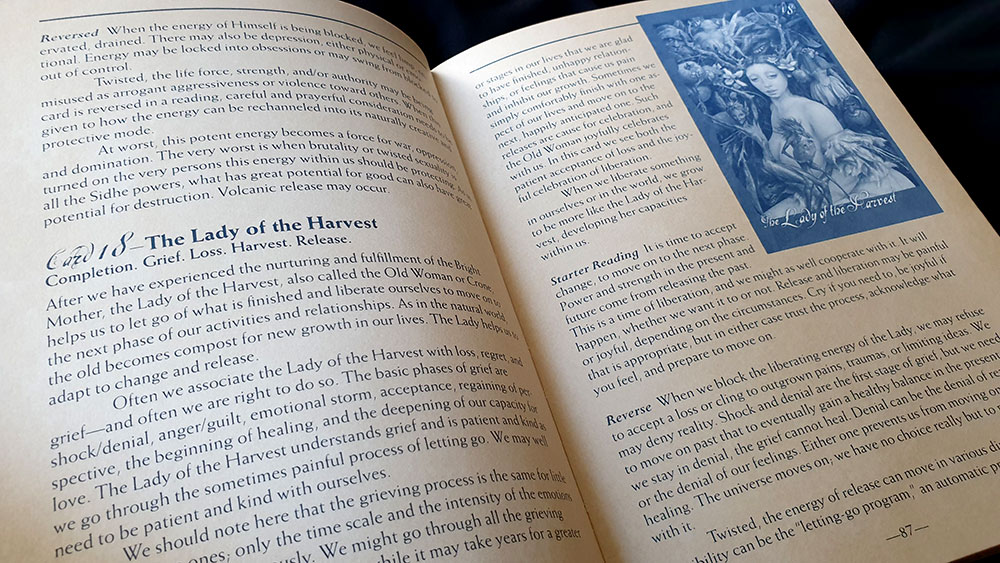
The deck is presented in a cardboard tray made from a metallic gold stock with a custom alcove for the cards, all of which is further housed in a large slipcase box with full colour wrap-around printing. A 208-page hardcover book with text by Macbeth sits above the deck in the box, providing the background to the cards and several methods of working with them, The lion share of the book is taken up with thorough explanations of each card (with the images rendered at a quarter the size of the page in a blue wash instead of colour or greyscale).
For those drawn to them and their realm, The Faeries’ Oracle is a valuable and comprehensive tool that can be used either for divination, or for simply connecting with those energies. Froud’s depiction of faery is idiosyncratic to be sure, but there will be some, if not all, elements that ring true for anyone that has encountered it before. It also just pretty, and if none of it resonates on a spiritual level, there’s a least some lovely artwork to be had.
Published by Fireside
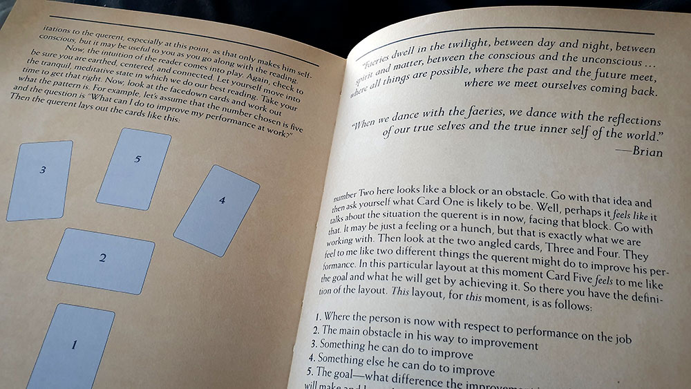

I wanna learn different spreads. I have had The Faries Oracle for 23 yrs and i wanna learn more