Categotry Archives: art

by

(h)Auroræ – G. McCaughry

1 comment

Categories: alchemy, art, esotericism, hermeticism, luciferian, Tags:

(h)Auroræ coverGabriel McCaughry’s (h)Auroræ could be considered an inadvisable tome to review here at Scriptus Recensera because attentive readers will note that your faithful reviewer has a proofing credit in the opening pages. In my defence, your honour, the proofing was for only a section of the work, and the finished book is so much more, appearing unfamiliar and unrecognisable from the raw and partial pure-text draught I worked with; unless that’s just due to a poor memory… I don’t remember.

(h)Auroræ has an air of being McCaughry’s magnum opus, the sum result, from an aesthetic perspective, of all that he has done previously with his Anathema Publishing imprint. It’s gorgeously presented, intricately designed, with a poetic quality that is enigmatic and just a little bit impenetrable. At 304 pages and 5.25 x 8.5 inches dimensions, it feels substantial and weighty, the right size, texture and weight to convey a sense of significance and substance, fitting in your hands like a treasured tome, without being cumbersome. This aligns with statements McCaughry has made elsewhere, where he has talked of the magick inherent in books, and the profundity inherent in writing, producing and reading them.

(h)Auroræ is divided into three main sections or books, the first of which reprises the (h)Auroræ title and is itself comprised of five codices; plus a long, circumlocutory introduction from Shani Oates. Each codex consists of short stanzas of poetry, formatted in a fairly large italic face and almost always accompanied with an illustration on the respective facing page. McCaughry’s style of verse is, one could charitably say, brisk, sometimes running to as little as four lines, with an economy of words that nevertheless draws from a clearly defined lexicon. He declaims, rather than rhymes, using archaic turns of phrase and employing a wide array of imagery that references a variety of mythological and magickal sources, including Luciferianism, tantra, alchemy, the Ruba’iyat and Mandaeism. This cornucopia of culture and its recherché language choices makes for a somewhat abstruse encounter, where you can get a sense of what is being said, but like alchemical texts of old, you’re never sure if you’re quite getting it all.

Illustration by José Gabriel Alegría Sabogal

Book two of (h)Auroræ is titled Neoteric Heterodoxy and, for the most part, eschews the poetry format of its predecessor for a more discursive approach. Here, divided into three sections, McCaughry discusses various aspects of magickal theory and growth, with considerations of Gnosticism, doubt and truth, as well as the various forces, constructs and entities in his conception of a magickal cosmology: Lucifer, the Temple of LUh-hUR, the UmbraPlasma, the Monolith, the Quartz of Return, the Omni-Cipher, the Demiurge and the PCR or Prism Concrete Reality.

The third and final book of (h)Auroræ is called Anaphoras, Advent & Theurgia, and feels very much the conclusion, incorporating as it does various miscellanea and appendices. The lion’s share of this section takes the form of McCaughry’s account of the workings that form the basis of what is presented here, effectively his magickal diary fleshed out into a substantial narrative. He does not provide much in the way of explicit, point-by-point instructions, instead advocating for the ability of an adept to find their own tools and techniques; and emphasising the status of (h)Auroræ as a book of mysticism, rather than magick, with all the ritual rigmarole that the latter might entail. With that said, McCaughry’s magickal record is detailed enough that should one wish to emulate it, there is much to draw from.

Page spread

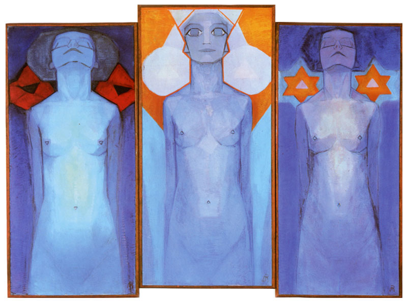
(h)Auroræ is profusely illustrated by José Gabriel Alegría Sabogal who almost deserves a co-author credit, such is both the impact and extent of his work. When almost every page within just the five codices of the (h)Auroræ section features an accompanying and presumably bespoke image, the amount of work is staggering; as is the cost, unless Sabogal severely undercharges for his work. There is an indefinable something about Sabogal’s illustrations, something that conveys an inherent sense of mystery and gnosis, but also somehow manages, with an apt turn of phrase, to keep silent.

Sabogal employs fine ink lines in a timeless manner that apes the look of traditional engraving, something that is reflected in the subject matter, where classical sculptures and equally sculptured bodies abound. In some instances, the lines of fine black ink are highlighted with striking washes of red, filling in spaces in some examples, and splattering across the image as blood in others.

Illustration by José Gabriel Alegría Sabogal

Helpfully and fittingly, Sabogal speaks to his role in the book in The Birds That Speak At Dawn, his own chapter at the conclusion of (h)Auroræ. Here, he describes his and McCaughry’s shared creative journey, but also provides an explicit overview of the entire book, highlighting its passage of transmutation that begins with death and putrefaction and proceeds through four other alchemical stages symbolised by birds. Sabogal talks of dreams in which he discovers strange books filled with mysterious emblems, and thanks to his work here he may have created just such an oneiric tome.

In addition to Sabogal’s illustrations, (h)Auroræ succeeds in matters aesthetical with McCaughry’s typesetting and layout, which compliments the graphic content and showcases the written. For anyone that has seen McCaughry’s hand in the layout of other Anathema publications, there will be much here that’s recognisable, with the return of some familiar treatments and typeface choices. McCaughry has an antique typographic style, especially noticeable in the frontispieces that synthesise a variety of faces, styles and sizes, all perfectly balanced in their hierarchy and not cluttered or messy. With that said, there’s no slavish beholding to archaisms here, but rather a classic timelessness that joins rarefied presentation with readability.

Illustration by José Gabriel Alegría Sabogal

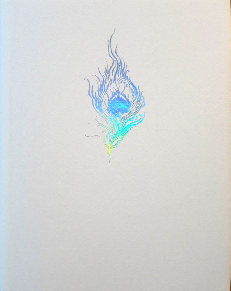
(h)Auroræ was made available in three editions: a standard edition of 500 individually hand-numbered copies, a collector’s edition of approximately 125 copies, and an eleven copy artisanal Spume of Luna edition. The standard hardcover edition of (h)Auroræ measures 5.25 x 8.5 inches, with 304 Cougar Natural 160M archive-quality paper pages bound in a lovely metal-flecked Italian Tele Legatoria Bronze bookbinding cloth. A design on the front is foiled in gold, as is the title and author on the spine. The collector’s edition is the same as the standard edition but bound in Eurobound Black Flanders (bonded leather), with gold foiling on the spine and a more complex design on the cover, incorporating blind-debossed elements. The eleven copy Spume of Luna edition, individually hand-numbered, signed and glyphed by the author, is three-quarter-bound in genuine Black Galuchat Ray rawhide, and white cow leather with gold foil blocking on the cover, and a blind-deboss on the back cover. The interior features handmade endpapers, in addition to those used within the standard hardcover edition.

Published by Anathema Publishing

by

The Blazing Dew of Stars – David Chaim Smith

No comments yet

Categories: alchemy, art, esotericism, hermeticism, qabalah, Tags:

The Blazing Dew of Stars coverDavid Chaim Smith, as his bio runs, is an author and artist based on Long Island, New York. He gained a BFA in drawing from Rhode Island School of Design and graduated from Columbia University with a Masters in 1989. His principle medium is finely rendered and intensely detailed pencil, and that’s what you get here in this large-format book from Fulgur; his second with that press, following on from 2012’s The Sacrificial Universe.

The Blazing Dew of Stars presents David Chaim Smith’s take on qabalah, otherwise seen in titles such as 2015’s The Kabbalistic Mirror of Genesis and 2016’s The Awakening Ground: A Guide to Contemplative Mysticism (both from Inner Traditions). Where those books differ from The Blazing Dew of Stars is the focus on Chaim Smith’s artwork, often appearing here as full page plates, with adjunct smaller illustrations in the margins of facing pages. That doesn’t mean this book is without writing, in fact, it is quite text heavy, with Chaim Smith’s images appearing as adjuncts to his dense, periphrastic text. It’s just such text that forms the first, and image-free, chapter, Reaching Beyond God, 24 pages of circumlocutory writing with phrases like “systems that cultivate compassion mitigate the primitive reflexes of animal power that produce the psycho-emotive toxins of the human realm” or “Conceptuality can slowly learn to be able to abide within it, such that subtle abstract impressions can slowly take over, subsuming the momentum of perceptual formation into visionary registers.” As your eyes glaze over after page after page of this, you find yourself skipping forward, hoping to hit the pretty pictures sometime soon; the ligatures on the serif typeface are nice, though, if a little showy.

David Chaim Smith: Secret Gestation of the Gnosime

Chaim Smith presents what he refers to as kabbalistic contemplative alchemy, a system he calls Iy’yun; a Hebrew word, sans the glottal stop, meaning ‘contemplation.’ Iy’yun is pursued, in this case in particular, through linguistic and graphic constructions, with its inner life creating resonating layers, revealed within the illustrations here, and it is this that distils the dew of the title; a gnostic realisation which accumulates with wonder, beauty and astonishment. Or so the blurb goes. This takes the form in a manner of ways: exegetical sections, more practical exercises in which Chaim Smith’s images are a meditative focus, and other exercises in which the illustrations are but representations of the concept in hand.

The dense and theoretical first chapter opening The Blazing Dew of Stars is followed by one that reprises the title of the book as its own and is subtitled A Kavanah Meditation in Three Parts. This three part meditation is based on three chambers, each focussed on a divine name: AHYH, ALP LMD HY YVD MM, and YHVH/MTzPTz. Chaim Smith provides a thorough exegesis on the metaphysics behind the procedure, in which the dew of contemplation is brought forth, the blaze is set alight, and the practitioner becomes a primordial mirror, a “liquid display of transelemental morphosis,” no less. This is then followed by the exercise itself, in which the various letters are visualised doing their thing, and which is, in turn, depicted graphically in Chaim Smith’s accompanying pencil illustration.

David Chaim Smith: The Blazing Dew

The third chapter, Unfurling the Dream Fire, is the book’s largest and most visually impressive section, in which Chaim Smith conveys ideas through four different methods: two textual and two graphical. Each spread begins with a usually brief verse, set in a large italic face, and this is then expanded upon below it in the smaller text of technical notes, featuring definitions, correspondences, and numerological values. The ideas contained within the initial quote are distilled into small, relatively simple, seals that sit in the right margin of the right hand page of a spread, while the left page is taken up entirely by considerably more elaborate elucidations of the ideas as full page illustrations. The idea, says Chaim Smith, is that the contemplator is able to overlap and interpenetrate meaning using a variety of mental tools.

The full page formatting of the images in Unfurling the Dream Fire allows them to be seen in all their glory, and execution. They are densely rendered almost entirely in just pencil; something that you don’t necessarily notice until you are viewing them at this size, where the smudged layers of graphite used for shading or as background can look murky and less impressive than at first glance. With his images featuring an abundance of alembics and other glass vessels, as well as the roots, trunks and branches of mystical trees, the most obvious comparison of Chaim Smith’s work are alchemical illustrations; notably those that accompany the work of fifteenth century alchemist George Ripley, such as the scroll that bears his name. There’s a persistent sense of growth and fluidity, of amrita dripping from receptacles and homunculi growing in cucurbits. All of the elements are contained within often circular borders, as well as boundaries created by text, often repeating the lines of the initial verse, or evoking key words. The same four-fold format is also followed in a later section, The Enthroning of the Blaze.

David Chaim Smith: Unfurling the Dreamfire

Several other sections follow Unfurling the Dream Fire, largely text based but accompanied with the occasional full-page image, including some instances where the illustrations are inverted, giving the impression of scratchboard or chalk on a black board. One of these, Dead Dreams Awaken the Sleeping Bride, is effectively a guided visualisation, heavy on exegesis within the journey text, accompanied by a single full-page illustration. Meanwhile, The Intoxicating Nectar of Vision, a received text of ten numbered verses that runs parallel to the creation narrative of the opening of Genesis, and which, naturally, follows the style and nomenclature of the rest of The Blazing Dew of Stars. This is an argot full of words such as transcendence, perceptual matrices, resonances and magical continuums; all lexemes that in their disorientating concatenation are often teetering on the edge of a word salad abyss.

David Chaim Smith: The Metacartograph

The regular edition of The Blazing Dew of Stars consists of 913 copies, measuring 27cm square with 138 pages in total, and 14 full page drawings, 29 seals and vignettes and a two-page folding plate of The Metacartograph, a large format, colour inverted illustration that acts as an “overview map of creativity in the manifestation of phenomena,” if you will. This edition is bound in black cloth, with a matte finish black dustjacket. The deluxe edition of 88 author-signed copies was bound by hand in full black morocco with special tooling in silver gilt, blind pressed and silver filled front panel embellishment. It included the dust jacket of the standard edition but was housed in a special lined slipcase of premium black cloth.

Published by Fulgur

by

Distillatio – Orryelle Defenestrate-Bascule

1 comment

Categories: alchemy, art, classical, esotericism, hermeticism, magick, tantra, Tags:

Orryelle Defenestrate-Bascule has already had one review this year here at Scriptus Recensera with Time, Fate and Spider Magic from Avalonia. While that work was largely a written one with elements of Orryelle’s art featured throughout, Distillatio is very much a complete showcase of their visual output in various mediums. As its name suggests, Distillatio represents said alchemical stage, and acts as a companion to the other parts of the process documented in Orryelle’s Tela Quadrivum series: Cojunctio, Coagula and Solve. The status of Distillatio as the final volume in this series and the culmination of the alchemical process is reflected in the design, with the book bound in a pure white cloth and wrapped in a weighty white dust jacket with the Cauda Pavonis or Peacock’s Tail in iridescent foil on the front and a similarly rendered fingerprint design on the back.

While the previous entries in the Tela Quadrivum series worked predominantly in black and white, with flecks of gold and silver, Distillatio takes the opportunity provided by the iridescence associated with its alchemical stage and runs with it. Colours, and in particular striking Melek Tausian-blues and a rich ruddy brown, dominate, with the book showcasing Orryelle’s ability as a painter in oils. Orryelle’s characteristic fleshy forms are given an added layer of depth and voluptuousness with the addition of oils, bringing with it a different sense of energy.

Like many of the line-drawn figures in occult art, Orryelle’s phantasmagorical forms usually have an ephemeral and chimerical feel, adrift in a timeless netherworld, but with the addition of oils, they become a lot more present, the line made flesh as it were. With this physicality comes two things, energy and permanence. In The Wild Hunt, participants in the Heljagd pour forth from the centre of the image, reaching across a tumultuous heaven in a furious motion that is mirrored below by the reaching branches of the World Tree. Their source at the centre, which in this case is the gutter of the two page spread, is a zoomorphic figure of Odin and Sleipnir interfused, disappearing into the liminal space created by the formatting of the book. Naturally evocative of Peter Nicolai Arbo’s Asgårdsreien painting from 1872, The Wild Hunt replaces Arbo’s classical forms with more tangible yet still fleetingly elven figures, whose ferocious, otherworldly speed is implicit within the flurry of brush strokes.

Orryelle Defenestrate-Bascule: The Wild Hunt

The World Tree of the The Wild Hunt is a frequent motif within Distillatio, often assuming the same compositionally-central role, with its branches and roots emanating outwards, bringing with it various forms of life. In one, alchemical birds appear in its branches and surrounds: a bloody-breasted pelican feeding its young, a resplendent white eagle that forms the tree’s crown and is mirrored by the shadow of a black eagle in its root, while a peacock claims a branch as its own. Similarly in Cycle of Life, the tree sits at the centre of the only partially coloured and inked image, some of its limb anthropomorphised into grasping hands, while various animals and humanoid creatures emanate from it and circle around the frame as embodiments of Nature, red in tooth and claw.

Orryelle Defenestrate-Bascule: Alchymic Birds on the World Tree

In more static images, Orryelle’s oil paint gives gravity and a luminous power to its subjects, such as the looming figure of Isis in Osiris Embalmed, or the apple-clasping Melek Taus adrift in a sea of peacock feathers and interstellar clouds in Melek Taus and the Path of Venus. Meanwhile, in With the Milk of a Gazelle, Hathor heals Hoor’s Eyes, an asomatous Egyptian landscape hosts Hathor, crowned effulgent, who heals the eyes of a contorted Horus that lies before her, his arms and legs twisted into uncomfortable reversal.

Orryelle Defenestrate-Bascule: With the Milk of a Gazelle, Hathor heals Hoor’s Eyes

As evidenced by the variety of deities featured throughout the works, Distillatio is indicative of Orryelle’s eclectic mythological tastes, with the various divine stars being familiar to anyone who has encountered hir work before. This syncretic quality draws principally on Egyptian, Hindu and Germanic myth, with bits of Greek and Celtic thrown in, sometimes in the same image.

It isn’t only oil paintings that feature in Distillatio and Orryelle also includes a selection of his digital montages. Some of these incorporate elements of his paintings, such as St Michael And/As The Beast which blends the background of a painting with repeating photographic images of Orryelle as the titular and winged saint. There is something a little incongruous about the presence of these montages, and the incredible skill evident in the paintings is not necessarily always matched in their digital siblings. It feels like the book would have been no poorer had they been left out, allowing for the paintings alone to be a more solid and consistent body of work.

Explanations for the images are spread periodically throughout the book, appearing in explanatory blocks before or after several blocks of spreads. It’s not the most satisfactory way of presenting this information, requiring a lot of flicking backwards or forwards, but there’s not many other ways to do it. These legends to the legends are fairly pithy and provide an invaluable aid to understanding Orryelle’s multi-layered images. It is a shame the typography used here does not mirror the beauty of the images, with it all feeling very defaulty due to the body being set in generic Times, save for Orryelle’s typographically-inadvisable tendency to use a goody bag of other typefaces to highlight certain words. Subheadings are also subject to this, centered atop each section and appearing variously in Harrington, Stonehenge and the face that shall not be named; well, OK, suffice to say, I was not best pleased to see the Egyptian-related subtitles being in dreaded, stroke-bolded Papyrus.

Distillatio was made available in standard and deluxe editions, with the standard being 640 hand-numbered copies in white cloth with a white dust-jacket. The deluxe edition of 64 hand-numbered copies signed by the artist came in crushed white quarter morocco, stamped in black with top edge silver in a dust-jacket and slipcase.

Published by Fulgur

by

Songs for the Witch Woman – John W. Parsons & Marjorie Cameron

No comments yet

Categories: art, devotional, goddesses, magick, thelema, witchcraft, Tags:

If you didn’t already know, your humble reviewer is quite the fan of Marjorie Cameron, with the Apsinthion collaboration between Gydja and Emme Ya giving aural form to much of her work and magickal cosmology. Songs for the Witch Woman is a collection of poetry by Jack Parsons, dedicated to Cameron, and illustrated throughout with her evocative imagery. Previously, as far as I’m aware, only publically and partially available in the September 1974 issue of the English Thelemic journal Sothis: A Magazine of the New Aeon, the thought of a release like this was very much a fevered Babalonian dream.

This version of Songs for the Witch Woman represents a typically exhaustive edition by Fulgur, with the poems, drawings and diary entries published together for the first time, along with a complete facsimile of the original 1950s notebooks, and contextual commentaries from William Breeze, George Pendle and Margaret Haines.

Parsons and Cameron’s currency has risen a lot of late, no doubt partially due to the two biographies on Parsons and Spencer Kansa’s one on Cameron. No longer quite that heretical fool that Crowleyan orthodoxy consciously or unconsciously attempted to paint him as, the father of American rocketry has now even had his life recently immortalised in the golden age of on-demand video; you can rest assured we won’t be watching that, of course.

The poems that comprise Songs for the Witch Woman were written by Parsons between 1946 and his death in 1952, and act as both a paean to Cameron, and an explication of the magickal cosmology they developed, the Witchcraft. Babalonian and sabbatic imagery abounds, with goats, horned moons, and voluptuousness up the wazoo. Parsons writes with a clear, evocative poetic style, with little baroque ornamentation and a pace and structure that means many of these poems could act as effective ritual accompaniments.

Marjorie Cameron: Danse

Against some of the poems, are twenty pen and ink images by Cameron, exhibiting a staggering control over line and form. Her style is entirely her own, all evocative economy of line and space, though there are obvious touchstones including Aubrey Beardsley’s stately royal figures, Egon Schiele’s jagged bodies, and somewhat prochronistically, Peter Chung’s aberrantly sensuous elongated flesh. Austin Spare could also be mentioned as a de rigueur comparison, with both artists sharing an interest in magickal bodies, though there’s a more angular and visceral quality to Cameron’s hand, rather than Spare’s ephemeral phantasmagorical forms.

Cameron’s minimalist skill is particularly evident in the images accompanying Aradia and Aztec where the amount of strokes needed to construct them can be counted on two hands. In others, Cameron, plays with the space on the page, in Autumn placing an obvious simulacrum of herself in the lower half of the page, with her hair rising up like flames into the space above her head. Something similar occurs in Passion Flowers, where the hair of a supine figure flows down and across the page, cascading from upper right to lower left.

Amongst the elongated female forms, of which there is an abundance, are images of Parsons, rendered unmistakable with Cameron’s economy and her evident ability as a caricaturist, able to distill someone’s essence into a few lines. Handsome and heavy-browed, he appears regal in the finely and confidently crafted images accompanying The Fool and Merlin, while his shock of dark hair is rendered matted in ink spatter amongst leaves and spider web in the qliphothic Neurosis. He can also be glimpsed in the ithyphallic eponym that accompanies Pan, or as the Sorcerer whose body seems to disintegrate amongst the stars he wields.

Marjorie Cameron: Pan

The digitised pages of the notebook are reproduced at 90% of their original size and include full page illustrations against some of the entries. In the case of some poems, such as Pan, this provides an additional image to illustrate the text, while others are the companions to previously unaccompanied poems. The style of these is less refined than Cameron’s black ink images, replacing the stark contrast of line and space with thicker strokes and washes of colour against the ecru background of the paper.

Watercolour version of Pan

The images and words of Songs for the Witch Woman are bookended with excerpts from Cameron’s diary, presented as both transcribed text and as the original handbook scans. Written a few months after the death of Parsons, the words were received as part of magickal workings, so for those inclined to adherancy and devotion, they have the status of holy writ (guilty). This is especially so when the digitised originals allow one to see Cameron’s hand, her script becoming larger and more emotive as pages past.

Pages from Cameron's diary

Songs for the Witch Woman is an invaluable resource, whether it be as simply a documentation of the work of Cameron and Parsons, or as a record useful for further research. Both the songs themselves and the entries from Cameron’s diary are rich in information and imagery ready for analysis, extraction or elaboration. Fulgur are to be commended for the thoroughness of their approach, with the large format and extensive scans of the original pages doing the work immense justice.

Songs for the Witch Woman is available in a limited edition hardback with 176 30.5cm x 24cm pages on 135gsm Italian paper, bound in blue cloth bearing the image used for Danse on the cover in black and a debossed silver moon on the back. It is completed with a dust-jacket bearing the first image from the original release on the front, and a reproduction of the words to Witch Woman on the reverse. The edition is limited to a fitting run of 1560 copies, 1390 of which are the regular edition, 156 of which are bound in quarter morocco leather, and fourteen of which are bound in full morocco.

Published by Fulgur


Review Soundtrack: Gydja & Emme Ya – Apsinthion 

by

Helvete: A Journal of Black Metal Theory – Issue 1: Incipit – Edited by Amelia Ishmael, Zareen Price, Aspasia Stephanou and Ben Woodard

No comments yet

Categories: art, satanism, Tags:

We stray a little from the usual matters magickal with this review of the first issue of Punctum Book’s journal of black metal theory. Helvete is a collection that is, to my surprise, no means unique, with academic interest in black metal having previously found expression in several iterations of the Black Metal Theory Symposium, with those contributions anthologised in publications such as Hideous Gnosis and more recently Mors Mystica. Black metal must surely be unique amongst all of metal’s subgenres in attracting this kind of academic attention, and to some extent this is understandable with black metal’s caché of cool, or at the very least its memeability; were such a word real. No one, as far as I am aware, is out there writing academic theses on grindcore, or even comparable subgenres, in terms of longevity and quantity, like death or doom metal; which is a shame.

Given the wealth of material already, erm, symposiumed and published, one would assume that the entry level, what-is-black-metal type discussions in this field would have been published long ago, if at all, and that is indeed the case here, with contributors exploring rather specialised areas of black metal’s topography. With that said, the first contribution, Janet Silk’s Open a Vein, does contextualise her discussion of suicide and black metal by setting the scene with the suicide of Mayhem’s Per ‘Dead’ Ohlin, a moment she describes as the birth of black metal (an urbane albeit arguable and problematic claim). Silk prefaces much of her consideration of depressive suicidal black metal (which she atypically abbreviates as the less recognisable SBM) with a survey of suicide in philosophy, religion, and other cultures, touching on Mishima and the death-drive of early Christian martyrs and Islamic šuhada. She does this in a slightly unnervingly amoral way, with what can be read at the very least as an admirable detachment with no moral judgement cast, and perhaps at worst, as a tacit approval of, or admiration for, suicide’s destructive and nihilistic impulses. I, in turn, make no moral judgement on this editorial choice and just reiterate the disconcerting feeling that inescapably arises when reading content that seems to sensibly suggest suicide is a good option. When DSBM is then considered within this context, its themes and motivations are validated as part of this greater milieu and given gravitas and import, rather than dismissed as mere posturing or angst. Silk’s main touchstone here, other than Dead, is Sweden’s Shining, and Denmark’s cheerfully named Make a Change… Kill Yourself, so it is by no means a broad survey of the sub-subgenre that is DSBM. Even if it wasn’t intended as such, it feels like some areas have been missed: the suicide of Dissection’s Jon Nödtveidt and how the anticosmic philosophies of the Temple of the Black Light compare to the nihilism of the musicians that Silk does document; or the isolation that is inherent in so many DSBM acts being solo projects by secluded, socially-awkward multi-instrumentalists.

The esteemed Timothy Morton finds a good springboard for his talk of hyperobjects and dank ecology in Wolves in the Throne Room, whose status as arch conservationists provides the basis for much of his musings. Despite being the Rita Shea Guffey Chair in English at Rice University, Morton’s paean to Wolves in the Throne Room feels more like a creative writing exercise, or the worst kind of music review in the world. You know the kind? The kind that describes the scenes that the music paints in the reviewer’s mind, rather than just saying what it sounds like. Do you know what is also annoying? All the questions. What’s the deal with that? Morton jumps around like he’s over-caffeinated, pre-empting all his conclusions with questions to the mute audience. When are we? Where are we? Why a pool of death? Why indeed. This works well when it is used initially for musings on the open-ended ambiguity of the band name (whose throne room, who are the wolves, are they welcomed, or invaders, or are they the original occupants?), but when page after page is peppered with not-rhetorical-but-sounding-rhetorical questions, it begins to grate. In the end, the questions, and indeed the wolves in this here room for a throne, tend to fade in favour of what comes across as talking points from Morten’s previous and voluminous discussions of a dark ecology without nature, barely tethered to the discussion of the band.Black ink on paper works by Allen Linder

The most enjoyable contribution here comes from David Prescott-Steed with Frostbite on My Feet: Representations of Walking in Black Metal Visual Culture. Perhaps this is because it is a meditation on something so simple, and yet so quintessentially, but not obviously, black metal. After all, who can imagine a black metal musician in a car? Inconceivable.¹ Prescott-Steed explores the theme of walking from multiple angles, including the personal, where he talks of the experience of ‘blackened walking,’ his term for walking around the modern metropolis that is an Australian city, but listening to a headphone soundtrack of frosty cuts from Burzum, Gorgoroth and Mayhem. He incorporates Rey Chow’s analysis of the cultural politics of portable music into this, exploring the themes of incongruity and of the act of disappearing that is inherent in removing an awareness of one’s environs by imposing a personal soundtrack; a theme that, though Prescott-Steed doesn’t dwell on it, feeds back into black metal’s tortured relationship between the over and underground, between fame and infamy, elitism and the recherché.

Daniel Lukes’ Black Metal Machine is a survey of the industrial strain of black metal; cleverly acronymed as IBM. He begins with an extensive grounding in methodology and context, namechecking Deleuze and providing several literary precedents (Ballard and Vonnegut) that emphasise the dystopian, post-apocalyptic vision of the future, rather than a shiny chrome utopia. This he relates to the misanthropy of black metal, where the science fiction-tinged desolation of the future is but a slight twist of a standard black metal narrative of destruction and contempt for the world. As examples, Lukes considers Red Harvest (who get several pages devoted to them), Dødheimsgard, Arcturus and Spektr, while also briefly touching on Marduk as well as Impaled Nazarene’s themes of a comic and perverse Armageddon.

Joel Cotterell concludes this volume with a brief consideration of the motif of the dawn in black metal, using tracks from Primordial, Satyricon, Inquisition and Nazxul as exemplars. Cotterell argues that the concept of dawn in black metal has a Luciferian component, denoting the rise of Lucifer as the morning star. Whether this interpretation of a less than rosy fingered dawn can be consistently applied to the over 400 songs that they found on metalarchives.com with dawn in the title  is not addressed.

In addition to the written component, Helvete contains a section of black and white photographic plates curated by Amelia Ishmael and titled The night is no longer dead, it has a life of its own. The nine artists attempt to evoke black metal visually with an emphasis on obfuscation through texture, meaning that there’s nothing too obviously black metal here, with only two densely rendered black ink forms (care of Allen Linder, see above) and one foggy landscape. Some of these are more successful than others, with the gems being Gast Bouschet and Nadine Hilbert’s images of Grímsvötn in Iceland, darkened to the point of abstraction but animated with emanations of effusive light.

Gast Bouschet and Nadine Hilbert’s images of Grimsvötn

There are some persistent little quirks about this book that irritate and makes you wonder how, in the parlance of the genre, ‘true’™ it is. Norway looms large within the pages and it is referred to by multiple authors as the home of black metal; not second wave black metal but apparently black metal in general. In another case, black metal is referred to as being “for the most part, exclusively Western” with the gracious caveat that it has since inspired international contributions in the last twenty years (Colombia and Taiwan being presented as the examples of amazing outliers). This overlooks the non-Western bands, most notably from South America and Asia, that thirty and more years ago were contributing to and influencing black metal. That this point of Western-ness is made in attempt to prioritise Scandinavian aesthetics as the aesthetics of black metal seems indicative of the tendency to fetishize the Norwegian strain of black metal above all else; implicit in the journal title. And it is the specifically Norwegian variant, there’s even little acknowledgement of what emerged from Sweden and Finland at the same time, perhaps because it never produced those memeable moments like a Varg Vikerness smirk or Abbath’s gurning visage.

In all, the debut volume of Helvete makes for a brisk read with its 100 pages, but does whet the appetite for more of this here black metal theory.

Published by Punctum Books


¹ The image of Snorre Ruch and Vikerness driving from Bergen to Oslo on the night of 10 August 1993 has always seemed wildly incongruous to me.

by

Lost Envoy: The Tarot Deck of Austin Osman Spare – Edited by Jonathan Allen

No comments yet

Categories: art, chaos, tarot

Lost Envoy coverThe prospect of a long lost tarot deck designed by Austin Osman Spare is a tantalising one, and for this reader at least, guaranteed a rush to the Strange Attractor Press preorder page. Once it was finally released and it turned up in the mail I had made it all the way to the “what the hel is this package” phase.

If the thought of a Spare-designed tarot deck makes you imagine classic Sparean images, all crisp phantasmagorical lines against a white background, then temper your expectations. The look of the cards is a denser one than that, with the style, while obviously in Spare’s hand, being more traditional, and made heavier with a thorough use of watercolour washes on both figures and backgrounds. The deck is also arguably more traditional than either Crowley’s Book of Thoth, or anything one might expect from the proto-Chaote that is Spare, with the Major Arcana images obviously drawing, for the most part, on the atu of the Tarot de Marseille and its antecedents. The Minor Arcana, on the other hands, reveals the cartomantic roots of Spare’s praxis, adopting the suits of traditional playing cards and adding four court cards of queen, king, knight and knave to each set. Perhaps the strongest diversion from convention, though, is the text heavy nature of the hands, with Spare scrawling interpretations and instructions at the foot and head of each card, reflecting the orientation of the reading.

But first, the provenance of this deck and why it was lost. To the latter question first, it wasn’t so much lost, and instead has been sitting quite contentedly for over 70 years in the collection of the Magic Circle, the famed London organisation for those magicians of the stage, and not the ritual chamber, variety. Editor Jonathan Allen, a curator at the Magic Circle museum, rediscovered the archived deck in 2013 and this volume reproducing the cards and featuring commentary from a number of essayists, provides the first broad exposure of Spare’s tarot.

The written contributions in Lost Envoy take two forms: archival documentation and analysis. The former includes Spare’s Mind to Mind and How, by a Sorcerer and Arthur Ivey’s Tarot Cards and a Pack in The Magic Circle Museum from the November 1969 issue of the Magic Circle’s in-house magazine The Magic Circular. Spare’s essay is an unpublished submission for the long running London Mystery Magazine, and provides a practical guide to cartomancy as well as giving a sense of the methods behind the creation of this deck. Ivey’s brief essay uses half of its two page length as a history of the tarot which prefaces an all too brief description of Spare’s tarot, creating a museum catalogue entry as it were.

Given that the two documents provide the only extant historical information about Spare’s tarot and his methods, they are referenced extensively in the accompanying essays, creating something of a sense of déjà vu. This is exacerbated by the ultimately limited amount of things that can be said about Spare’s tarot, meaning that many of the same points are familiarly made across multiple essays. Both Helen Farley and Gavin Semple’s contributions cover the provenance of the deck and Spare’s nascent involvement in the occult milieu of Victorian London, each then followed with a little analysis of some of the cards and their characteristics. A more focused consideration of the cards themselves is provided by Phil Baker’s His Own Arcana, with his points ably reinforced with the inclusion of full colour images of the trumps and full bleed plates of details.

The Deputation by Sally O’Reilly takes a different approach from its companions, with an imagined encounter between Spare and his friend, the suffragette Sylvia Pankhurst. Spare and Pankhurst sit and engage in witty banter about his cards, with her queries allowing him to provide the explanatory exegesis. It’s a diversion whose mileage may vary depending on one’s patience for the conceit of words put into the mouths of historical figures; especially given that their tone and mores are inevitably predicated by the lens of today.

The final essay comes from Alan Moore who, with A Cartomantic Mirror, provides a pretty exhaustive tarot reading of the meaning and intention of Spare’s deck using, and it gets pretty damn meta here, Crowley and Harris’ Thoth deck. Again, no expense has been spared and the cards drawn from the Crowley/Harris deck are reproduced here in full colour, with some key atu each given a page to themselves.

The essays take up only half of this volume’s 336 pages and the remainder is comprised of reproductions of Spare’s cards. These are presented first as full pages reproductions of each of the major and minor arcana, and then followed by six examples of the various coloured card backs. For extra thoroughness, the cards are then presented again in a concordance that transcribes all of the textual data found on the cards, one page for each, along with a listing of marginal links that tie one card to another, and meticulous footnotes providing still further information. Between some of these individual pages are full colour folded inserts of some of the cards, showing the way in which Spare graphically linked the designs together across multiple spreads. This is one of those things that reveals the attention to detail that has gone into producing this volume, with an almost unnecessarily thorough presentation of the data.

Lost Envoy has been designed by Fraser Muggeridge studio, with a cover that appears a strange, jarring melange of geometric colour until one realises, as this late junction, that it shows a cascade of Spare’s multi-coloured card backs. The book is bound with, apparently, a period binding common to many of the volumes found in The Magic Circle library, with a gold deboss of Spare’s autographic bird’s head sigil (no, not the cool vulture one, the one that looks like Montgomery Burns). The text formatting inside the book is not entirely satisfying, with the body copy rendered in a far too modern sans serif typeface which isn’t conducive to reading and gives the impression, false though it may be, of text being dumped in from a Word document with Calibri set to default. With this are awfully snug header and footer margins, due to the page numbering being put on the outer edge, which again, and contrary to the intent, feels like the default settings in a Word doc, rather than something carefully designed. Otherwise, a lot of effort has gone into the production of this book, with the cover text debossed (and the aforementioned sigil debossed and foiled too), a beautifully raised emboss on the inside cover page bearing the Magic Circle logo, not to mention the preponderance of colour prints and the inserted replicas of cards.

With its repeated representation of the cards in Spare’s deck in both graphic and textural forms, it’s clear that the intent of this book is one of complete and thorough documentation, in which the cards are presented in the best possible light for posterity. Whether anyone is going to read the transcribed page for each card isn’t the point, and this reviewer certainly didn’t. Instead the point is that it’s there should one need it. In this way, the essay content is almost secondary, and it is the cards themselves that tell the story.

Lost Envoy was made available in two editions: a standard hardback edition still available with 336pp pages, fully illustrated in colour, with over 200 images. And a now sold out numbered and debossed edition of 300 copies, with fold-out sections.

Published by Strange Attractor Press

by

Fiddler’s Green: Peculiar Parish Magazine (Volume 1, numbers 3 and 4)

No comments yet

Categories: art, folk, witchcraft

I must admit to being unaware of Fiddler’s Green before receiving copies from publisher Clint Marsh, but one look at these two issues and it was a “where have you been all my life” type thing. Fiddler’s Green is described as “art and magic for tea-drinking anarchists, convivial conjurors and closeted optimists,an appealing cadre to be a part of, even if my tea-drinking is minimal at best. This brief is perfectly reflected in the style, illustration and formatting, with a look that is evocative of something one could imagine sitting alongside Jimmy Cauty’s Lord of the Rings poster, or the work of Hapshash and the Coloured Coat; indebted as it is, like them, to the stylings of Art Nouveau and the pen and ink drawings of Arthur Rackham.

If there’s one word to describe Fiddler’s Green, it’s ‘delightful.’ The small press feel, the whiff of a village newsletter, the smack of leather on willow… you get the idea. Each of the issues is a saddle-stitched, stapled magazine of 35-45 letter-sized pages, bound in a muted green coloured card, with everything rendered in black and white, save for the foiled title on the cover.

Editor Clint Marsh presumably provides much of the written content here, with a handful of the contributions being uncredited. These are often reflective musings based around little themes: bibliophilia, artistic process, creative thinking – all things one could enthusiastically support and subscribe to the newsletter thereof.

In addition to these credited and uncredited contributions, and alongside writings from authors unknown at least to me, there are a couple of familiar faces. Timothy Renner of Stone Breath provides illustrations to a piece by Kenneth MacKriell in the fourth issue, while Daniel Schulke contributes a eulogy to Michael Howard in number 3. Indeed, Schulke and Three Hands Press never seems that far away, with the imprint, amongst others, punctuating the volumes with adverts. The formatting also has a similar aesthetic to many of Three Hands Press titles, with that beloved combination of woodcuts and archaic typefaces.

There’s no persistent theme to Fiddler’s Green, other than a fulfilment of the broad and charming mission statement. There are elements of witchcraft and folk magic, but by no means in an all-pervasive manner. There’s a certain reflective and philosophical attitude, but again this doesn’t dominate. And there’s a palpable sense of spirit of place and landscape. In all, it perhaps lives up to that othertimely aura that permeates from cover to cover, redolent of Victorian and fin de siècle journals, fitting written companions for salon and parlour.

Each issue concludes with a couple of regular features: letters to the editor (usually pretty unanimous praise for previous issues) and a review section. In the third issue, the reviews are something of a revelation, focusing predominantly on zines and other small press outputs, an area I feel woefully unaware of. In the fourth, it is books attract the reviewer’s attention with a certain degree of crossover with the content and themes found here at Scriptus Recensera.

Fiddler’s Green is published occasionally by Wonderella Printed and can, along with other exquisite publications, be ordered from www.fiddlersgreenzine.com/shop

by

Black Mirror 0: territory

No comments yet

Categories: art, magick, Tags:

black_mirror_0This new series is the product, in collaboration with Fulgur, of Black Mirror, a new research network based at the Arts University Bournemouth, which explores the influence and role of enchantment, the occult, magic and esotericism in modernist and contemporary arts in an international context. Its contributions are peer-reviewed by an editorial board comprised of Judith Noble and Dominic Shepherd of Arts University Bournemouth, Daniel Zamani of Trinity College, Cambridge, Amy Hale of Golden Gate University, Robert Ansell of Fulgur Esoterica, Gavin Parkinson of the Courtauld Institute, Jesse Bransford of the State University of New York and Ulli Seegers of Heinrich Heine University of Dusseldorf.

In their introduction, Judith Noble, Dominic Shepherd and Robert Ansell set out the intent of this new venture, touching in particular on the intersection of Surrealism and the occult and using this as a methodological blueprint for the now. As its subtitle suggests, this first volume of Black Mirror is concerned, fittingly, with the mapping of contested territories in art and occultism, places occupied not just by artists and occultists, but by academics too.

Jesse Bransford’s Lifting the Veil: Esoteric Interpretations of Seven Contemporary Artists does as the title says and gives two pages, one for text, the other for an image, to seven contemporary artists: Alex Jovanovich, Karsten Krejcarek, Rebecca Forgac, Afruz Amighi, Juliet Jacobson, Matt Greene, and the duo of Ryan Pfeiffer and Rebecca Walz. Like many of the artists featured in Black Mirror, these seven do not always have explicit or obvious connections with esoterica, no sigils, steles or Spare-style phantasms here, but Bransford does an expert job of teasing out the various metaphysical themes encoded in their work.

From Mondrian to Charmion von Wiegand: Neoplasticism, Theosophy and Buddhism by Massimo Introvigne is a more traditional artist study, dealing first with Mondrian whose esoteric affiliations should be familiar to most occultists, before turning to his friend and fellow Theosophist, Charmion von Viegand. This is an enjoyable but all too brief account of both artists, with the colour images, particularly those by Mondrian, highlighting the profoundly magickal effect that apparently simply blocks of colour can have.

Piet Mondrian - Evolution, 1911

Quite possibly the highlight of this edition is The Fool and the Mirror: Concerning the Relations between Art, Magic and the Academy, in which Julian Vayne addresses the idiosyncratic numbering of this first volume by considering the Fool, designated 0 in the tarot. In many ways, this is a sequel to Judith Noble, Dominic Shepherd and Robert Ansell’s earlier introduction to Black Mirror as it reiterates the philosophy of the publication and the metaphysics that underlie its symbolism. Vayne uses the symbolism of the Fool to broadly approach a number of issues, the most interesting of which is the peculiar place that practicing occultists might find themselves in a world where occultism has become an acceptable and increasingly popular subject for academia. Vayne naturally sees Black Mirror as part of this dialogue between magick and the academy and hopes that it can be a place where occultism and the art it produces can be rigorously and respectfully analysed by practitioners and non-practitioners alike.

Elsewhere, in The Secret Life of Objects, Marie von Heyl is interviewed by Daniel Zamani, accompanied by several full page plates of the repurposed found objects from her Occasional Table Series. Surrealism is a touchstone in this interview and also come in to focus in Gavin Parkinson’s Surrealism’s Popular Occultism: From H. P. Lovecraft to H. Rider Haggard. Here, Parkinson’s lengthy consideration is more concerned with matters literary than visual arts, looking at Lovecraft and other pulp writers and how their personal mythology of cosmic devolution appealed to the Surrealists.

With its 124 octavo-sized pages, the content in Black Mirror is by no means exhaustive. Essays run to ten pages on average, including full page illustrations and references. As with many of the works that come via Fulgur, there is a certain dryness to the content here, with a drive for respectability that means some of the classless less sophisticated glamour of occultism doesn’t get a look in.

Black Mirror is presented in a cloth-bound octavo format of 124 pages, with a dust jacket featuring a wraparound image of Jeremy Deller’s installation project Sacrilege. The internal stock is a weighty matte, and the end papers are a high-gloss black that create the black mirror of the title. The standard edition runs to 600 copies, with a special AV issue of 300 coming with a DVD of Marie von Heyl’s work, WYSIWYG.

Published by Fulgur.

1 2