ScriptusScribe

by

A Rose Veiled in Black – Edited by Robert Fitzgerald and Daniel Schulke

No comments yet

Categories: devotional, goddesses, thelema, Tags:

A Rose Veiled in Black coverFocusing its attention on the figure of Babalon, A Rose Veiled in Black is the second volume in Western Esotericism in Context, a series from Three Hands Press which began with the previously reviewed Hands of Apostasy and continued with the also reviewed Luminous Stone. It features essays from ten writers: Amodali, Robert Stein, Erik Davis, Caroline Wise, Daniel A. Schulke, Frater A.I., Gordan Djurdjevic, Grant Potts, Manon Hedenborg-White, Richard Kaczynski and Robert Fitzgerald. Along with these written pieces are visual contributions from names both familiar and unfamiliar: Barry William Hale, Hana Lee, Linda MacFarlane, Liv Rainey-Smith, Mitchell Nolte, Nicole DiMucci Potts, Sarah Lindsay and Timo Ketola.

Aleister Crowley naturally looms large within these pages, and co-editor Robert Fitzgerald kicks things off with a discussion of the various appearances of, and allusions to, Babalon in the Master Therion’s The Vision and the Voice, his record of travelling through the Enochian aethyrs. This is a text that is cited time and time again throughout A Rose Veiled in Black and Gordan Djurdjevic covers similar ground to Fitzgerald, but also surveys the glimpses of Babalon that can be gleaned in The Book of the Law, and briefly touches on Leah Hirsig’s relationship with Crowley and Babalon herself. Hirsig gets more of her own focus in “I am Babalon,” a piece by Richard Kaczynski, who fastidiously documents the life, before and after Crowley, of the woman who identified herself as Babalon and as the mother of several magical children, including Crowley’s subsequent Scarlet Woman, Dorothy Olsen.

A more experiential approach comes from Amodali of Mother Destruction/Sixth Comm fame, whose wonderfully-verbose-titled Introductory Theoria on Progressive Formulas of the Babalon Priestesshood addresses what she sees as fundamental misinterpretations and distortions of the archetypes and formulas of the sexual gnosis key to Babalon’s magic. To this end, Amodali draws on her over 25 years of magical experience to present a ritual formula, informed by Dr John Dee’s De Heptarchia Mystica, in which practitioners forge the Body of Babalon, in a tasty taster of her long-forthcoming title The Marks of Teth from Three Hands Press.

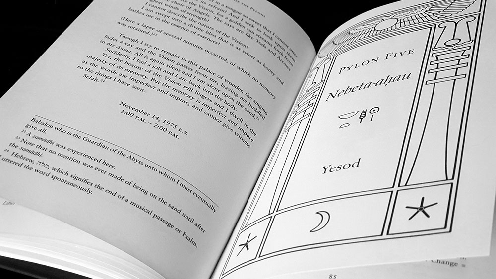
A Rose Veiled in Black spread for Introductory Theoria by Amodali

Other contributors offer practical options too, either as instruction or documentation, with Robert C. Stein detailing a Liber Nu-based working he performed in Australia in 1985, within an asteroid or comet-formed crater under a sky occupied, as above, so below, by Halley’s Comet. Meanwhile, in Seven Chalices of the Lady, Grant Potts presents a group rite, originally performed at the Bubastis Oasis OTO, Texas, in 2013. Drawing on a Red Tara practice from the Nyingma tradition of Tibetan Buddhism, the rite associates the chakras with the seven Babalonian chalices of the title, seeking to attune the body of light to the Thelemic current and the mysteries of Babalon.

Towards the end of A Rose Veiled in Black, co-editor Fitzgerald returns to make his own practical septenary contribution with a Rite of the Seven Keys of the Kingdom, a ritual for achieving communion and congressus with Babalon, with liturgy drawn from the Enochian keys, The Vision and the Voice, Liber Cheth vel Vallum Abiegni and Dee and Edward Kelley’s original 1587 transmission from the Daughter of Fortitude. Fiztgerald’s partner in editing, Daniel Schulke, meanwhile, provides a lengthy meditation on Babalon’s theme of abomination, which he relates to the quintessentially Cultus Sabbati taboo-breaking Formulae of Opposition and abjection; though that latter post-structuralist terminology is not used here. Schulke effectively makes an unstated case for the release of this book by a publishing house more often associated with witchcraft, contemplating the relationship betwixt Babalon, Abomination and witchcraft. He draws intersections between Babalon’s cup of fornications and the witches’ cauldron, and highlights other ways in which her imagery has analogues in the systems of the Cultus Sabbati. Then, of course, there’s John Whiteside Parsons, who definitively referred to his Babalon-focused system as The Witchcraft.

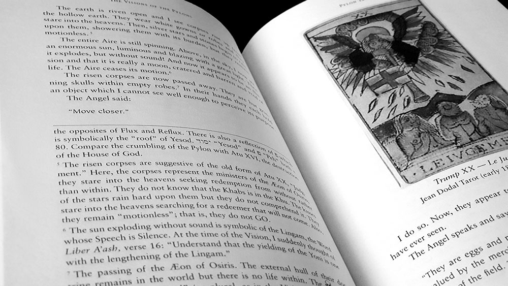
A Rose Veiled in Black spread for Waiting for the Scarlet Apocalypse by Manon Hedenborg-White

Next to Uncle Al, Parsons is the Babalon devotee who gets the most mileage in A Rose Veiled in Black, with Manon Hedenborg-White giving over a substantial 33 pages to Uncle Jack and his place in the mythos of Babalon. Hedenborg-White begins with a solid history of Parsons and his various interactions with Babalon (citing extensively from George Pendle’s Strange Angel) before devoting a significant amount of space to highlighting the difference between his conception of Babalon and that of Crowley. While the Babalon of Crowley’s The Vision and the Voice is removed, residing in the astral, and largely passive, Parsons’ Babalon is a goddess with agency and the ability, and will, to move into the material realm, giving orders and fomenting revolution.

This view is something also explored by Erik Davis in Babalon Rising: Jacks Parsons’ Witchcraft Prophecy, in which he describes it as emblematic of Parsons’ “magickal feminism.” Both Davis and Hedenborg-White portray Parsons and his vision of Babalon as being ahead of its time, with the contrast between Californian Uncle Jack and the Victorian Crowley being particularly notable; though Davis does not shy away from calling Parson’s earnest views somewhat essentialist and slightly cheesy. The fulfilment of Parsons’ witchcraft prophecy, which had predated even Gerald Gardner’s publication of Witchcraft Today in 1954, saw the growth of witchcraft as a counterculture, often feminist, movement, in the latter half of the 20th century; with Davis suggesting it was no accident that the particularly militant and vociferous strands began in Los Angeles.

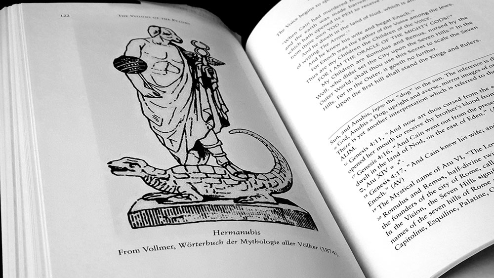
A Rose Veiled in Black spread for Emblematic Arcana of Babalon by Frater AI

Perhaps the most outlier of contributions here comes from Caroline Wise who almost admits as much in the narrative of her Dreaming of Babalon and the Bride of the Land. This begins abruptly, placing the reader in an unexpected narrative in which Wise is flying, quite reflectively and with great clarity, over the landscape of Glastonbury in what one eventually realises is a dream experience. It ends with flashes of the number 156 and a message from Babalon instructing Wise to ‘find me in this land.’ Wise’s work has always had a sense of the geographical about it, in particular her many pages spent on the road goddess Elen, and this is what occurs here, with her following Babalon’s directive and seeking to find her within the magical landscape of Glastonbury. This draws heavily on Katherine Maltwood’s idea of the Glastonbury Zodiac, great (theoretical) landforms within the region’s hills, streams and roads that appear to represent the twelve signs of the zodiac, with Wise’s journey predominantly focusing on themes of the grail cup, the constellation of Virgo and echoes of Mary Magdalene.

Mitchell Nolte: Our Lady Babalon

A Rose Veiled in Black concludes with another distinct approach, with Frater A.I.’s Emblematic Arcana of Babalon, in which he provides a meditation on certain themes and symbolism associated with Babalon, represented as a series of sigils and emblems. Reminiscent in some places of Hagen von Tulien’s stark black and white designs, these images draw on commentary from The Vision and the Voice along with tarot and qabbalistic symbolism to illustrate concepts such as Babalon as the disposing intelligence of Cain, her seven-headed mount and the City of Pyramids, and the Egg of the Babe of the Abyss.

In all, there is a wide variety of work in A Rose Veiled in Black, ranging from good to great, and with no obvious missteps or huge dips in quality. The work is proofed fairly well, with only a few howlers slipping by: in his piece on Leah Hirsig, Kaczynski quotes from the Gnostic Mass and has Chaos as the sole “Viecregent” of the Sun, rather than, surely, ‘viceregent,’ while Hedenborg-White’s piece has one instance in which the names of Babalon and Parsons are transposed, leading to the head scratching genderfuck of “the goddess asks Babalon to give his mortal life in exchange for her incarnation… Parson responds: ‘I am willing.’”

Liv Rainey-Smith: Babalon

A smattering of black and white images are scattered throughout A Rose Veiled in Black (with some Babalon henna designs by Nicole DiMucci Potts providing a consistent but atypical interstitial style), but the bulk of visual contributions are found as full colour plates in the centre of the book. These are all, suitably, quite luxurious, with the most notable examples being ones in which oils, acrylics and their digital approximates, render Babalon in swathes of fleshy brushstrokes. Mitchell Nolte’s digital Our Lady Babalon has her bare-breasted and enthroned within a dense tableaux that has something of Gustave Moreau’s regal, decadent splendour about it. Timo Ketola’s pastels on paper Babalon carries a similar feeling of opulence with libidinous folds of cloth cascading from a chalice-wielding Babalon. The chalice reappears in Linda Macfarlane’s Babalon, where she stands strong before an acrylic-rendered septagram, her hair a Kate Pierson-like mane of red and her left arm snake-entwined. Finally of note is Liv Rainey-Smith’s 2014 woodcut with hand-applied garnet, purpurite, tigers eye, bloodstone and jade in which Babalon most closely resembles her apocalyptic description, riding upon the seven-headed beast and carrying the cup of her fornications in her hand.

Layout is expertly handled by Joseph Uccello in a functional serif for body and subheadings. The only flash of glamour comes from the titles, which are rendered in Moyenage 32, a blackletter face with a hint of the modern, which feels strangely fitting here without falling into the trap of being obviously Babalonesque (neither overly ‘occult’ or stereotypically ‘feminine’).

Spread with Devotion by Hana Lee and Babalon by Timo Ketola

A Rose Veiled in Black was made available in two editions: a standard hardcover edition with a dust jacket, limited to 1,092 copies, and a deluxe edition of 77 copies, quarter-bound in scarlet goat with marbled papers. The standard edition is bound in red cloth with text foiled in gold on the spine, while the dust jacket bears the image of Babalon by painter Linda Macfarlane, who has previously explored a number of other Babalonian themes.

Published by Three Hands Press

by

Wortcunning – Nigel G. Pearson

No comments yet

Categories: folk, witchcraft, Tags:

Wortcunning coverAs Nigel Pearson explains in his introduction, this compact little volume from Troy Books documents a collection of herbal lore he was given access to in the early 1980s. The accumulated knowledge of a Sussex family group of witches, the information was assembled on a set of index-cards, housed within a box, with herbs and ailments spread across them in several, presumably multigenerational, hands. The information was recorded by Pearson, and the cards returned, but it was largely forgotten for the ensuing decades until his own interests coincided with the content of the herbal.

Befitting the index card format, there’s not a lot of information for each herb, with the entry usually consisting of the name, a month and/or planetary attribution, a subheading giving the ailment followed by very brief instructions on use. There’s also the use of what is described as a habitat code, a four by five grid system used to note a plant’s habitat and soil conditions. In addition to alphabetically listing the herbs, Wortcunning includes entries for various maladies, all of which provide a cross-reference to their treatment by listing the relevant plants.

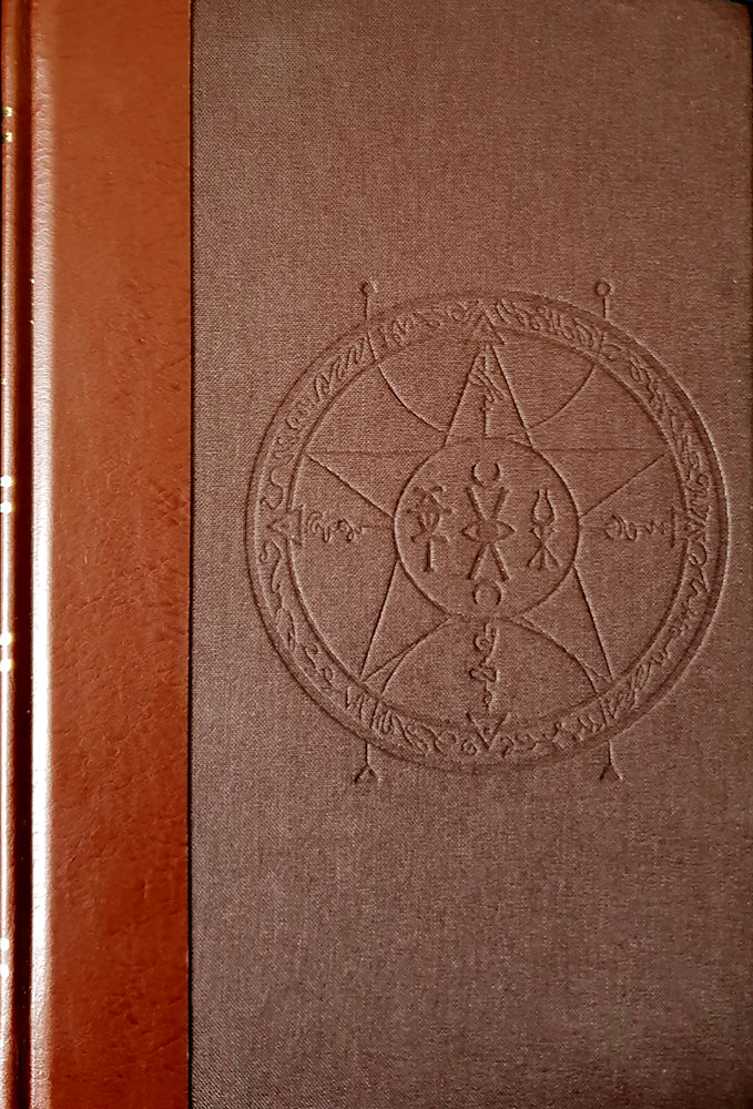
Despite the sigil-festooned device on the cover, there’s little to no magical aspects involved in these cures and their application, with most being either imbibed or topically applied with nary a trace of ceremony or orison. Perhaps the most common practice here is infusion, with multiple recipes calling for the creation of tonics and teas, while poultices occur less. Similarly, there’s no poisonous path here, and while baneful plants such as henbane, datura and hemlock are listed, their only instruction is a stern one, telling the reader not to touch them.

Wortcunning spread with Sussex material

There is an ugliness, atypical of Troy Books, to how this information is presented, with the symptoms rendered with hideous outmoded underlines that brutally cut across the page, while the choice of italics for instructions and dosages comes across as bitsy and messes with the overall hierarchy. This messiness is compounded by some of the formulae using the at/@ symbol, which though it is applied in its traditional sense to mean “at the rate of,” feels incongruously modern and just ugly, like you’re looking at sentences of improperly formatted email addresses. Also, the use of the habitat code means that each entry ends with an untidy string of capital letters that need to be decoded by flicking back to the legend at the start, when that information could have been more simply written in full. Obviously, this code system is included (like the use of the @ symbol, one supposes) in deference to accurately reflecting the styling of the original cards, but there’s no denying it gets on the tits off this reviewer. Speaking of tits and the getting on thereof, may we draw attention to the infuriatingly consistent improper use of semicolons, where they are used where colons should be.

Wortcunning spread with herbal entries

Wortcunning has a lovely formatting conceit that allows it to be read either from the front or the back. While reading it one way presents the Sussex lore as recorded by Pearson, flipping it over gives the reader a slightly different book, with a thorough listing of the more traditional usages and attributes of the same herbs. This has the benefit of increasing the page count substantially, as the Sussex material only runs to a meagre 65 pages. It also, naturally, provides a lot more content, with the barebones and brevity of the first half contrasting markedly with its counterpart. Here, Pearson writes in considerable detail for each herb, adding in the magic and the history of each plant, and giving their symbolism and varieties of magical application. Although Pearson apologises in his introduction for the lack of encyclopaedic writing on each plant, the length of these entries (running from half a page to a more usual full page), suits the type of book it is and doesn’t skimp on the deets.

Unlike the barebones of the Sussex material, these entries are broken up with the occasional image of the respective plant, sometimes appearing at full or half page size but more often than not, as little thumbnails with text wrapping around them. These are clearly sourced from different locations, so there’s not a consistent style to them, with various stroke weights and degree of detail; though the overall style is, naturally, botanical illustration.

Wortcunning spread with herbal entries

The any-which-way formatting of Wortcunning is done very well, with the cover superficially duplicated at both ends, and the spine details formatted to be read either way, meaning that inevitably, and somewhat delightfully, you never know which ends you’ll be starting from when you pick it up with a casual glance. There’s always a lot of flipping involved (until you eventually notices that, oh, one cover says “A Folk Medicine Herbal” and the other “A Folk Magic Herbal”).

Wortcunning is presented in a 187 x 114mm pocket format on 193 90gsm cream paper pages, in a paperback edition, a standard hardback edition and a fine edition. The standard edition is bound in green cloth, with copper foil blocking to the cover and spine, with light black endpapers and black head and tail bands. The fine edition of 86 exemplars is hand bound in high quality, soft touch faux leather with copper foil blocking to the front and spine with marbled end papers. This is held in a fully-lined black library buckram slip-case, with copper foil blocking replicating the cover motif on front and reverse sides.

Published by Troy Books

by

Telesmata: New Images of the Sabbatic Mysterium – Daniel Schulke

No comments yet

Categories: art, sabbatic craft, witchcraft, Tags:

Telesmata catalogue coverHeld in November of 2018, in Mortlake and Company’s Seattle gallery space, Telesmata was an exhibition of work by Daniel Schulke, with its subject matter encapsulated in the subtitle promising new images of the Sabbatic Mysterium. The catalogue of the exhibition is presented in a 180 by 250mm, perfect bound format, with a substantial page count of 48. It should be noted that not all of the images shown in Telesmata are featured in this catalogue, but they are available in an online gallery on the Mortlake and Company website.

My first encounter with Schulke’s artwork was in the icon-like images of his Viridarium Umbris: The Pleasure Garden of Shadow, all high contrast black and white tones, with forms both human and arboreal featuring prominently. The most obvious continuation of this work is Daimonic Intelligence of the Mandrake, an oil on canvas work, used on the posters for the exhibition, which reprises an image found, rendered in lines of ink, in the opening pages of Viridarium Umbris. On a whole, though, that pen and ink style is absent from the work of Telesmata but there are familiarly-formed figures, and naturally, the themes remain the same.

Daniel Schulke - Daimonic Intelligence of the Mandrake

It is oils that dominate here, with only two submissions in watercolour on paper (representing female and male sacrifices to the Sabbatic Egregore Ozzhazæl respectively). The themes of most of the paintings will resonate with anyone familiar with the Sabbatic strand of witchcraft, predominantly illustrating ritual formulae: figures swirl around the field that is The Blood Acre in one, the phallic arcanum of the Stone God is illustrated in another, while Eokharnast, the first horse, appears with a corporeal, humanoid projection in a painting from 2018.

Telesmata spread

Schulke works largely with flat plains, his figures often appearing against muted or entirely black backgrounds, but when they do appear in landscapes, they recall the work of Christos Beest with their sense of hermetic numinosity, heavy with import due to their isolation within the land. His female figures in particular recall those from Viridarium Umbris, all almond eyes and perpetual nubile nudity, but now enfleshed in painterly skin.

Daniel Schulke - Female Sacrifice unto Ozzhazael

Perhaps the most striking and evocative of the images presented here are ones in which Schulke has used plant-derived materials as the sole medium (with iron as a fixative). He explains that the works are entirely experimental, coming from meditations on the source plant, thereby creating an image of the plant’s spirit. Included in the catalogue are representations of the daimons for eucalyptus, walnut, oak and unspecified tannins, with each bearing arboreal faces within twisting, phantasmagorical forms that are decorated with voluted bark-like markings.

Daniel Schulke: Ink Daimon: Tannins

As its 48 pages suggest, this catalogue takes the opportunity to do more than simply document the work, and said work is preceded by a significant introduction from Schulke, and proceeded by another brief text on materials. In his introduction, Schulke talks of the way in which painting is a fundamentally magical act, creating images that are by their very nature occult, due to the way in which layers are built one upon the other, both revealing and concealing. For him, then, a magical image is a ritual object in an immediate sense, but also one that reflects an accumulation of knowledge and experience.

Telesmata's concluding third section, Substance

In the concluding third section, Substance,  Schulke underscores the magical process behind painting with a meditation on the way in which it alchemically blends together various ingredients, not just in the pigments, but in the material on which they are applied, creating a matrix of tree oils, resins, wood and linen fibre. He concludes this point with a brief herbal (and whatever the mineral equivalent would be), consisting of nineteen types of plants, stones and metals that can be used for painting.

Published by Three Hands Press in conjunction with Viatorium Press

by

The Book of Q’ab iTz – David Herrerias

No comments yet

Categories: art, sabbatic craft, Tags:

The Book of Q'ab iTz coverSince forming in 2018, Atramentous Press have quickly built a significant catalogue of releases, with this being their fourth title already. The Book of Q’ab iTz is one part magickal record, one part art portfolio, with the latter being what author David Herrerias is best known for. Mexico-born, Sweden-based Herrerias has created cover art in his distinctive wispy style of oils for black metal acts such as Irkallian Oracle, Akhlys and most spectacularly, Nightbringer, as well as featuring in occult publications from Three Hands Press, Anathema Publishing and others.
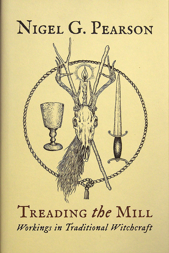
The Book of Q’ab iTz is divided into two sections: a written preamble that takes up a little under half of the work, and the Book of Q’ab iTz proper, which consists predominantly of illustrations by Herrerias. This latter section is, in turn, divided into two codices, presenting formulae of the Androgyne, and of the Xoëtic Alphabet respectively. The written preamble does two things: first, it presents an explanation of the modalities out of which the illustrative content emerged, with Herrerias describing his approach based on the Sabbatic Tradition as found in Andrew Chumbley’s Dragon Book of Essex, Qutub and Azoëtia. These are presented as either instructions to the reader, or as diary recollections of Herrerias’ own work. This preamble also  provides something of an explanation for the illustrations, with an exegesis, still somewhat veiled in obnubilating occult language, of the symbolism and the themes. Unfortunately, as all this written comment occurs in the first half of the book, it somewhat divorces it from the corresponding images, and the correlation between the two sections can be forgotten as you move forward (or subject to a constant flicking betwixt pages and the marking of places with fingers).
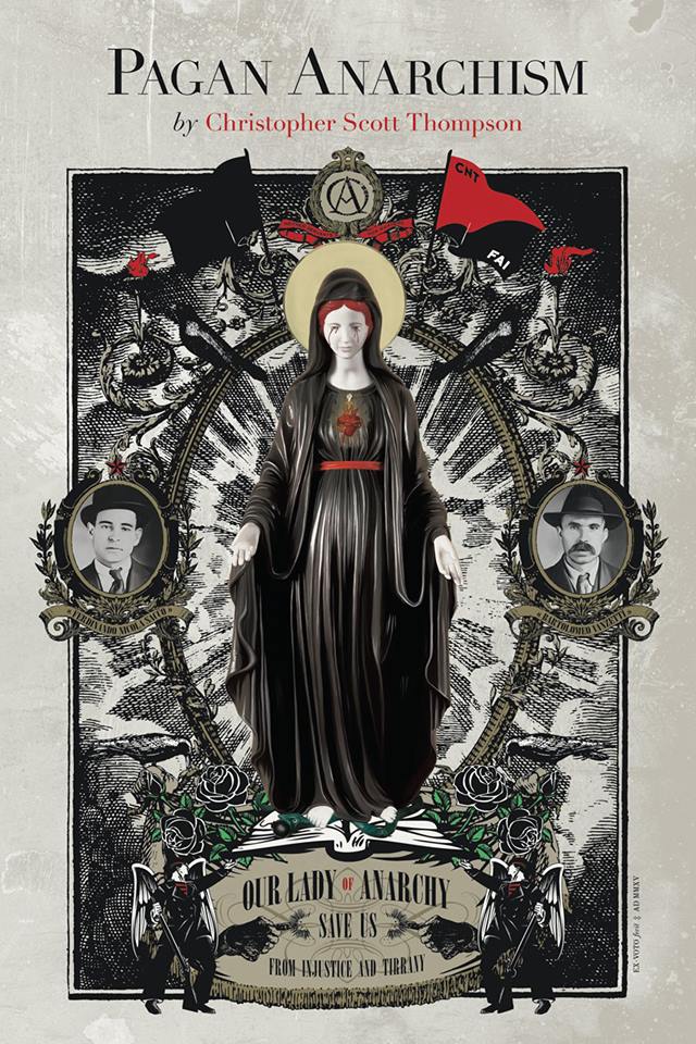
The Book of Q'ab iTz spread

The images of Codex I, Formula of the Androgyne, are presented in a variety of usually dense and detailed styles, with a heavy calligraphic element being perhaps the most common motif. Here, Herrerias writes in a lovely, florid hand, often layering the text over images, or otherwise creating dense surfaces of typographic colour. While hard to read, even if you do speak Spanish, the text from some of these images is translated and printed, without explanation, in a section before the main images. Other than this curlicued text, the artwork here contains as its main feature a prevailing theme of the corporeal, featuring a variety of human bodies and individual body parts, usually dissolving or evolving into various forms. Phalluses and multiple sets of breasts abound, including several appearances by the winged-penis that is the fascinum, featuring, sometimes overtly, others covertly, in a variety of images.

David Herrerias: The Book of Q'ab iTz spread

In Codex II, the images differ little in overall style, but there is an increasing emphasis on the incorporation of Mesoamerican motifs, with the usual pallet of western occult imagery being joined by figures that would not be out of place in Mayan codices. This relates to Herrerias’ integration of his Mexican cultural background incorporation into the Ophidian and Sabbatic path, with most notably the Tlacuache (Opposum) and the Tecolotl (Owl) featured throughout as significant totemic forces that mark the “moment of experiential ecstasy at the Witches’ Sabbat.” This is, perhaps, the most interesting element of The Book of Q’ab iTz as it provides a unique innovation of the array of symbols, and one that, if initially incongruous, begins to have a certain appeal.

David Herrerias: The Book of Q'ab iTz spread

While presenting a body of work that is consistently his own, Herrerias employs a variety of styles for which, in some cases, there are some clear touchstones and precedents. Chumbley seems the most obvious, in particular the use of facetted plains and jagged, eldritch tendrils that have always been evocative of Lovecraft’s references to unsettling non-Euclidian geometry. Austin Osman Spare also lends a pretty indelible mark on the work, most immediately with Herrerias’ use of intense self-portrait in which he stares out at the viewer, recalling the same gaze from Spare in a multitude of images. Similarly, a totemic painting comprised of three faces stacked one upon the other seems like an obvious riff on Spare’s Mind and Body from 1953, while anytime human figures merge and dissolve into amorphous shapes, or steles combine frontalist godforms, sigils and mystic letters, it’s hard not to think of Spare’s oeuvre.

The final selection of artwork in The Book of Q’ab iTz moves Herrerias away from the pen and brush and towards the lens, with a series of black and white photographs documenting the formula of the Xoëtic Alphabet. Each of these darkly-toned images is accompanied on the preceding page by a brief, if cryptic, explanation of each stage in the process.

David Herrerias: Formula of the Xoëtic Alphabet

Given the effort that has gone into a title like this, from the choice of stock to the quality of printing, not to mention the hours spent by Herrerias in creating the images, it’s a shame more of the same wasn’t applied to finessing the text. There are deficiency in both editing and proofing, with the lack of the former meaning you can have a single sentence that runs to seven lines, while the absence of the latter sees the conflation of ‘its’ for ‘it’s’ and general spelling and grammatical mistakes. While Herrerias does admirably for someone whose first language, one assumes, is not English (and some areas are better than others), it would have been a kindness to have a more rigorous editor to tighten the run-on sentences, lipo the other bits of literary flab, and keep the tenses making senses.

David Herrerias: The Book of Q'ab iTz spread

The Book of Q’ab iTz has been released by Atramentous Press in four editions: standard hardback, the Somatic special edition, the Telesmatic deluxe edition, and a trade paperback. The standard edition of 333 exemplars has a natural terracotta cover with central insignia and printed spine, binding approximately 120 pages of a weighty 150 gsm Munken Rough stock and natural heritage blue endpapers. The Somatic edition of 33 wraps the same in a goatskin cover, with gold foil insignias blocked to cover and rear, five foiled ribs on the spine, enclosed in a felt-lined cloth slipcase. Finally, the thirteen exemplar Telesmatic edition binds the above in polished goatskin cover, but houses it in a full leather solander box with a foil blocked title on the front and ribs to spine, and comes with a sigillic talisman by Herrerias on nagual-made paper from Mexico.

Published by Atramentous Press

by

Via Tortuosa – Daniel A. Schulke & Robert Fitzgerald

No comments yet

Categories: sabbatic craft, witchcraft, Tags:

Via Tortuosa coverReleased by Xoanon in 2018 with little fanfare (for example, other than an announcement of imminent release, there’s no presence on the publisher’s website), Via Tortuosa is an outline of Crooked Sorcery as defined by the Cultus Sabbati. While the practical side of this system can be found in at least two ritual-heavy tomes also published by Xoanon, Andrew Chumbley’s Azoëtia and his Dragon-Book of Essex, in many ways, Via Tortuosa feels like the background information and explanation that those two titles lack. While not necessarily an entry-level book by any means, having too specific and aberrant a nomenclature for one, it does give the impression of being an overview, an explication of themes that are otherwise usually taken as read.

With Schulke and Fitzgerald sharing authorship credits, it’s not clear who does what, but, being more familiar with the work of former rather than the latter, it’s fair to say that some sections have more of a Schulkian feel than others, particularly the introduction. Here, Schulke (one assumes) is in full flight, staking a claim for ownership of the Crooked Path phrase and flinging out familiar words from the Cultus Sabbati lexicon: your ‘recensions,’ ‘reifications’ and ‘modalities,’ plus some new ones. Congratulations in particular on ‘enspissation’ for which a Google search returns only two results: a bootleg PDF of Schulke’s own Veneficium, and a paper from 1988 discussing the primary culture of bovine mammary acini on a collagen matrix; though this review is probably providing a hit by the time you, dear reader, peruse it, go SEO!  Also, there’s ‘detritivores,’ which may or may not get slipped into future casual conversations; that’s going to take some applause-worthy work.

Via Tortuosa spread with second section, Adversus

Via Tortuosa is divided into three sections, with the middle of these being a single poem titled Adversus. The first section, Exegesis, consists of eight chapters outlining core principles, themes and concepts of the Crooked Path. These hit the beats one would expect to be hit, beginning with an explication of the path itself, here called the Backward Way in the chapter title, which as its twin names suggest, is defined by doctrines of inversion and transgression, with the idea of aberration being a key one from which all else follows. The sabbat itself is offered as exemplary of this, and with its evagination of Christian liturgy and ritual, is said to create a warping of usual psychic and sensorial states. It is not just the crooked manner of the path that is considered here, though, and subsequent chapters turn to more specifics, first with the idea of the Opposer, whose current intersects with the deepest strata of the Via Tortuosa, challenging those who would travel along it. The Crooked Path is also a multiplicious one, bifurcating at the liminal point that is the crossroads, becoming the Divided Way and the Path of Chance, and still further into paths of immediation, intention, creation, remedy and return, before resolving into the Crooked Circle.

Jim Dunk: title image for Exilic Wisdom chapter

Beyond the path itself, Via Tortuosa turns its attention to core elements from the Sabbatic Tradition’s cosmology: Cain (whose journey provides much of the ritual narrative here), the serpent in the garden of Eden, and the Black Man of the Sabbat. These are followed by a survey of several key ritual approaches, acting not as a full explication with any rituals to adhere to by rote, but a discussion of various ideas, including the use of familiars, congress with spirits, and ordeals of solitude that mirror Cain’s own ostracism.

Via Tortuosa spread

With the exception of a glossary and bibliography that follow, Via Tortuosa concludes with its third part, devoting a significant part of the book, 50 pages in all, to a collection of parables. These Parables of the Exiled are brief little stories in the vein of their gospel equivalent, presenting pithy tales, pregnant with crooked meaning and import. The most enjoyable of these apologues are stories involving the original exile, Cain (which add to sabbatic mythos surrounding him), while others are set in different historical locals and in that theoretical world of yester-century that seems equally home to Beedle the Bard’s Tale of the Three Brothers and the story of Puss in Boots. There are 24 of these in total, each largely playing into that core idea of inversion and transgression with their lessons being somewhat contrary to what Jesus delivered with the form.

Via Tortuosa is low on in-text illustrations, and other than one crossed stang-like full page image and a similar figure on the title page, the only graphic elements are nine images that sit above each chapter title. Created by James Dunk (presumably not the same Jim Dunk that used to tell people not to drink Molson lager), these have something of a welcome, atypical style, heavy on inky contrast and hard edges. Resembling the stelae or cartouche depictions of enthroned Egyptian gods, these figures have an atavistic quality, their totemic qualities emphasised in themes of decapitation and amputation, with otherness conveyed through a lack of limbs connecting hands to torso.

Jim Dunk: title image for The Opposer chapter

Via Tortuosa has been released with a total run of 559 copies, with 496 of these comprising the standard edition. Presented in crown octavo format, the standard edition is bound in a lovely metallic-flecked, deep red carmine cloth, with a serpentine design foiled in gold on the cover and rear, and the title and author names similarly blocked on the spine. This is wrapped in a letterpress-printed dust jacket that replicates the front and back serpent motif, slightly debossed on its heavy red card due to the printing method. The remaining 63 copies comprise a deluxe edition of 44 in quarter goatskin and slipcase, and a special edition of nineteen in full goatskin and slipcase.

Published by Xoanon

by

The Language of the Corpse – Cody Dickerson

No comments yet

Categories: folk, germanic, Tags:

Language of the Corpse coverBearing the subtitle The Power of the Cadaver in Germanic and Icelandic Sorcery, Cody Dickerson’s The Language of the Corpse is a short little treatise from Three Hands Press. Running to just 76 pages, undivided by chapters and with type set at a fairly large point size, it is an enjoyable one-sitting read that feels more like an extended essay or brisk thesis than a full book. This puts it in the company of another recent title from Three Hands Press, Richard Gavin’s The Moribund Portal, with which it shares a certain focus on matters of quietus.

As the title and subtitle make obvious, the subject in hand here is a corporeal one, concerning itself with both symbolic and actual use of human remains for metaphysical purposes. Dickerson frames this consideration with Óðinn, who as Valföðr and Hangadróttinn, makes a fitting embodiment of the themes of death and vital remains that follows. While he doesn’t feature prominently throughout the rest of the book, it’s clear with this introduction, and his return at the conclusion, that from Dickerson’s perspective, he oversees it all.

The Language of the Corpse spread

The book’s remit allow Dickerson to amble through a variety of related objects, predominantly associated with Western Europe and more specifically with Scandinavia, where reanimated corpses loom large as symbols of eldritch alterity. Indeed, if there’s one theme here it’s how the remains of the dead, be it an entire body or the singular hand of glory, provided a method of congress between this world and others. For example, those Iron Age people whose bodies have been found in peat bogs may have been victims not of just sacrifice (in itself a form of connecting with the divine) but of augury, with their intestines read for import and wisdom. As Dickerson eloquently puts it, the corpse then acts as an agent by which the living gain access to the wisdom of the gods, becoming “a symbol of the highest degree of exchange between man and the divine,” and thereby the greatest possible offering.

It is this sense of communication, of touching the divine, which can then be seen in the other examples that Dickerson draws on from across a substantial span of time and distance. Whether it’s figures sitting on burial mounds in saga literature, the necromancy of sixteenth and seventeenth century Icelandic sorcerers, or the belief in the apotropaic and sanative power of an executioner’s touch, there is a sense of death acting as a transmitter of power and knowledge, and for good as much as for ill.

The Language of the Corpse spread

There’s a certain familiarity that occurs in The Language of the Corpse, with little areas being covered that anyone immersed in this here milieu will, or should, have at least a passing awareness of due to their ubiquity. The intersection of mandrakes with this topology is the most obvious one, hitting all the usual talking points when discussing their connection with death and the gallows. Similarly, a brief foray into the idea of mumia, a protoplasmic cure-all made from human remains, echoes a similar survey of the subject from Daniel Schulke’s recently reviewed Veneficium.

Dickerson writes in a style that fits rather well with Three Hands Press. While not as ornate or antique as some of his companions, he nevertheless deftly employs a well-furnished lexicon and is able to dip into a conversational, but not too informal, turn of phrase when required to address the layreader. This is all, in turn, competently and thoroughly proofed, with no significant complaints from your humble reviewer.

The Language of the Corpse front design

The Language of the Corpse has been made available in three editions: a trade paperback, a hardcover edition of 1,000 copies with a dust jacket, and a deluxe edition with special endpapers and quarter leather binding. The dust jacket and paperback version features a collage designed by Bob Eames, based on The Physician from Hans Holbein’s The Dance of Death, while the front and back of the hardcover edition is debossed with a lovely floral skull motif, cruelly hidden by said dust jacket.

Published by Three Hands Press

by

Sabat #3 and #4 – Edited by Elisabeth Krohn

No comments yet

Categories: art, witchcraft

Sabat #3 coverSabat is a magazine irregularly published by creative director and editor Elisabeth Krohn. We’ve chosen to review two issues because the latest is a slightly atypical, harder to parse, volume that could be summarised in one or two paragraphs, whereas the previous issue from 2017 is a weightier work worthy of its own singular review.

The third volume of Sabat is referred to as the crone issue, and brings a natural end to the sequence of maiden and mother showcased in the previous two issues. This theme of the crone has a variety of interpretations, due to the substantial list of contributors across its 160 pages, with thirteen writers, twenty-two photographers and twelve artists. In matters of writing, standouts include contributions from Myroslava Hartmond, Pam Grossman, Sonya Vatomsky, and Gabriela Herstik.

Hartmond gives a brief account of the 1960s radical feminist group W.I.T.C.H. (an abbreviation of Women’s International Terrorist Conspiracy from Hell, a name you can believe in) and their intersection between actual witches in a symbolic and to a lesser extent, theoretical sense; with the group’s manifesto describing witches as the “original guerrillas and resistance fighters against oppression.” Meanwhile, Grossman provides the most immediate discussion here of the crone in a broad mythological sense, identifying various figures who have appeared as crones from classical myth to Margaret Hamilton as the cinematic Wicked Witch of the West. In a delightful feint, she begins discussing Hekate (a figure not classically depicted as a crone, a popular modern pagan misconception), only to acknowledge this and suggest that this perceptual evolution of maiden to crone is as valid as anything set in the slip of myth.

Sabat #3 spread with feature on April Graham

As a focus on one particular crone, Vatomsky decodes the Slavic figure of Baba Yaga, depicting her as a figure of great power and agency, and arguing that characteristics such as these and others have been lost in her translation into the West. For that touch of pop culture, Herstik considers the women of the Addams family (Wednesday, Morticia and the supremely crone-ish Grandmama) as expressions of the divine feminine; ably illustrated by Vanessa Reyes in two full page ink drawings.

Interviews feature heavily in Sabat #3, with almost all of them beginning with the mantra-like inquiry ‘what does the word Witch mean to you?’ These straddle that divide/intersection of praxis and performance, with some focusing on practitioners (such as queer feminist witch and anti-ageist activist Dulcamara, or Blue Mountains witch April Graham), and others on artists working in jewellery, music and performance art. Sara Gewalt is a jeweller, sculptor and photographer studying, at time of writing, at Konstfack University, who has worked with bands such as Degial and Watain, but is here interviewed with a focus on her Totem necklaces of bone-shaped ceramic. Camille Ducellier is a French multimedia artist with a strong queer and feminist focus, principally working with film and sound. At the time of interview, she was beginning to adapt her sound piece La lune noire (based on the astrological idea of Lilith as a black moon and originally broadcast by France Culture, in 2016) into a full sound installation. Miki Aurora is a Vancouver based performance artist who describes herself as an “artist, filmmaker + occultist designing workings that fuse cyberfeminist theory with chaos practice,” and who uses the modalities of ritual for performance art pieces.Sabat #3 spread with interview with performance artist Miki Aurora

While Norway-born, London-based editor and founder Krohn provides creative direction and clearly has a singular vision, the art direction and its execution falls to designer Cleber Rafael de Campos; half a world away in Brazil for the first two issues, but back in London for the third. It is easy to see why the third issue of Sabat was awarded a silver placing at the 2018 European Design Awards, with its 164 pages that look very, how you say, designery. It’s also very witchy, but not always in the most conventional sense. No rustic gentleness here, no wispy filigree, but also, it must be said, no grim sabbatic tropes, no goats and stangs and other signifiers of Traditional Witchcraft with the capital T and the capital W.

What does dominate, though, is female imagery, with the female form appearing in a variety of situations, some more witchy than others, but always well executed. While there are some male photographers amongst the contributors here, there feels a distinct lack of the male gaze across the imagery. It is the photography that creates some of the most impact here, whether it’s the portraits of featured artists and practitioners, or the little fashion spreads and photographic essays that often seem unannounced and unexplained, and as such, are just effortlessly cool. It’s these that help Sabat feel different, giving it its import and focus, and makes it live up to the association with the #WitchesofInstagram hashtag.

Sabat #3 spread with #letitgo feature

Campos has an equally bold and contemporary design style, employing some core layout elements throughout Sabat but also changing things up with format-disrupting injections where necessary. Printed for the most part on a dull matte stock that gives everything just the right touch of gravitas and muted cool, this is broken up with glossy silver title pages featuring die-cut crescents and discs that provide windows backwards and forwards to other pages as the moon moves through its phases, punching holes through the text of the titles. This lunar sojourn reaches its culmination with a full moon, where graphic designer Dario Gracceva takes the typographic reins around the theme of #letitgo for several pages. In another case, the same silver pages are left without a lunar die cut, but images from the surrounding photo essay are lightly printed on them, appearing ghostly and making the page itself seem almost translucent. Elsewhere, subtle embossing (or debossing, depending on what side of the leaf you’re looking from) of text over images can be almost missed, but once discovered, enhance the tactile experience of Sabat.

Sabat #3 spread with photoshoot of Vivien James by Lolo Bates

With the trilogy of maiden, mother and crone completing with the third issue, the fourth volume of Sabat takes as its theme the elements and uses this as an opportunity to try a significantly different approach to its predecessors. Rather than the dense, perfect bound format of the previous issues, Sabat #4 consists of five large format posters and an unbound booklet of six A3 sheets folded to A4. The posters vary in size from A2 to a folded A1, with the styles feeling more like a work from a design annual, rather than anything overtly witchy. These are presented folded and held together by a string, with the individual A3 leaves of the booklet interspersed throughout.

Sabat #4 spread with large scale poster and unbound booklet leaf

The written content for Sabat #4 takes the form of five one page meditations on each of the elements, delivered by Myroslava Hartmond, Pam Grossman, Sonya Vatomsky, Kristian J. Solle and Sabina Stent; some of whose names will be familiar from previous issues. Given the format, the list of artists for this issue is equally short, and features Nikolai Diekmann, Anne Sophie Ryo, Anniinna Anna Amanda, Elisa Seitzinger, Maria Torres and Ossian Melin.

Sabat #4 spread with large scale poster and unbound booklet leaf

Maybe it shows a lack of imagination on my part, but I’m not sure what to do with it all. Do I disassemble it and try to find wall space to Blu Tack them to amongst a myriad of bookcases? Or, having at least read the written content, do I leave it as a somewhat unsatisfyingly unexplored, hard-to-store art portfolio, with, no matter where it ends up, the corners getting increasingly bent and worn; as is already beginning to happen. At the risk of sounding uncharacteristically plebeian, I just don’t get it, and when both issues cost the same price, I find myself happier holding something with the certainty of 160 beautifully designed, perfect bound pages.

Sabat #4 spread with large scale poster and unbound booklet leaf

Published by Sabat Magazine

by

Of the Witches’ Pact with the Devil – Francesco Maria Guazzo

No comments yet

Categories: sabbatic craft, witchcraft, Tags:

Of the Witches’ Pact with the Devil coverIn October of 2017, Three Hands Press in association with Mortlake and Company, presented Witch-Ikon, an exhibition featuring what was described as “contemporary imagery of witchcraft emergent from the occult, esoteric and fine art milieus,” with work by Marzena Ablewska-Lech, Tom Allen, Claudia Avila, Francisco D, Dolorosa de la Cruz, Rik Garrett, David Herrerias, Timo Ketola, Rory MacLean, Roberto Migliussi, Johnny Decker Miller, Liv Rainey-Smith, K Lenore Siner and Benjamin A. Vierling. In addition to a 48-page, full colour exhibition catalogue (not to mention a similarly-named publications of essays and art that is still forthcoming), Three Hands Press released this little volume and made it available at the gallery.

Of the Witches’ Pact with the Devil is an excerpt from the Montague Summers-directed translation of Francesco Maria Guazzo’s 17th century witch hunter’s manual Compendium Maleficarum; said here to be the seventh chapter of Book 1, but in all other versions consulted it was listed as Chapter VI. Whether it’s the sixth chapter or the seventh, as it titles suggests, this excerpt deals with one of those key moments of the sabbatic narrative, making it ripe with imagery, and one for which that imagery was given very real form with the accompanying legendary woodcuts that have graced the covers of a thousand black metal demo tapes.

Of the Witches’ Pact with the Devil chapter

Guazzo describes the pact between the witch and the devil as either expressed or tacit, with the former performed in the presence of the devil, and the latter as a written petition that may be submitted by a proxy if the supplicant is afraid to speak directly to their new master. Common to both forms are certain matters that Guazzo arranges under eleven headings, beginning with an initial denial of the Christian faith to facilitate the removal of the chrism and the rubbing off the mark of baptism, and ending with an oath to never accept the Eucharist, to destroy all other church relics and to proselytise for the devil.

Designed by Daniel A. Schulke with execution of type by Joseph Uccello, Of the Witches’ Pact with the Devil is printed in two-colour letterpress by Dependable Letterpress, giving the book some lovely tactile and olfactory qualities, with its subtle debossing of the body copy (still more pronounced in the titles, subtitles and images) and the whiff of inks. Uccello renders the body in a serif face that’s hard to pin down but has the right mix of readability and a hint of the archaic, while the page headers are in a lovely blackletter-style variant of the Espinosa Nova face. This rotunda style is also seen on the cover and is used for the in-body numbering of the stages of the witches’ pact, which are further offset from their companions by being printed in red. Proving, its versatility, the one drop cap in the copy uses an illuminated style of Espinosa Nova, while the crosses that dot the book as decorative ends are drawn from its glyph set. Five of the original woodcuts from Compendium Maleficarum are used as illustrations, including the infamous image of the osculum infame.

Of the Witches’ Pact with the Devil spread

Of the Witches’ Pact with the Devil is presented without comment (save for the original footnotes of the Summers translation), so it feels more like a curio or replica than a contemporary reification of praxis. This is something confirmed by the unique production, and its attention to detail. Unfortunately, the content has not been privy to the same eye, and it is an imperfect transcription, featuring a smattering of errata, with transposed letters, and missing or wrong words. It’s not rampant, but there’s enough of it for it to become noticeable and set you off looking for more.

French flap from Of the Witches’ Pact with the Devil

Of the Witches’ Pact with the Devil was made available in a softcover edition of 400 hand-numbered and hand-sewn copies, and a hardcover edition of 40 now sold out copies. Handbound by Klaus-Ullrich Rötzscher of Pettingell Bookbindery, the softcover is bound with a letterpress cover printed on brown card with French flaps, while the hardcover is in a full gilt leather cover with handmade endpapers. The French flaps of the softcover version featuring an image of the devil enthroned, extracted from one of the unused woodcuts, mirrored to face inwards on their respective flap, with a different Latin phrase beneath it; all with the same letterpress debossing of the cover and back elements.

Published by Three Hands Press

by

Shamanic Journeying: A Beginner’s Guide – Sandra Ingerman

No comments yet

Categories: shamanism

Shamanic Journeying coverSandra Ingerman is best known to this reviewer for her collaborations with ambient musician and percussionist Byron Metcalf, producing the album The Spirit of Healing and the standalone Winter Solstice track A Healing the Earth Journey with Dashmesh Khalsa also. In her introduction, Ingerman details her first encounter with shamanism in a workshop she took for nothing more than extra credit whilst studying at the California Institute of Integral Studies in 1980. The workshop was led by Michael Harner and it was this that introduced her to the concept of shamanic journeying. Since then, Ingerman has incorporated the practice with her background in psychotherapy, creating a method to expand consciousness, empower, and provide guidance.

At the outset, Ingerman makes it clear that she is not providing instruction on how to become as shaman as such, merely using a technique that, she says, is common to all forms of shamanism; or to quote directly, common “to all cultures,” as she rather recklessly claims. This is an idea drawn from Harner, and it’s clear that what Ingerman presents here is very much in his mould, with all the corners shaved off and made clean and presentable. As a result, the shamanism discussed here is shorn of any context or examples, and is assigned broad, universal principles in something of an essentialist, categorical manner. The shaman, then, comes across as the type of bland, clean and very vanilla spirit worker that might very well give workshops at the California Institute of Integral Studies. They “maintain harmony and balance in their communities” – whatever that means – and, by omission, presumably are never feared, never perform maleficia, and never kill or injure through magic or otherwise. Unsurprisingly, such malicious sorcery isn’t listed as one of the three common causes for illness in a shamanic worldview, which in rather contemporary parlance, are instead loss of power due to depression or illness, soul loss from a traumatic event, or spiritual blockages and negative energies that a client has taken on due to a loss of power or soul (which sounds pretty much like the first two anyway).

Shamanic Journeying spread

While the subtitle does mark this book as being for beginners, and it comes in at under 90 pages so there’s not a lot of space for elaboration, a real sense of what shamanism can entail, with actual anthropological examples, would have made its basic premise more convincing. Instead, the bovine excrement detector is constantly releasing a high pitch siren as time and time again what is being broadly described doesn’t ring true; not because the details are wrong but because there are so often no details.

Ingerman’s instructions are simply and straightforward, unburdened as they are by any referencing of sources or verifiable anecdotes. This suits the type of book it is, with everything refined and distilled down to a palatable set of guidelines. She describes how to travel to the lower, middle and upper worlds, and of encountering power animals and spirit guides; nomenclature which reveals the intended market (especially when she says it is common to have a unicorn or Pegasus as a power animal; alrighty then).  The technique here is effectively visualisation (of a type that while not guided, at least contains a fair dose of suggestion) with a percussive soundtrack, and it’s only said sound and the use of a broadly shamanic lexicon that makes it feel anything like shamanism. Indeed, the prevailing sense is that of it being nothing more than a therapeutic exercise that a psychotherapist might have a patient undergo as a creative imagination exercise.

Shamanic Journeying: A Beginner’s Guide comes with a CD featuring drumming for three journeys. Running to 12 minutes, 20 minutes and 30 minutes, these three tracks are simple, unadorned and effective drumming pieces, the first beginning with rattles and whistles, and the second featuring double-drumming.

Published by Sounds True.


Review soundtrack: Byron Metcalf and Sandra Ingerman – The Spirit of Healing

by

Trolls: An Unnatural History – John Lindow

No comments yet

Categories: folk, germanic

Trolls coverJohn Lindow, Professor Emeritus of Old Norse/Folklore at Berkeley, has a few significant academic contributions here on the Scriptus Recensera shelves, most notably his substantial Norse Mythology: A Guide to the Gods, Heroes, Rituals, and Beliefs. Published by Reaktion Books, Trolls: An Unnatural History feels a little more public-facing, sitting alongside similar popular cultural history titles on the likes of dragons and other fantastic beasts. This is something suggested by the John Bauer painting from Bland tomtar och troll used on the cover, with its archetypal imagining of what a Swedish troll looks like, all immense hunched frame, large nose and shaggy hair. But there is more to trolls than this popular folk image, and as a result, there’s more to Trolls: An Unnatural History too.

While there is noticeably more consideration within these pages of the Bauer-like troll of folklore, and that figure, fittingly, looms large throughout, Lindow provides a thorough consideration of the first trolls, those of the earlier Old Norse sagas. In these sources, beginning with a poem by ninth century court poet Bragi Boddason, trolls are defined by their indefinability, being creatures that are described in a variety of sometimes contrary ways, with the only consistency being their designation as Other. These trolls, rather than being the bogeyish figures of later folklore, are closer to gods, being forces of nature and the alterior, often synonymous with giants and other broadly defined eldritch beings of death, the wild and the cosmological landscape.

Lindow shows that these characteristics, this liminal insolubility, is not something incongruous with later folklore depictions of trolls (just as the various uses of the name in modern parlance can be read as relating, in various ways and degrees, to its original inscrutable descriptions; perhaps with the exception of the Trolls of World of Warcraft, you come get da voodoo). Indeed, the inability to control by definition made the term a catch-all one that could be as easily applied to a range of supernatural creatures as it had been in the Viking Age.

Spread featuring images by Johan Fredrik Eckersberg and Peter Nikolai Arbo

Perhaps the most enjoyable section of Trolls: An Unnatural History is the somewhat awkwardly titled fourth chapter Fairy-tale Trolls and Trolls Illustrated, which begins, as indicated, with a discussion of the evolution of trolls stories from folklore into the more codified realm of fairy tales. This is then followed by a thorough survey of how these literary illustrations were complimented by actual illustrations, in the works of such artists as Johan Fredrik Eckersberg, Peter Nikolai Arbo, Otto Sinding, Erik Werenskiold and Theodor Kittelsen. While we are dealing with single artists with singular visions, these images are interesting because they presumably do represent the multiplicity of ways in which trolls were visualised in the mind of nineteenth century Scandinavians. Lindow tracks this evolution of thinking, showing how the unresolved imagery of Eckersberg (in which trolls are largely just wild men) and other illustrators was gradually distilled into a very particular visual language, as seen in the work of Werenskiold and Kittelsen, with the troll’s corporeal monstrosity writ large.

Lindow notes that Werenskiold’s work contains a style of illustration (which would come to dominate in that of Kittelsen and others), which sees trolls emerging from and merging with the environment, a “blending of trolls with the materiality of the landscape.” Werenskiold uses the same cross hatching for wood as he does for the trolls that appear in front of it, while Kittelsen’s trolls are often show in symbiosis with the forests from which they issue, with relatively tiny trees and grasses growing on their mossy heads and backs.

After a discussion of trolls in literature (Ibsen’s Peer Gynt being perhaps the most notable example), Lindow gives a survey of trolls from a broader cultural viewpoint, in particular as they are marketed to children. This allows for brief mentions of works by the likes of Tolkien, Rowling, as well as a discussion of the familiar diminutive troll dolls and their then nascent feature film. He then concludes with an epilogue for the digital age, focusing on the use of ‘troll’ as a designation in digital discourse, where the characteristics of the Viking Age troll as an unwelcome and disruptive force from the outside have been renewed with vigour.

Spread featuring an image by Theodor Kittelsen

Sources are not cited within the body of Trolls: An Unnatural History and instead, Lindow uses an area following the epilogue in which, in sections for each chapter, he discusses the various sources, providing them with either broad context or as specific recommendations. This is an interesting way to do it, giving the reader the opportunity to look thoroughly at the source material, but without distracting the flow of the body with footnote, endnotes, or goddess forbid, in text citations. This reflects Lindow’s writing style throughout, which is popular rather than academic and theoretical, engaging the reader with an erudite manner that is still approachable.

Trolls: An Unnatural History binds its 160 pages and dark grey endpapers in a red cloth, with the title and author foiled in gold on the spine. This is then wrapped in a glossy dust jacket with the aforementioned image by Bauer on the front. Images are featured throughout, particularly in the fourth chapter with its focus on visual depictions of trolls.

Published by Reaktion Books

1 2 7 8 9 10 11 12 13 14 15 20 21