Categotry Archives: witchcraft

witchcraft

by

Treading the Mill: Workings in Traditional Witchcraft – Nigel G. Pearson

No comments yet

Categories: folk, witchcraft, Tags:

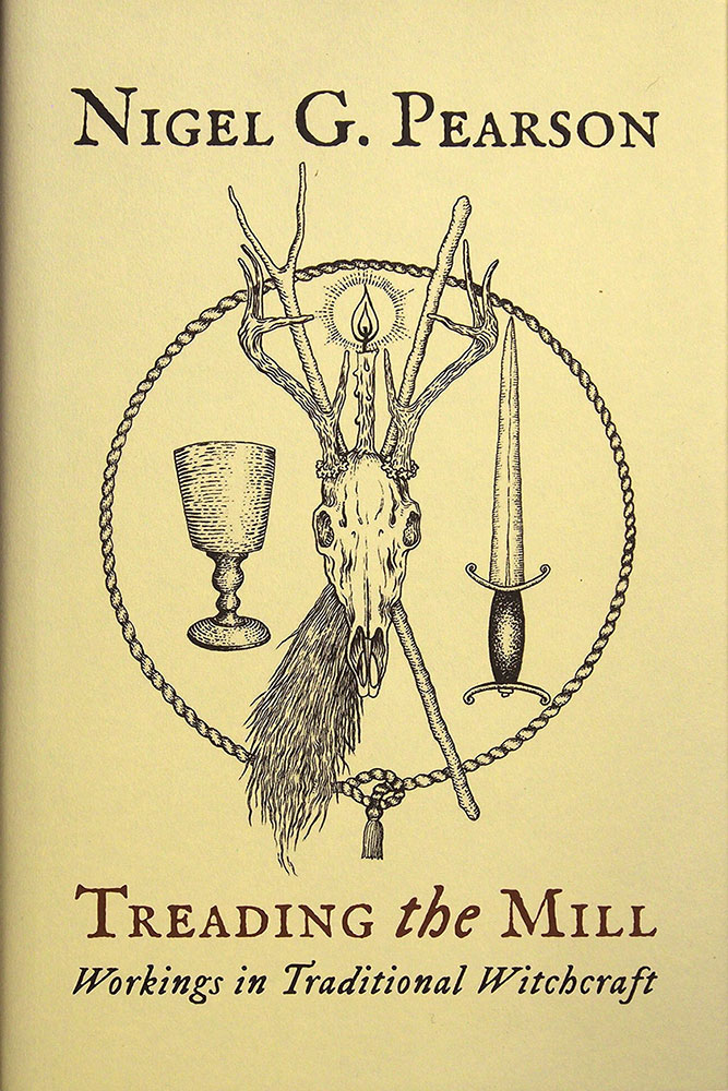
Treading the Mill coverThis volume from the lovely people at Troy Books is a 2016 expanded reissue of Nigel G. Pearson’s Treading the Mill – Practical Craft Working in Modern Traditional Witchcraft, a book that was originally released in 2007 by Capall Bann. With its rough-looking cover (disembodied, low opacity heads floating over a murky woodland), that particular incarnation has never moved beyond the ‘Inspired by your views’ list on Amazon, simply because yes, you really should judge a book by its cover. So, if nothing else, this Troy Books edition wins for having a lovely new cover to judge, care of the inimitable Gemma Gary.
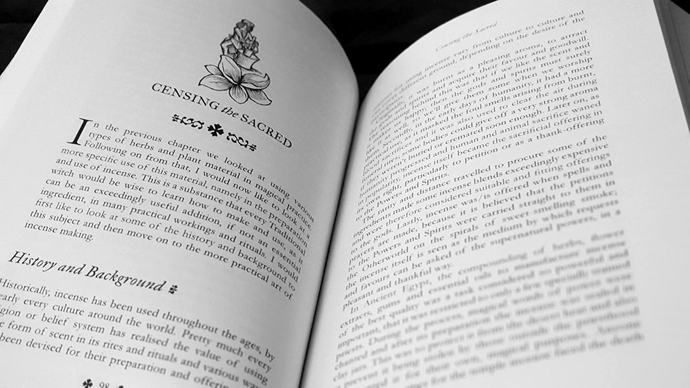
In the company of this new cover is a new chapter, as well as a new introduction (and the original one too), along with revised text throughout the whole book, photographic plates from Pearson, and a smattering of internal images by Gary (largely as chapter headers). In his new introduction, Pearson notes that, in a sad loss for those oenologically-inclined, he has removed a chapter on the mysteries of the cup (with accompanying guide to winemaking), which is replaced in this edition with one on the creation and use of magical incenses.

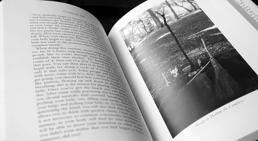
The first chapter, as one would expect, concerns the creation of space and takes that very act, hallowing the compass, as its title. It’s a broader discussion than just that one rite though, and the rubric allows for a wider consideration of the basic toolkit of Traditional Witchcraft: covering of tools, the opening and dismissing of the compass, the calling and honouring of the directions, and a closing statement and thanksgiving. As this list suggests, this hallowing of the compass incorporates many ritual elements and tools that will be familiar to anyone that has encountered entries from this milieu before, but it also includes slightly atypical elements, in particular a guided pathworking for determining individual directional correspondences.

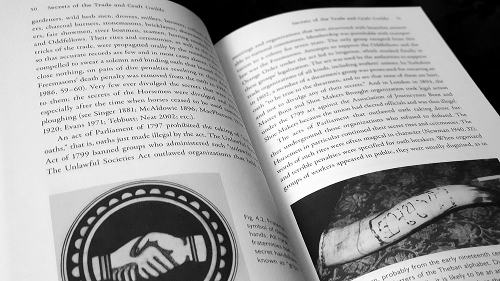
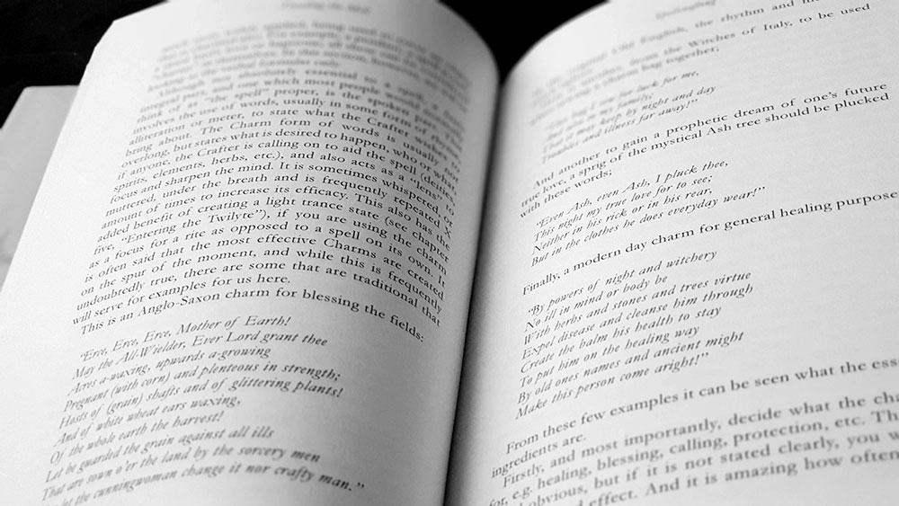
Treading the Mill page spread

Pearson writes effortlessly with a straightforward style that is without artifice, but which, as evidenced by the book’s 260 page length, is notably more detailed and elongated than one might expect for a title such as this. There isn’t necessarily any flab or undue verbosity to the writing, it just runs long, with Pearson taking his time to ease out points, often informally addressing the reader with hypophora; where a more concise writer might simply bullet, note it, ship it. For example, he provides two lengthy examples of procedures for compass hallowing, each filled with little asides and a conversational tone for what could easily be the driest of instructions. It’s impossible and unnecessary to attach a value judgement to this, as it is not bad writing or wrong writing, but simply the style and something for which time must be allowed when reading.

Treading the Mill, proceeds as one would expect of a title like this, covering many bases familiar, including wand creation (with a brief attendant consideration of the magical properties of various native British trees), spellcrafting (incorporating a variety of techniques under the rubric of natural magic, including herbs, potion and lotions), and the aforementioned section on incense and olfactory magic. Each of these receives a full and thorough chapter, with Pearson each time providing a little introductory theory and history, followed by broad advice, and then more specific recipes or listing of properties. It’s important to note that for all the thoroughness, Pearson doesn’t give much in the way of rituals, formulae or recipes that must be followed by rote, instead offering a general framework and enough information for the practitioner to work out their own specific approach. The reason for this may be gleaned in the prelude to the section on spellcrafting where Pearson states that the efficacy of a spell lies within the person performing it, rather than the spell itself.

Image by Gemma Gary

The acknowledged so-called low magic of the preceding chapters then gives way to a different emphasis with Entering the Twilyte, in which the focus is not on sympathetic magic but more on transvection and others examples of travelling in spirit. Pearson makes a distinction between the spirit travelling of the Craft and the full-on possessive states of voudon, or the heightened sensations of ecstatic religions, presenting instead something with a more sedate aura, where awareness and control is maintained. Like the compass hallowing at the start, this involves a fair bit of guided pathworking and visualisation, which Pearson acknowledges is looked down upon by some traditional witches but which is, he says, just “good old-fashioned Witch magic” that has been part of his own training, and used by other traditional crafters, past and present. And for those who think they are unable to visualise anything, he’s got one word for you: “piffle.”

The final two chapters of Treading the Mill turn to the beings encountered, first with what are defined as spirits, and then with the powers or gods. Spirits is a broad definition that runs from environmental genii locorum such as land wights and sea spirits, to familiars and fetches, all the way to the Almighty Dead and the Elven and Faerie Folk. Pearson provides a veritable bestiary of these various creatures, and for some, includes ways of working with them: a rite for communing with your fetch, or a guided pathworking to visit the ancestors, for example.

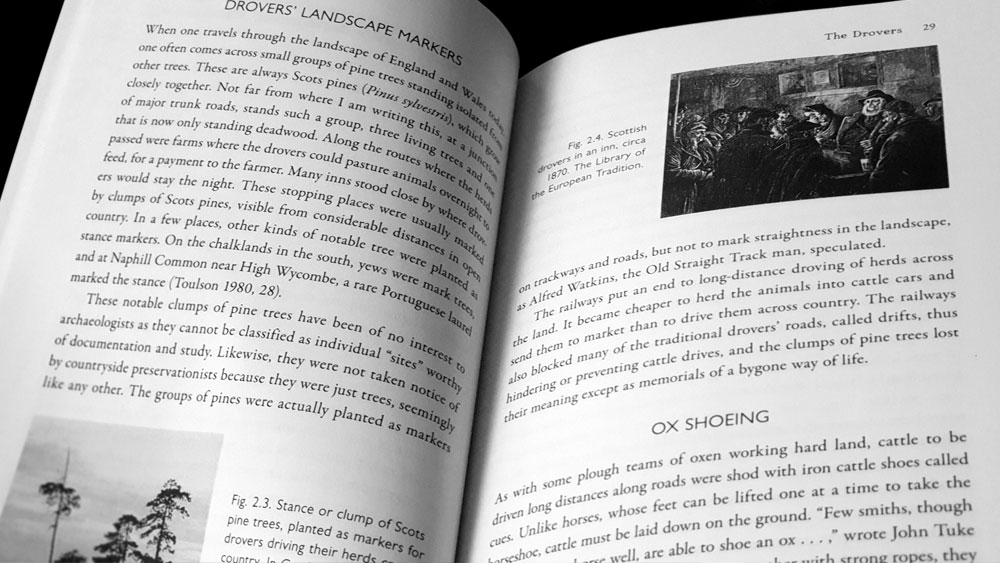
Treading the Mill page spread with photograph plate

For the gods, Pearson makes the point straight out of the gate that traditional witchcraft is not a nature-based fertility religion like its ignominious sibling Wicca, and so the gods of this system, while having associations with nature and the land, are seen as more cosmic forces that, to render it poetically, “have their being in the realms of the stars and the dark space beyond and between them.” These deities are not given names in this system (though Pearson acknowledges that they have analogues in some mythologies and that those names are used by some practitioners), but instead have broad titles that describe their roles. For the male there are the King of the Wildwood, the Lord of the Mound, and the Master of Light, while the female is the Witch Goddess who is both the Great Queen and the Black Goddess. For each of these, Pearson provides a thorough description, along with little rites and workings for connecting with them.  

While inevitably there’s not a lot of revelations in Treading the Mill, with it covering territory that multiple authors have explored (and will continue to do so), Pearson presents it all as a cohesive, internally consistent system. His thoroughness, while making it longer than other such tomes, works to its advantage, giving the reader a carefully considered and complete window into this version of traditional craft.

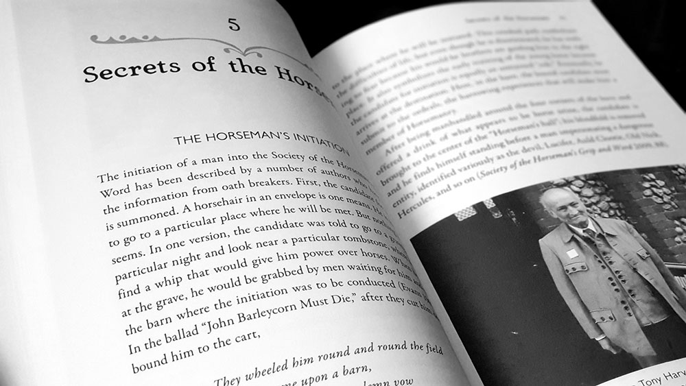
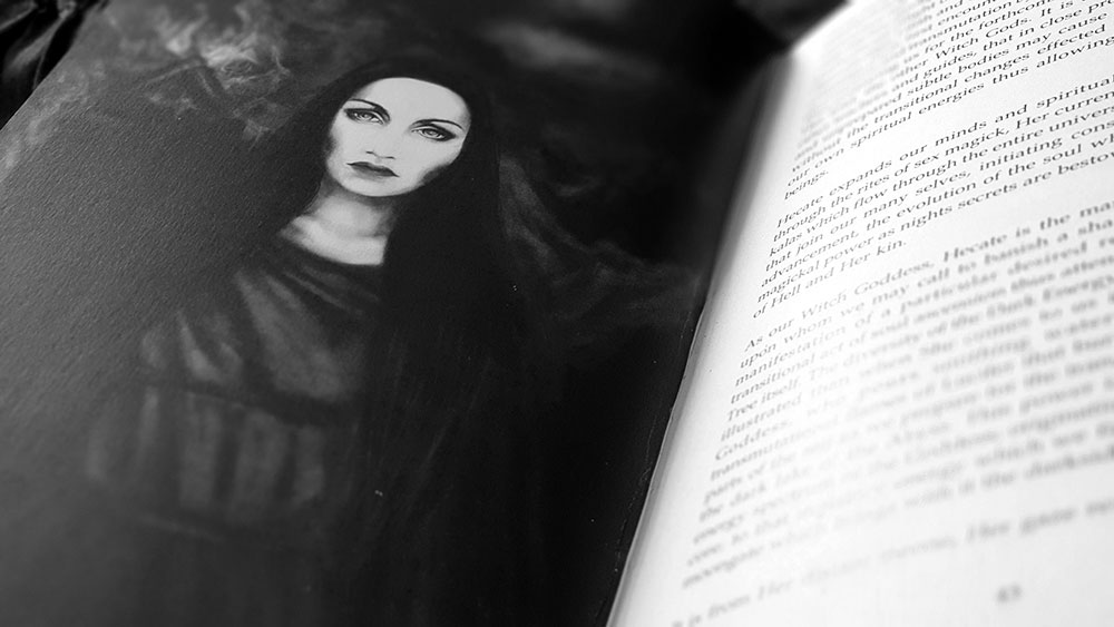
Treading the Mill page spread with chapter heading

There’s a comforting weight to Treading the Mill, with its 260 pages on a nice 90gsm stock, bound with solid coverboards. The formatting within adds to that feeling of stability, with its deft and confident layout, providing nothing sensational but rather a clear and clean look with just the right amount of witchy archaisms. It is this, and the content itself, that makes Treading the Mill sit effortlessly on the shelf in the company of other Troy Book titles from the likes of Gemma Gary and Corinne Boyer, with its scrappy Capall Bann beginnings all but forgotten.

As with many titles from Troy Books, Treading the Mill is available in a multitude of formats, from, at one end of the economic scale, a paperback edition with a gloss laminate, to, at the other, a fine edition of 15 hand bound examples in red goat leather with gold foil blocking to the front and spine, housed in a fully lined black library buckram slip-case, blind embossed to the front. In the middle range of affordability and availability is the standard hardback edition with red endpapers, bound in black with gold foil blocking on the spine, and wrapped in a buttermilk 120gsm matt dust jacket. A now sold out special edition of 250 hand-numbered copies was bound in black recycled leather fibres, with gold foil blocking to the front and spine, and red endpapers and head and tail bands. Finally, there’s the patented Troy Books Black Edition version: a limited hand-numbered edition of 250 in Royal format, 234 x 156mm, bound in black recycled leather fibres, with black foil blocking to the front and spine.
Published by Troy Books
by

Pagan Anarchism – Christopher Scott Thompson

No comments yet

Categories: paganism, witchcraft

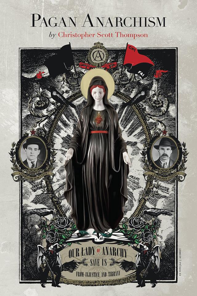
Pagan Anarchism coverPublished by Gods and Radicals, this brief 100 page, nine chapter volume from Christopher Scott Thompson does what it says on the can: talks about paganism and anarchism. There has been of late a certain, if not wealth, then at least a healthy crop of titles addressing occultism, paganism and witchcraft in particular as expressions of political resistance and rebellion. There is, as Thompson acknowledges, Peter Grey’s Apocalyptic Witchcraft from 2013, and only a couple of months ago, David Salisbury’s Weiser-published Witchcraft Activism; not to mention elements of paganism and occultism touched on in Stockholm University Press’s Anarchism and Religion series. Thompson’s unique selling point here is its concern with, shall we say, classic anarchism, and with that, pretty classic witchcraft too. Indeed, despite the paganism in the title, and references to some broadly pagan society, it is more witchcraft that is considered here; which as dual faith observers are so wont to mention, may be pagan or not.

For Thompson, the one thing that brings paganism and anarchism together is another ‘ism,’ animism, arguing that it is this that provides the fundamental contradiction between pagan and capitalist world views. With that said, I’m sure some contrarian could argue that you can define oneself as a pagan without necessarily being an animist. One can, to use Thompson’s example, object to dumping poison in a river because you believe, as a pagan, that it is a sacred river, without necessarily believing that that sacrosanctity is a result of, or is imbued by, the river having agency and consciousness.

By way of introduction to this synthesis, Thompson provides succinct histories of both paganism and anarchism. For paganism, he begins with definitions per Ronald Hutton, touches on the feudal systems and power relationships of mediaeval Europe, before finally summarising the modern pagan revival with a fairly standard trajectory: Romanticism, Leland, Murray, Gardner, et al. On the anarchism side of things, Thompson again returns to Romanticism as a significant cultural alembic, noting an intersection between that most pagan of poets and author of The Masque of Anarchy, Percy Bysshe Shelley, and the politically progressive family of his wife, Mary Wollstonecraft Shelley. Clearly familiar with his subject, Thompson then proceeds through the history of largely secular anarchism (Godwin, Proudhon, Stirnin, Bakunin, etc), but is also able to find those occasional instances of a pagan presence, such as founder of the Ancient Druid Order, militant labour organiser and anarchist communist George Watson MacGregor-Reid.

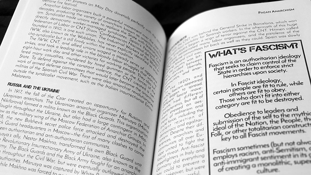
Pagan Anarchism spread

The way in which MacGregor-Reid was “ill at ease with the values and the limitations of contemporary civilization” (as historian Adam Stout put it), sums up the considerations here, and the precarious dance that Thompson must perform in advocating for what is essentially a future of the past, a step backwards to go forwards. He addresses such concerns, summarising various contemporary expressions of these theories and noting the problematic nature of the most extreme and anti-civilisation versions of environmental anarchism such as Deep Green Resistance; who, it must be said, end up sounding similar to the most fervent adherents of anti-cosmic ideas.

In one of the concluding chapters, Thompson presents his own theoretical, high idealised, vision of a future anarchist city, potentially hundreds of years following the fall of capitalisation. Everything is very nice, people presumably sing Kumbaya (Pagan Version) a lot, and there’s apparently no room for misanthropes, curmudgeons, loners, the social inept, or snarky reviewers of occult books, because “people aren’t alienated from each other, they live and work together in close proximity.” Sounds hideous.

Thompson uses the Rojava autonomous region in northeastern Syria as the closest extant analogy to this shining anarchist city on the hill, with the zone’s pluralistic democratic federalism, environmental sustainability and decentralisation sounding like the most progressive brand of anarchism.

The chapters of Pagan Anarchism are interspersed with single-page poems and prayers. These are part of a sliver of practical application that Thompson inserts within all the theory. There’s a little guide to bringing the magic back, as it’s described, with incense lighting, walking with intent, etc, while the appendix includes a basic pagan ritual, venerating the gods and the ancestors, and intended to be repeated at least once a month.

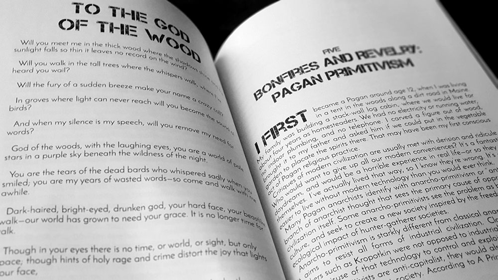
Pagan Anarchism spread

Printed by print-on-demand company Lightning Source, Pagan Anarchism runs to just under 100 pages and is perfect bound in a soft matte cover. It bears a striking collage by Ex Voto Fecit on the cover depicting Our Lady of Anarchy, and this is laid out by Li Pallas who has worked on other Gods and Radical titles. It is not clear who did the interior layout here, though, and it differs from that of other Gods and Radicals publications, which have a clear, functional look that doesn’t wow but is perfectly acceptable. Pagan Anarchism, though, seems a bit clunky.

Rather than the elegant Didot serif of the cover, the interior is all sans serif all the time. Copy is rendered in a larger-than-it-should-be serif more suited for display than body (high stroke contrast, a slanted bar in the ‘e’), with smaller-than-it-should-be leading that makes everything feel cramped and shouty; as are the pull quotes which are even bigger and even shoutier. Everything is indented, including, atypically, first paragraphs, while the first paragraphs of each chapter add drop words to this indent, each rendered in a large, all-caps, distressed stencil typeface, because, y’know, anarchy. This same Crass-esque face is used for chapter titles, sub headings and somewhat inexplicably and incongruously, for a full page excerpt from Charles Leland’s Aradia. In all, everything feels very crammed, and not even anarchic, despite the on-the-nose stencil face, while the tightly-spaced sans serif face of the body is only seditious and iconoclastic by not being conducive to reading.

Published by Gods and Radicals Press

by

Crafting the Arte of Tradition – Shani Oates

No comments yet

Categories: folk, robert cochrane, witchcraft, Tags:

Crafting the Arte of Tradition coverAfter their first forays into occult publishing with the Pillars journal, Anathema Publishing presented their first stand-alone title with Crafting the Arte of Tradition by Shani Oates. Since then, at the time of writing, they have followed this up with two books by Craig Williams, one by Anathema owner Gabriel McCaughry, and two further titles from Oates. With an expanded paperback edition of Crafting the Arte of Tradition now available from Anathema, let’s get a review of the classic hardback original from 2016. Full disclosure time, I have had pieces published by Anathema Publishing in the past, and have worked for them as a copy editor. Will this have an effect on this review? Let’s find out.
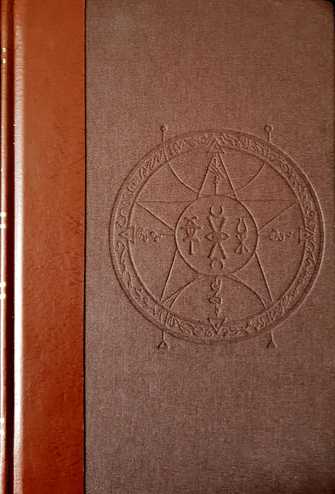
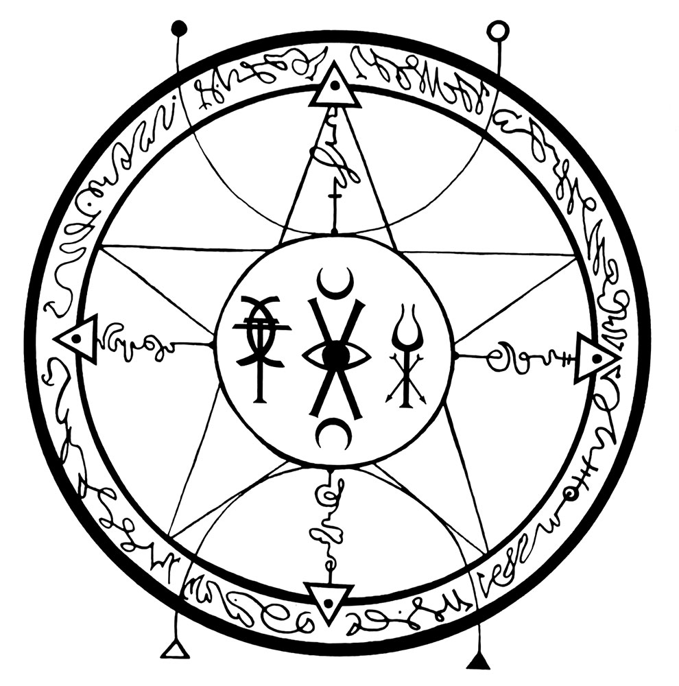
Normally the reviews here at Scriptus Recensera leave the discussion of the book’s appearance to the end, but let’s switch that up and start off by judging this book by its cover. It’s beautiful. Brown where many occult publishers go black, Crafting the Arte of Tradition has a confident appearance, with a sigil blind debossed into the cloth cover, and the title and author in gilt on the spine creating a contrast with the russet tone. Inside the cover, the beauty continues, as McCaughry displays a deft and sophisticated hand when it comes to typography, with chapter titles simply but effectively rendered in a combination of different styles and cases; though I’m not sure what I think about the use of the attractive and meaningless pilcrow (¶) in subtitles. That said, the margins are a little snug, and with the full justification of type, this creates somewhat intimidating blocks of typographic colour that fill the pages; something that appears to have been rectified in the new paperback edition.

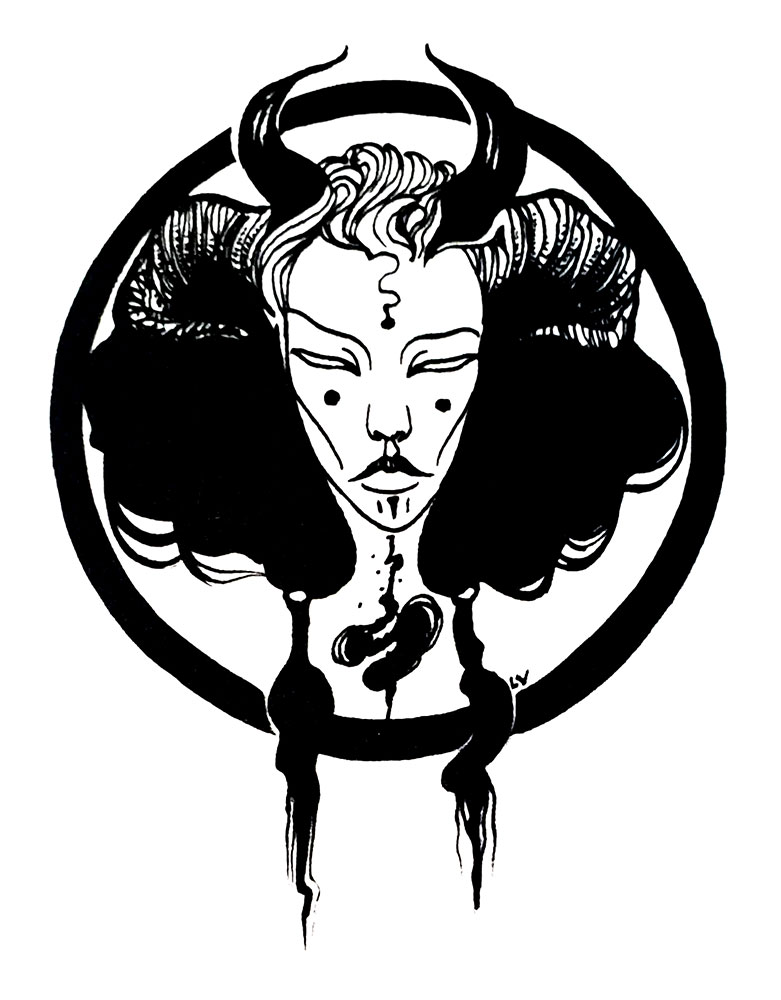
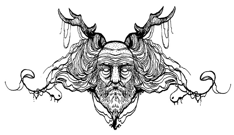
Images throughout Crafting the Arte of Tradition are used sparingly and effectively, with Luciana Lupe Vasconcelos providing starkly beautiful line drawings as both full page illustrations and as fillers and end pieces. These are unashamedly indebted to Aubrey Beardsley, but Vasconcelos makes the style her own, adding innovation rather than relying on slavish imitation. Her forms have a regal, Marjorie Cameron-style elegance, arrayed in fantastical costumes and robes, sprinkled with just the right touch of distance and distain.

Work by Luciana Lupe Vasconcelos

As for the written content, Crafting the Arte of Tradition is very much Oates to a T. She obviously loves to write, though sometimes without consideration for the reader: brevity is sacrificed on the altar of verbosity, and paragraphs run long, stretching to as much as half a page in some cases. Oates seems to have studied at the same writing school attended by Andrew Chumbley and Daniel Schulke, or at least taken a postgraduate paper there, as her writing, which has been straight forward enough in the past, is unnecessarily ornamented and tortuous.

Crafting the Arte of Tradition is arguably part of a recent trend towards a more, how you say, philosophical or analytical approach to witchcraft, instead of the tired rituals-n-recipes formula that has dominated that branch of occult publishing for over fifty years. Peter Grey’s Apocalyptic Witchcraft provided a precedent for this (though his approach is more poetic than academic), while The Witching-Other: Explorations & Meditations on the Existential Witch by Peter Hamilton-Giles is a more recent example. What that means in reality, though, can be that simple concepts are given an unnecessary veneer of complexity due to the use of repetition, and the employing of language that obfuscates, rather than reveals.

Insignia of the Clan of Tubal Cain

Despite being ostensibly an explication of the craft as viewed by Robert Cochrane’s Clan of Tubal Cain, it’s sometimes easy to forget this as for the first couple of chapters, one finds oneself lost in an Oatesian swirl, within which it can be hard to understand or determine a particular focus. This is not just because of Oates’ obtuse language, but the structure, wherein there is often no flow, and paragraphs can begin abruptly as non sequiturs, as if you dozed off a little and have been rudely jolted awake. It is not that the words are obscure or archaic, which they aren’t, but that the phrasing that ties them together is clumsy and circuitous, with tenses changing, and flow halting, overwhelmed by the attempt to sound grander, more authoritative or more arcane than is needed. Improper use of commas plays a large part here, with that little flick being often poorly and inexplicably placed, making for an even more difficult read, and for one in which the immersion for the reader is constantly being broken as you go “What? That’s not how commas work.” The most generous assessment would be to call this writing a stream of consciousness, with all its abrupt leaps and sentence fragments, but even then, a little wrangling of words would have done wonders to instil some sense of, well, sense.

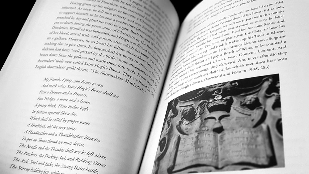
Crafting the Arte of Tradition spread

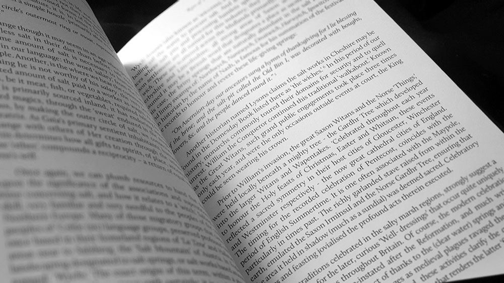
This lack of comprehensibility is compounded by sloppy proofing and referencing where stray or repeated words litter sentences, and where in some cases, sources have been cut and pasted and then not edited for accuracy. In one particularly egregious example, what is clearly an OCRed source text is quoted, but has been so inattentively dealt with that two errors introduced in the text recognition process occur in its single sentence length: ‘the’ has been scanned and left as ‘I lie,’ while a salt pit called the Old Biat is instead referred to ‘Old Bin I.’ As it is, this quote is incorrectly attributed and cited. It is not, as is unhelpfully and vaguely claimed, from “an historian by the name of Nash” but from The History of the County Palatine of Chester by J. H. Hanshall. The reference to Nash comes from the secondary source used by Oates (A Glossary: Or, Collection of Words, Phrases, Names, and Allusions to Customs, Proverbs, &c., which Have Been Thought to Require Illustration, in the Works of English Authors, Particularly Shakespeare, and His Contemporaries by Robert Nares) which quotes both Nash (that would be Dr Treadway Russell Nash, 1724 – 1811, for those keeping score at home) and Hanshall in the same section, but in relation to clearly different facts. The title of Hanshall’s work, but not Hanshall himself, is then cited by Oates as the source, despite having just claimed that this statement is by “an historian by the name of Nash… famous for his summation of the festival,” with the source and page numbering clearly just being lifted from Nares’ referencing of Hanshall. The same citing of a secondary source as if ‘twere a first occurs in the following paragraph where Oates again uses the entry from Nares’ book in quoting from “another historian named Lysons” (that would be the Reverend Daniel Lysons in his Magna Britannia: Being a Concise Topographical Account of the Several Counties of Great Britain. Containing Cambridgeshire, and the County Palatine of Chester, Volume 2 from 1810). This source is duly cited by cutting and pasting the truncated, authorless-citation format employed by Hanshall, rather than going looking for the original publication by the Reverend Lysons.

The above is highlighted in excruciating detail not to score points or to shame, but out of disappointment. When a lot of effort has gone into a book like this, as the glowing first half of this review is testament to, it is a shame when poor scholarship comes through like that in such a pellucid manner; especially when the resources are available to so easily get it right (all three books are available on Google Books and are fully searchable). When one is presenting a tradition and using historical documents to back up its themes, surely accuracy matters, especially when weak work in one area can make the reader wary of the rest. And speaking of references, for whatever reason Cochrane is referred to throughout this book with his birth name of Roy Bowers, which means that when his articles are referenced, they’re now nonsensically cited as the work of one Mr Bowers, when that isn’t the name under which they were published.

Work by Luciana Lupe Vasconcelos

It is only in later chapters of Crafting the Arte of Tradition that clear points, albeit laboured, rather than well made, can be discerned, and that’s possibly only because it’s broken up by clear subtitles that indicate the subject area. Here, Oates discusses various tools of the craft, locations of power and various other symbols from folklore, myth and legend, but there’s still an unavoidable sense of aimlessness, with no clear direction and with the various thematic locales wandered into as if by accident.

So in summary, come for the prettiness, wade through the wooliness. Crafting the Arte of Tradition is presented as a 200 page hardcover octavo with gilt lettered bonded leather spine, matching blind stamped cloth boards, metallic endpapers, colour and black and white illustrations, and appendices. It is limited to 300 copies of which 280 are bound as the standard edition; the remaining twenty comprise the Fjölkunnig special edition and are bound in full leather, instead of cloth boards. In the hand, Crafting the Arte of Tradition feels very solid with its leather binding, brown cloth and the slightly heavier than usual weight of the pages within.

Published by Anathema Publishing

by

Wortcunning – Nigel G. Pearson

No comments yet

Categories: folk, witchcraft, Tags:

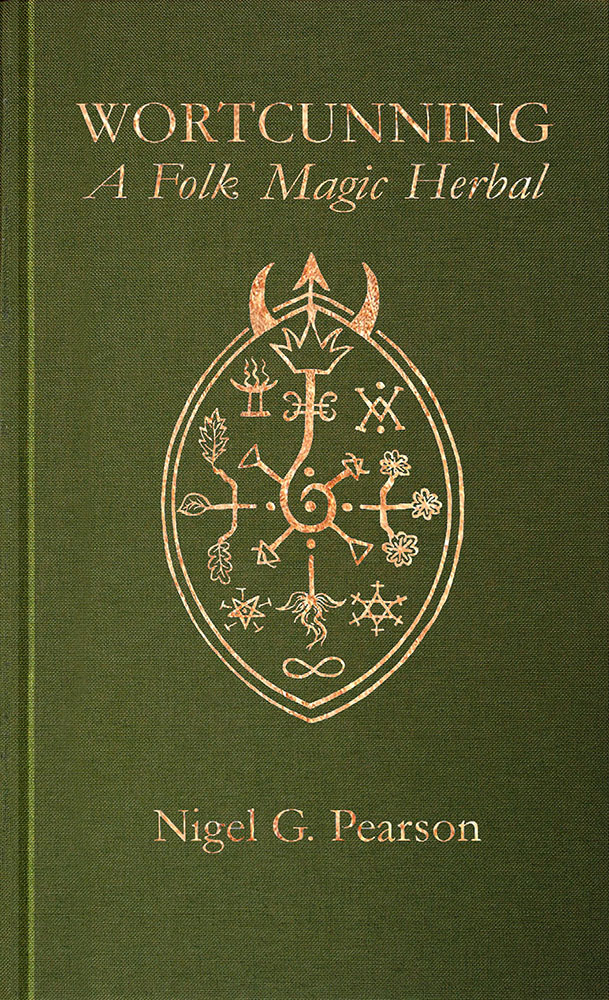
Wortcunning coverAs Nigel Pearson explains in his introduction, this compact little volume from Troy Books documents a collection of herbal lore he was given access to in the early 1980s. The accumulated knowledge of a Sussex family group of witches, the information was assembled on a set of index-cards, housed within a box, with herbs and ailments spread across them in several, presumably multigenerational, hands. The information was recorded by Pearson, and the cards returned, but it was largely forgotten for the ensuing decades until his own interests coincided with the content of the herbal.

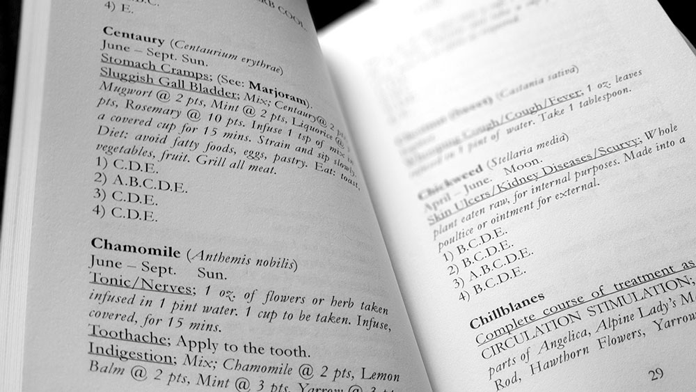
Befitting the index card format, there’s not a lot of information for each herb, with the entry usually consisting of the name, a month and/or planetary attribution, a subheading giving the ailment followed by very brief instructions on use. There’s also the use of what is described as a habitat code, a four by five grid system used to note a plant’s habitat and soil conditions. In addition to alphabetically listing the herbs, Wortcunning includes entries for various maladies, all of which provide a cross-reference to their treatment by listing the relevant plants.

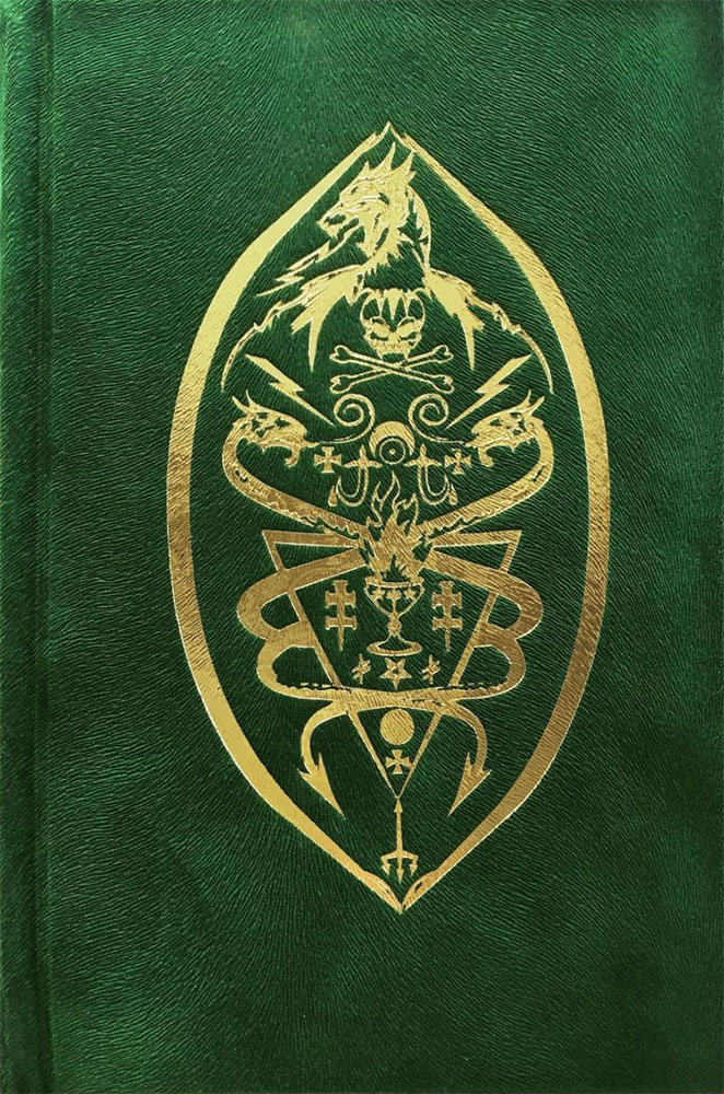
Despite the sigil-festooned device on the cover, there’s little to no magical aspects involved in these cures and their application, with most being either imbibed or topically applied with nary a trace of ceremony or orison. Perhaps the most common practice here is infusion, with multiple recipes calling for the creation of tonics and teas, while poultices occur less. Similarly, there’s no poisonous path here, and while baneful plants such as henbane, datura and hemlock are listed, their only instruction is a stern one, telling the reader not to touch them.

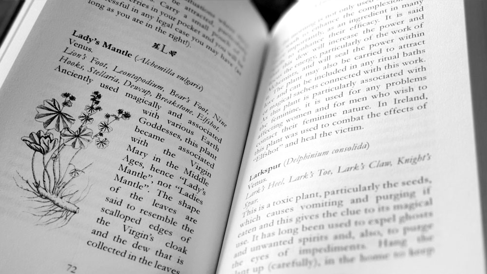
Wortcunning spread with Sussex material

There is an ugliness, atypical of Troy Books, to how this information is presented, with the symptoms rendered with hideous outmoded underlines that brutally cut across the page, while the choice of italics for instructions and dosages comes across as bitsy and messes with the overall hierarchy. This messiness is compounded by some of the formulae using the at/@ symbol, which though it is applied in its traditional sense to mean “at the rate of,” feels incongruously modern and just ugly, like you’re looking at sentences of improperly formatted email addresses. Also, the use of the habitat code means that each entry ends with an untidy string of capital letters that need to be decoded by flicking back to the legend at the start, when that information could have been more simply written in full. Obviously, this code system is included (like the use of the @ symbol, one supposes) in deference to accurately reflecting the styling of the original cards, but there’s no denying it gets on the tits off this reviewer. Speaking of tits and the getting on thereof, may we draw attention to the infuriatingly consistent improper use of semicolons, where they are used where colons should be.

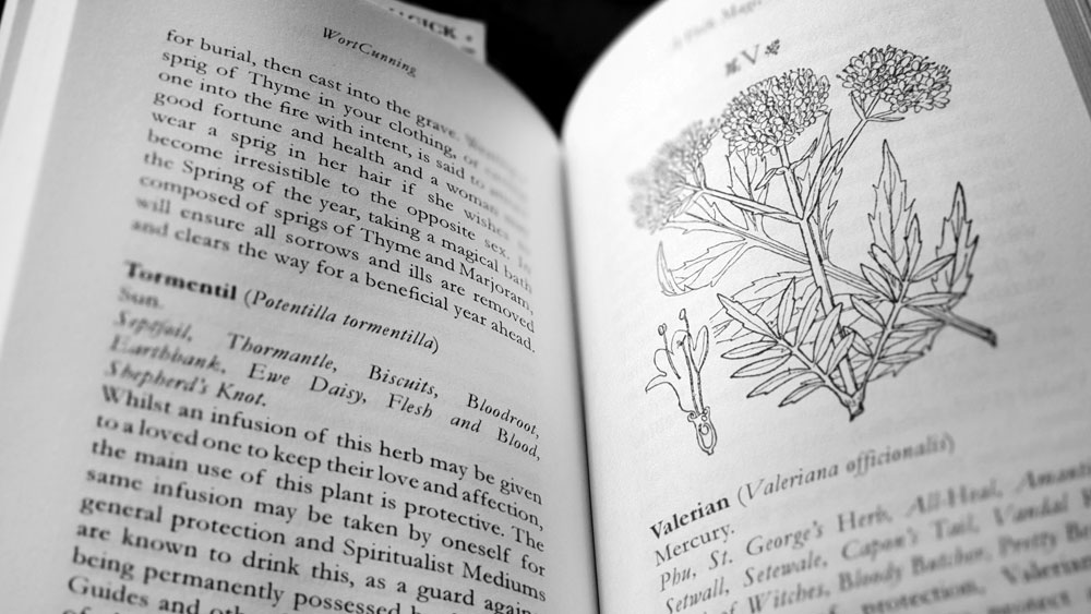
Wortcunning spread with herbal entries

Wortcunning has a lovely formatting conceit that allows it to be read either from the front or the back. While reading it one way presents the Sussex lore as recorded by Pearson, flipping it over gives the reader a slightly different book, with a thorough listing of the more traditional usages and attributes of the same herbs. This has the benefit of increasing the page count substantially, as the Sussex material only runs to a meagre 65 pages. It also, naturally, provides a lot more content, with the barebones and brevity of the first half contrasting markedly with its counterpart. Here, Pearson writes in considerable detail for each herb, adding in the magic and the history of each plant, and giving their symbolism and varieties of magical application. Although Pearson apologises in his introduction for the lack of encyclopaedic writing on each plant, the length of these entries (running from half a page to a more usual full page), suits the type of book it is and doesn’t skimp on the deets.

Unlike the barebones of the Sussex material, these entries are broken up with the occasional image of the respective plant, sometimes appearing at full or half page size but more often than not, as little thumbnails with text wrapping around them. These are clearly sourced from different locations, so there’s not a consistent style to them, with various stroke weights and degree of detail; though the overall style is, naturally, botanical illustration.

Wortcunning spread with herbal entries

The any-which-way formatting of Wortcunning is done very well, with the cover superficially duplicated at both ends, and the spine details formatted to be read either way, meaning that inevitably, and somewhat delightfully, you never know which ends you’ll be starting from when you pick it up with a casual glance. There’s always a lot of flipping involved (until you eventually notices that, oh, one cover says “A Folk Medicine Herbal” and the other “A Folk Magic Herbal”).

Wortcunning is presented in a 187 x 114mm pocket format on 193 90gsm cream paper pages, in a paperback edition, a standard hardback edition and a fine edition. The standard edition is bound in green cloth, with copper foil blocking to the cover and spine, with light black endpapers and black head and tail bands. The fine edition of 86 exemplars is hand bound in high quality, soft touch faux leather with copper foil blocking to the front and spine with marbled end papers. This is held in a fully-lined black library buckram slip-case, with copper foil blocking replicating the cover motif on front and reverse sides.

Published by Troy Books

by

Telesmata: New Images of the Sabbatic Mysterium – Daniel Schulke

No comments yet

Categories: art, sabbatic craft, witchcraft, Tags:

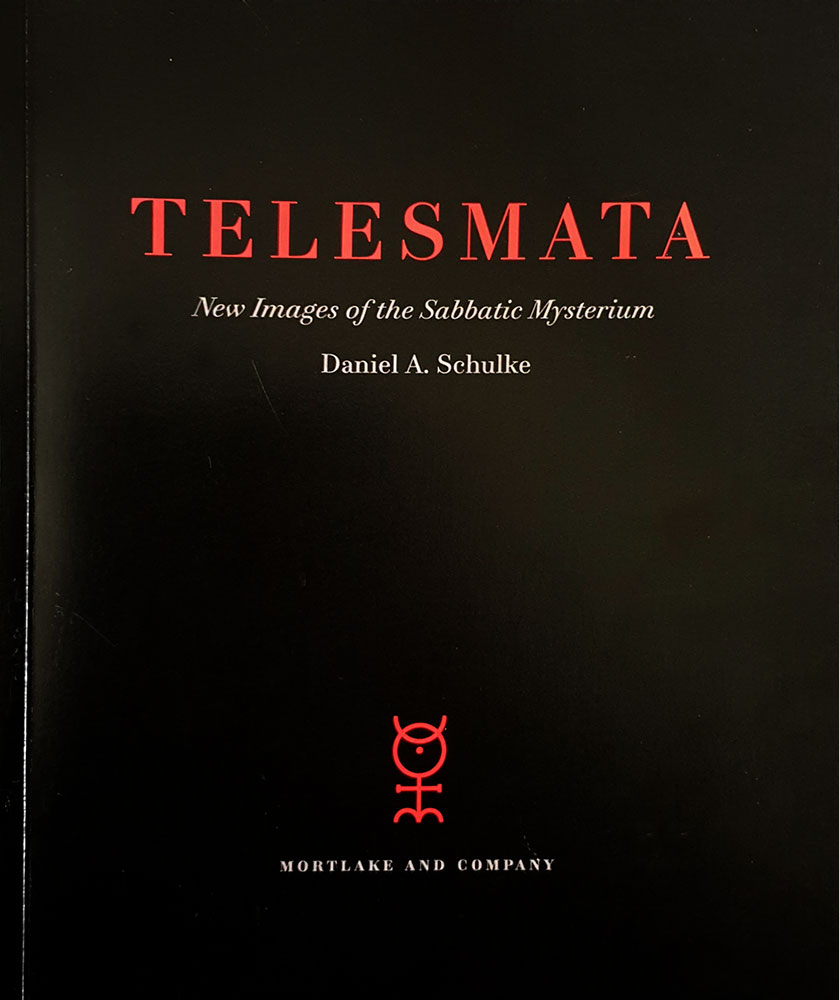
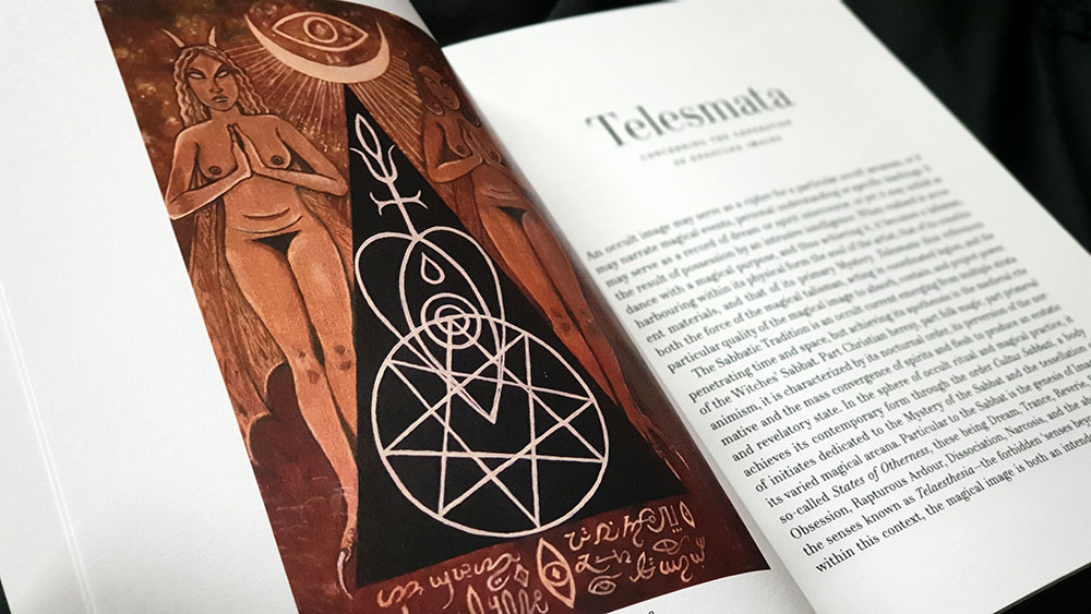
Telesmata catalogue coverHeld in November of 2018, in Mortlake and Company’s Seattle gallery space, Telesmata was an exhibition of work by Daniel Schulke, with its subject matter encapsulated in the subtitle promising new images of the Sabbatic Mysterium. The catalogue of the exhibition is presented in a 180 by 250mm, perfect bound format, with a substantial page count of 48. It should be noted that not all of the images shown in Telesmata are featured in this catalogue, but they are available in an online gallery on the Mortlake and Company website.

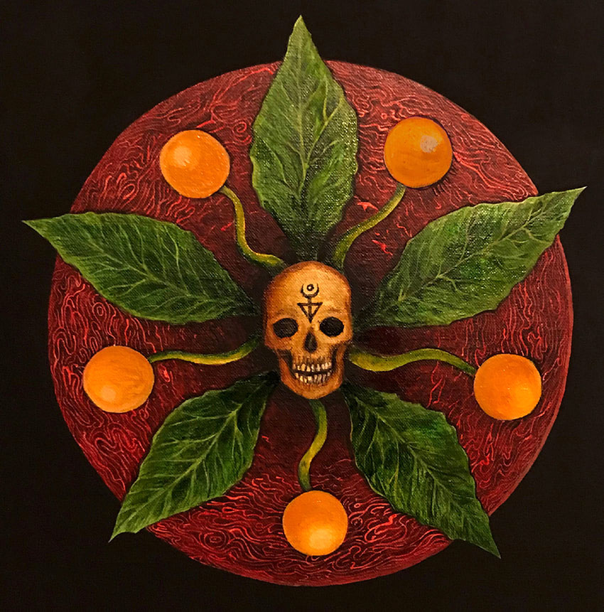
My first encounter with Schulke’s artwork was in the icon-like images of his Viridarium Umbris: The Pleasure Garden of Shadow, all high contrast black and white tones, with forms both human and arboreal featuring prominently. The most obvious continuation of this work is Daimonic Intelligence of the Mandrake, an oil on canvas work, used on the posters for the exhibition, which reprises an image found, rendered in lines of ink, in the opening pages of Viridarium Umbris. On a whole, though, that pen and ink style is absent from the work of Telesmata but there are familiarly-formed figures, and naturally, the themes remain the same.

Daniel Schulke - Daimonic Intelligence of the Mandrake

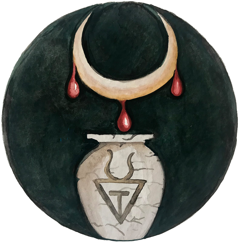
It is oils that dominate here, with only two submissions in watercolour on paper (representing female and male sacrifices to the Sabbatic Egregore Ozzhazæl respectively). The themes of most of the paintings will resonate with anyone familiar with the Sabbatic strand of witchcraft, predominantly illustrating ritual formulae: figures swirl around the field that is The Blood Acre in one, the phallic arcanum of the Stone God is illustrated in another, while Eokharnast, the first horse, appears with a corporeal, humanoid projection in a painting from 2018.

Telesmata spread

Schulke works largely with flat plains, his figures often appearing against muted or entirely black backgrounds, but when they do appear in landscapes, they recall the work of Christos Beest with their sense of hermetic numinosity, heavy with import due to their isolation within the land. His female figures in particular recall those from Viridarium Umbris, all almond eyes and perpetual nubile nudity, but now enfleshed in painterly skin.

Daniel Schulke - Female Sacrifice unto Ozzhazael

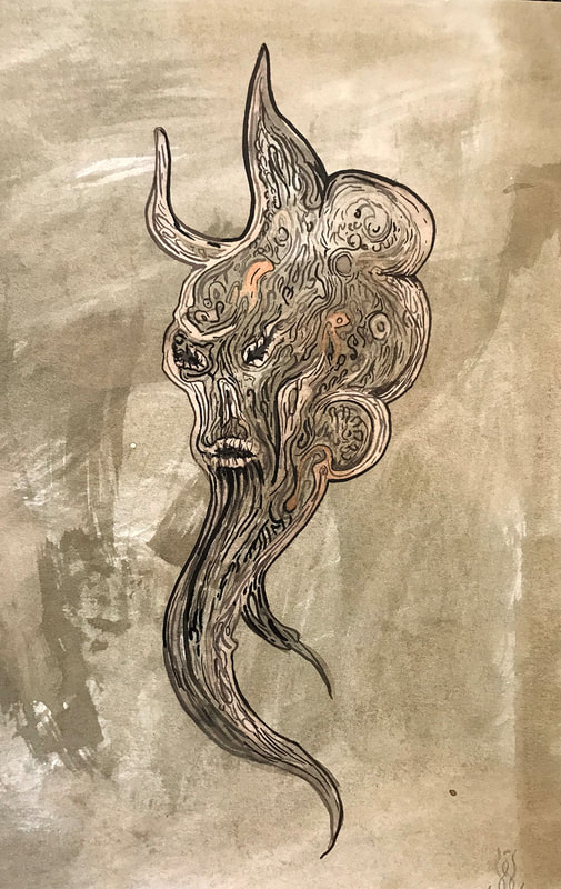
Perhaps the most striking and evocative of the images presented here are ones in which Schulke has used plant-derived materials as the sole medium (with iron as a fixative). He explains that the works are entirely experimental, coming from meditations on the source plant, thereby creating an image of the plant’s spirit. Included in the catalogue are representations of the daimons for eucalyptus, walnut, oak and unspecified tannins, with each bearing arboreal faces within twisting, phantasmagorical forms that are decorated with voluted bark-like markings.

Daniel Schulke: Ink Daimon: Tannins

As its 48 pages suggest, this catalogue takes the opportunity to do more than simply document the work, and said work is preceded by a significant introduction from Schulke, and proceeded by another brief text on materials. In his introduction, Schulke talks of the way in which painting is a fundamentally magical act, creating images that are by their very nature occult, due to the way in which layers are built one upon the other, both revealing and concealing. For him, then, a magical image is a ritual object in an immediate sense, but also one that reflects an accumulation of knowledge and experience.

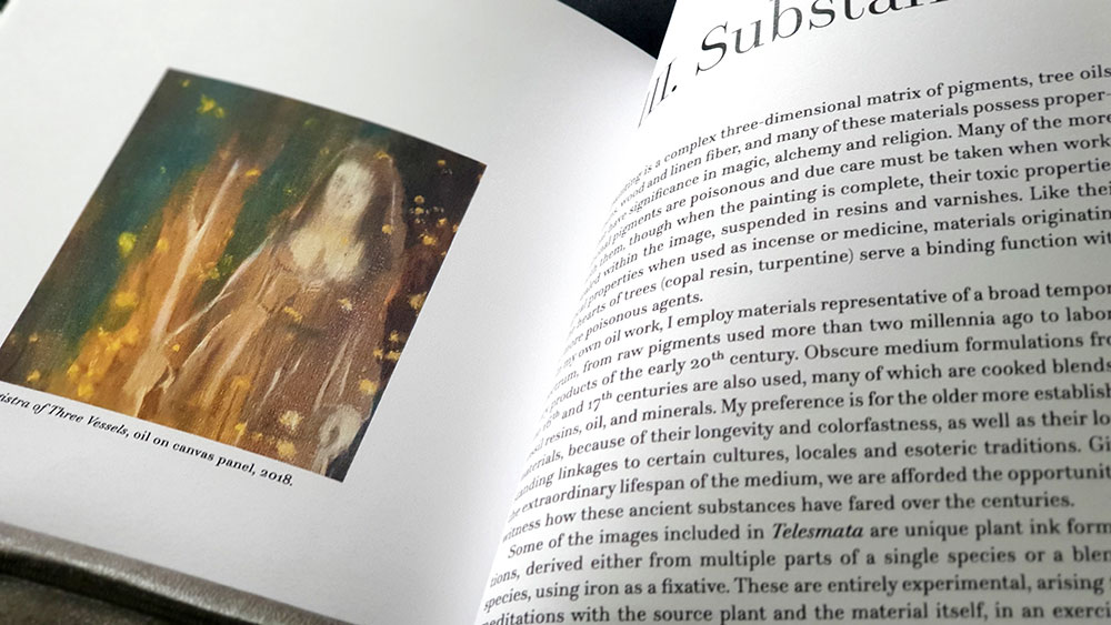
Telesmata's concluding third section, Substance

In the concluding third section, Substance,  Schulke underscores the magical process behind painting with a meditation on the way in which it alchemically blends together various ingredients, not just in the pigments, but in the material on which they are applied, creating a matrix of tree oils, resins, wood and linen fibre. He concludes this point with a brief herbal (and whatever the mineral equivalent would be), consisting of nineteen types of plants, stones and metals that can be used for painting.

Published by Three Hands Press in conjunction with Viatorium Press

by

Via Tortuosa – Daniel A. Schulke & Robert Fitzgerald

No comments yet

Categories: sabbatic craft, witchcraft, Tags:

Via Tortuosa coverReleased by Xoanon in 2018 with little fanfare (for example, other than an announcement of imminent release, there’s no presence on the publisher’s website), Via Tortuosa is an outline of Crooked Sorcery as defined by the Cultus Sabbati. While the practical side of this system can be found in at least two ritual-heavy tomes also published by Xoanon, Andrew Chumbley’s Azoëtia and his Dragon-Book of Essex, in many ways, Via Tortuosa feels like the background information and explanation that those two titles lack. While not necessarily an entry-level book by any means, having too specific and aberrant a nomenclature for one, it does give the impression of being an overview, an explication of themes that are otherwise usually taken as read.

With Schulke and Fitzgerald sharing authorship credits, it’s not clear who does what, but, being more familiar with the work of former rather than the latter, it’s fair to say that some sections have more of a Schulkian feel than others, particularly the introduction. Here, Schulke (one assumes) is in full flight, staking a claim for ownership of the Crooked Path phrase and flinging out familiar words from the Cultus Sabbati lexicon: your ‘recensions,’ ‘reifications’ and ‘modalities,’ plus some new ones. Congratulations in particular on ‘enspissation’ for which a Google search returns only two results: a bootleg PDF of Schulke’s own Veneficium, and a paper from 1988 discussing the primary culture of bovine mammary acini on a collagen matrix; though this review is probably providing a hit by the time you, dear reader, peruse it, go SEO!  Also, there’s ‘detritivores,’ which may or may not get slipped into future casual conversations; that’s going to take some applause-worthy work.

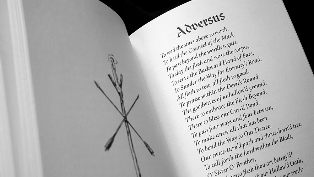
Via Tortuosa spread with second section, Adversus

Via Tortuosa is divided into three sections, with the middle of these being a single poem titled Adversus. The first section, Exegesis, consists of eight chapters outlining core principles, themes and concepts of the Crooked Path. These hit the beats one would expect to be hit, beginning with an explication of the path itself, here called the Backward Way in the chapter title, which as its twin names suggest, is defined by doctrines of inversion and transgression, with the idea of aberration being a key one from which all else follows. The sabbat itself is offered as exemplary of this, and with its evagination of Christian liturgy and ritual, is said to create a warping of usual psychic and sensorial states. It is not just the crooked manner of the path that is considered here, though, and subsequent chapters turn to more specifics, first with the idea of the Opposer, whose current intersects with the deepest strata of the Via Tortuosa, challenging those who would travel along it. The Crooked Path is also a multiplicious one, bifurcating at the liminal point that is the crossroads, becoming the Divided Way and the Path of Chance, and still further into paths of immediation, intention, creation, remedy and return, before resolving into the Crooked Circle.

Jim Dunk: title image for Exilic Wisdom chapter

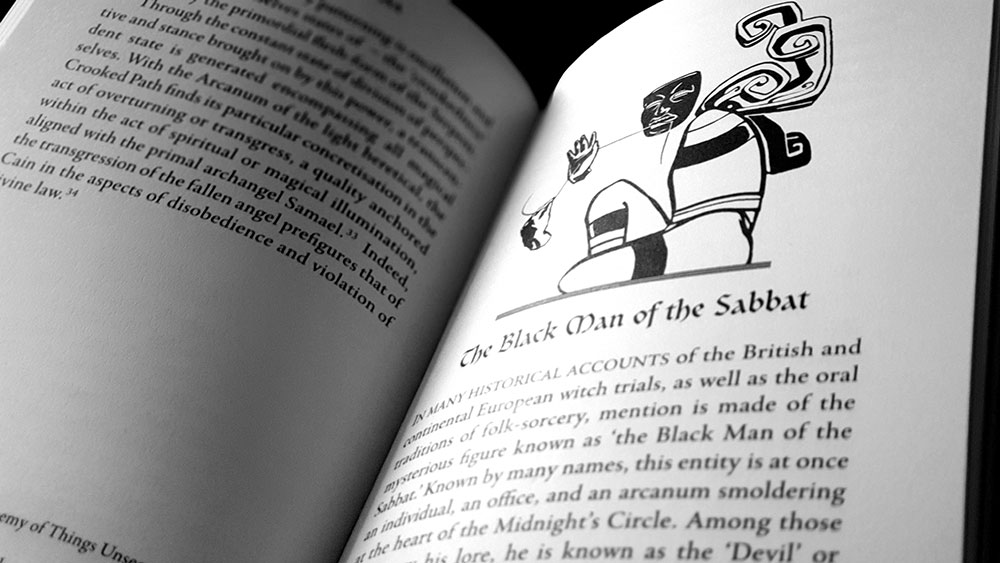
Beyond the path itself, Via Tortuosa turns its attention to core elements from the Sabbatic Tradition’s cosmology: Cain (whose journey provides much of the ritual narrative here), the serpent in the garden of Eden, and the Black Man of the Sabbat. These are followed by a survey of several key ritual approaches, acting not as a full explication with any rituals to adhere to by rote, but a discussion of various ideas, including the use of familiars, congress with spirits, and ordeals of solitude that mirror Cain’s own ostracism.

Via Tortuosa spread

With the exception of a glossary and bibliography that follow, Via Tortuosa concludes with its third part, devoting a significant part of the book, 50 pages in all, to a collection of parables. These Parables of the Exiled are brief little stories in the vein of their gospel equivalent, presenting pithy tales, pregnant with crooked meaning and import. The most enjoyable of these apologues are stories involving the original exile, Cain (which add to sabbatic mythos surrounding him), while others are set in different historical locals and in that theoretical world of yester-century that seems equally home to Beedle the Bard’s Tale of the Three Brothers and the story of Puss in Boots. There are 24 of these in total, each largely playing into that core idea of inversion and transgression with their lessons being somewhat contrary to what Jesus delivered with the form.

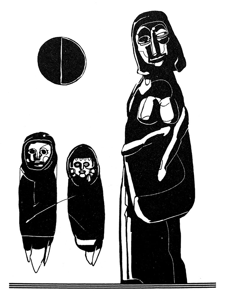
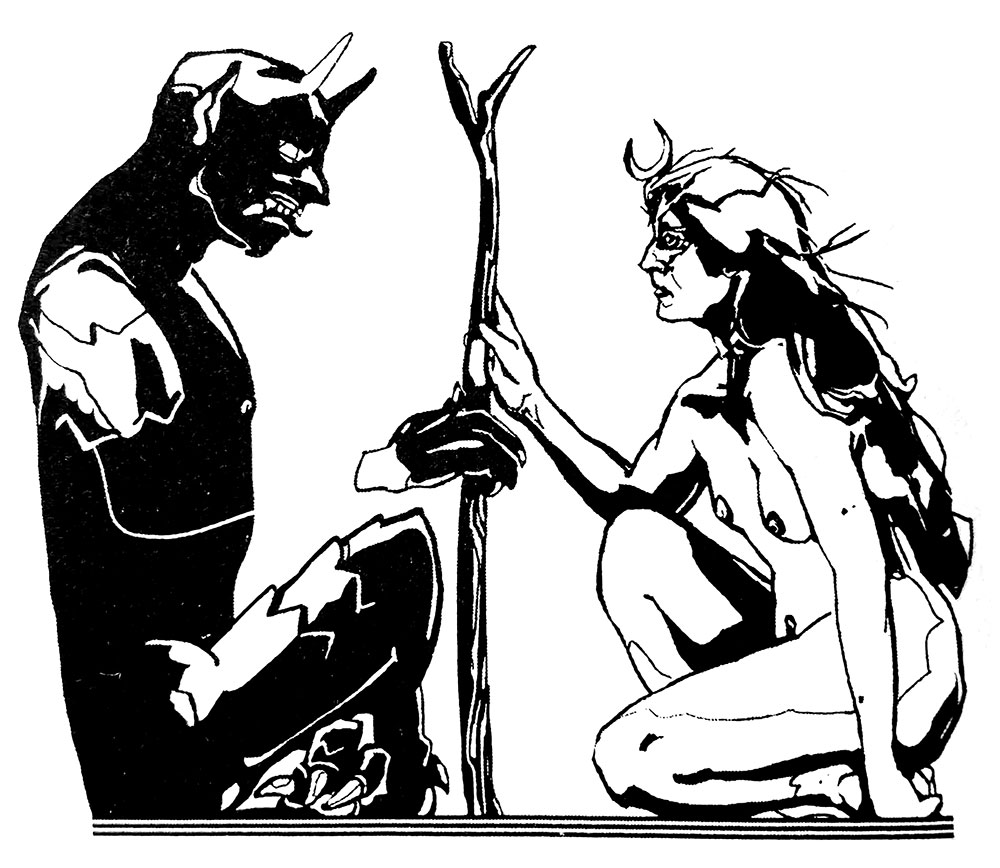
Via Tortuosa is low on in-text illustrations, and other than one crossed stang-like full page image and a similar figure on the title page, the only graphic elements are nine images that sit above each chapter title. Created by James Dunk (presumably not the same Jim Dunk that used to tell people not to drink Molson lager), these have something of a welcome, atypical style, heavy on inky contrast and hard edges. Resembling the stelae or cartouche depictions of enthroned Egyptian gods, these figures have an atavistic quality, their totemic qualities emphasised in themes of decapitation and amputation, with otherness conveyed through a lack of limbs connecting hands to torso.

Jim Dunk: title image for The Opposer chapter

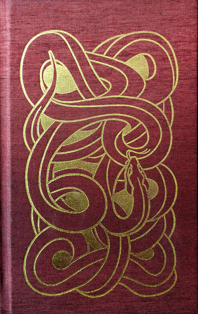
Via Tortuosa has been released with a total run of 559 copies, with 496 of these comprising the standard edition. Presented in crown octavo format, the standard edition is bound in a lovely metallic-flecked, deep red carmine cloth, with a serpentine design foiled in gold on the cover and rear, and the title and author names similarly blocked on the spine. This is wrapped in a letterpress-printed dust jacket that replicates the front and back serpent motif, slightly debossed on its heavy red card due to the printing method. The remaining 63 copies comprise a deluxe edition of 44 in quarter goatskin and slipcase, and a special edition of nineteen in full goatskin and slipcase.

Published by Xoanon

by

Sabat #3 and #4 – Edited by Elisabeth Krohn

No comments yet

Categories: art, witchcraft

Sabat #3 coverSabat is a magazine irregularly published by creative director and editor Elisabeth Krohn. We’ve chosen to review two issues because the latest is a slightly atypical, harder to parse, volume that could be summarised in one or two paragraphs, whereas the previous issue from 2017 is a weightier work worthy of its own singular review.

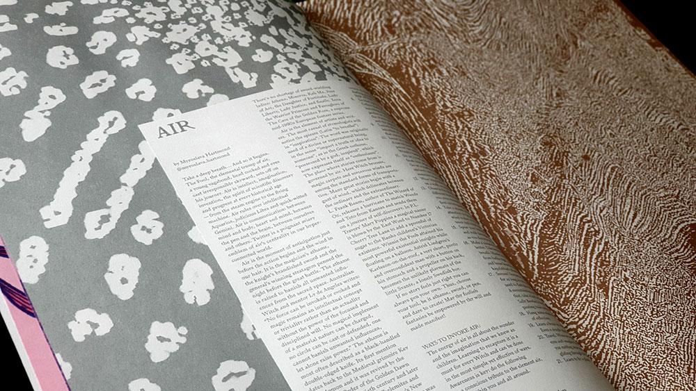
The third volume of Sabat is referred to as the crone issue, and brings a natural end to the sequence of maiden and mother showcased in the previous two issues. This theme of the crone has a variety of interpretations, due to the substantial list of contributors across its 160 pages, with thirteen writers, twenty-two photographers and twelve artists. In matters of writing, standouts include contributions from Myroslava Hartmond, Pam Grossman, Sonya Vatomsky, and Gabriela Herstik.

Hartmond gives a brief account of the 1960s radical feminist group W.I.T.C.H. (an abbreviation of Women’s International Terrorist Conspiracy from Hell, a name you can believe in) and their intersection between actual witches in a symbolic and to a lesser extent, theoretical sense; with the group’s manifesto describing witches as the “original guerrillas and resistance fighters against oppression.” Meanwhile, Grossman provides the most immediate discussion here of the crone in a broad mythological sense, identifying various figures who have appeared as crones from classical myth to Margaret Hamilton as the cinematic Wicked Witch of the West. In a delightful feint, she begins discussing Hekate (a figure not classically depicted as a crone, a popular modern pagan misconception), only to acknowledge this and suggest that this perceptual evolution of maiden to crone is as valid as anything set in the slip of myth.

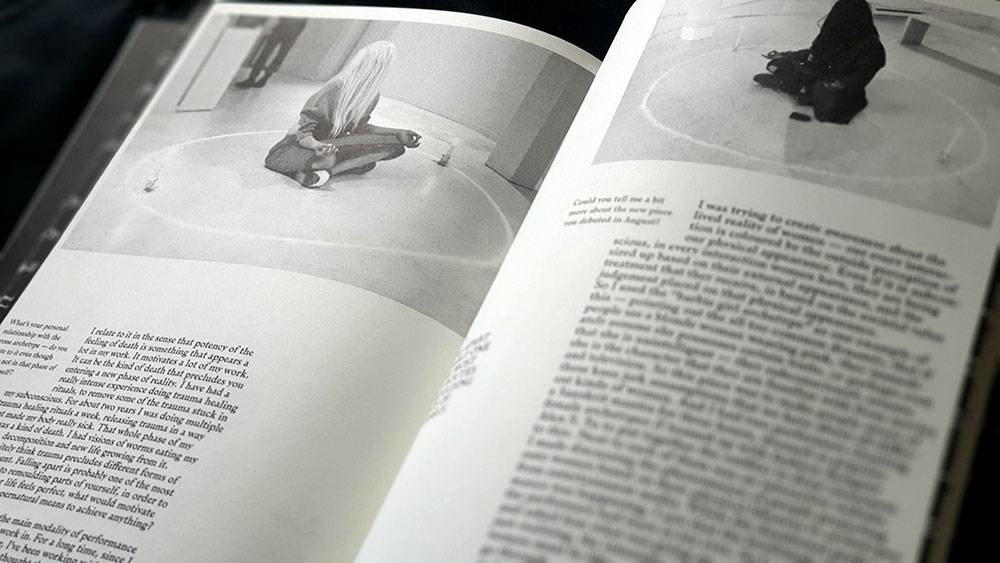
Sabat #3 spread with feature on April Graham

As a focus on one particular crone, Vatomsky decodes the Slavic figure of Baba Yaga, depicting her as a figure of great power and agency, and arguing that characteristics such as these and others have been lost in her translation into the West. For that touch of pop culture, Herstik considers the women of the Addams family (Wednesday, Morticia and the supremely crone-ish Grandmama) as expressions of the divine feminine; ably illustrated by Vanessa Reyes in two full page ink drawings.

Interviews feature heavily in Sabat #3, with almost all of them beginning with the mantra-like inquiry ‘what does the word Witch mean to you?’ These straddle that divide/intersection of praxis and performance, with some focusing on practitioners (such as queer feminist witch and anti-ageist activist Dulcamara, or Blue Mountains witch April Graham), and others on artists working in jewellery, music and performance art. Sara Gewalt is a jeweller, sculptor and photographer studying, at time of writing, at Konstfack University, who has worked with bands such as Degial and Watain, but is here interviewed with a focus on her Totem necklaces of bone-shaped ceramic. Camille Ducellier is a French multimedia artist with a strong queer and feminist focus, principally working with film and sound. At the time of interview, she was beginning to adapt her sound piece La lune noire (based on the astrological idea of Lilith as a black moon and originally broadcast by France Culture, in 2016) into a full sound installation. Miki Aurora is a Vancouver based performance artist who describes herself as an “artist, filmmaker + occultist designing workings that fuse cyberfeminist theory with chaos practice,” and who uses the modalities of ritual for performance art pieces.Sabat #3 spread with interview with performance artist Miki Aurora

While Norway-born, London-based editor and founder Krohn provides creative direction and clearly has a singular vision, the art direction and its execution falls to designer Cleber Rafael de Campos; half a world away in Brazil for the first two issues, but back in London for the third. It is easy to see why the third issue of Sabat was awarded a silver placing at the 2018 European Design Awards, with its 164 pages that look very, how you say, designery. It’s also very witchy, but not always in the most conventional sense. No rustic gentleness here, no wispy filigree, but also, it must be said, no grim sabbatic tropes, no goats and stangs and other signifiers of Traditional Witchcraft with the capital T and the capital W.

What does dominate, though, is female imagery, with the female form appearing in a variety of situations, some more witchy than others, but always well executed. While there are some male photographers amongst the contributors here, there feels a distinct lack of the male gaze across the imagery. It is the photography that creates some of the most impact here, whether it’s the portraits of featured artists and practitioners, or the little fashion spreads and photographic essays that often seem unannounced and unexplained, and as such, are just effortlessly cool. It’s these that help Sabat feel different, giving it its import and focus, and makes it live up to the association with the #WitchesofInstagram hashtag.

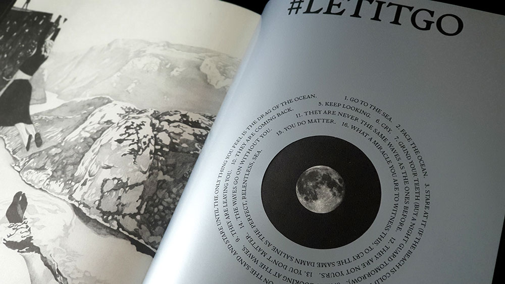
Sabat #3 spread with #letitgo feature

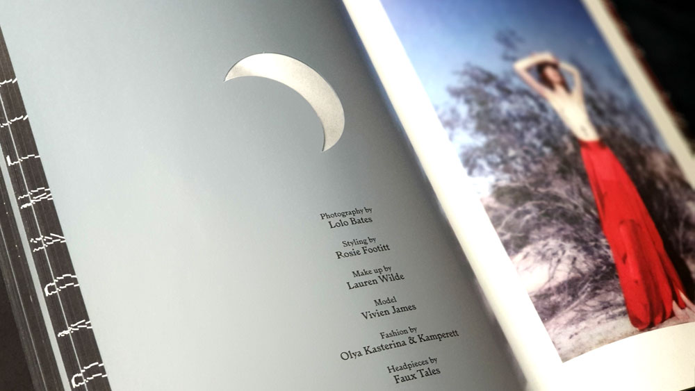
Campos has an equally bold and contemporary design style, employing some core layout elements throughout Sabat but also changing things up with format-disrupting injections where necessary. Printed for the most part on a dull matte stock that gives everything just the right touch of gravitas and muted cool, this is broken up with glossy silver title pages featuring die-cut crescents and discs that provide windows backwards and forwards to other pages as the moon moves through its phases, punching holes through the text of the titles. This lunar sojourn reaches its culmination with a full moon, where graphic designer Dario Gracceva takes the typographic reins around the theme of #letitgo for several pages. In another case, the same silver pages are left without a lunar die cut, but images from the surrounding photo essay are lightly printed on them, appearing ghostly and making the page itself seem almost translucent. Elsewhere, subtle embossing (or debossing, depending on what side of the leaf you’re looking from) of text over images can be almost missed, but once discovered, enhance the tactile experience of Sabat.

Sabat #3 spread with photoshoot of Vivien James by Lolo Bates

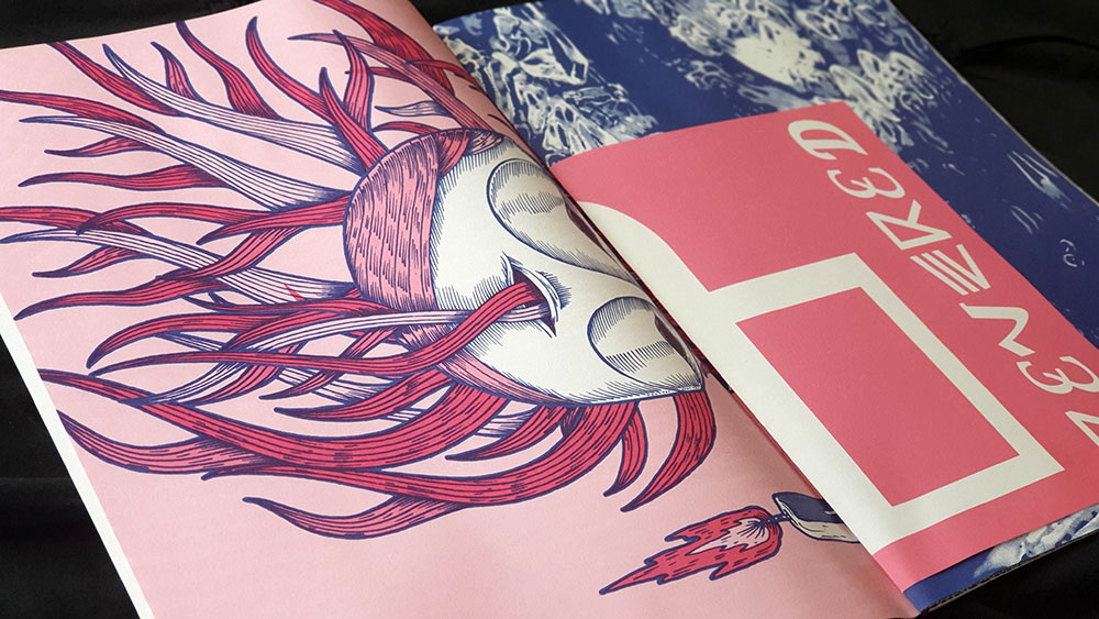
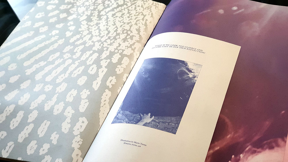
With the trilogy of maiden, mother and crone completing with the third issue, the fourth volume of Sabat takes as its theme the elements and uses this as an opportunity to try a significantly different approach to its predecessors. Rather than the dense, perfect bound format of the previous issues, Sabat #4 consists of five large format posters and an unbound booklet of six A3 sheets folded to A4. The posters vary in size from A2 to a folded A1, with the styles feeling more like a work from a design annual, rather than anything overtly witchy. These are presented folded and held together by a string, with the individual A3 leaves of the booklet interspersed throughout.

Sabat #4 spread with large scale poster and unbound booklet leaf

The written content for Sabat #4 takes the form of five one page meditations on each of the elements, delivered by Myroslava Hartmond, Pam Grossman, Sonya Vatomsky, Kristian J. Solle and Sabina Stent; some of whose names will be familiar from previous issues. Given the format, the list of artists for this issue is equally short, and features Nikolai Diekmann, Anne Sophie Ryo, Anniinna Anna Amanda, Elisa Seitzinger, Maria Torres and Ossian Melin.

Sabat #4 spread with large scale poster and unbound booklet leaf

Maybe it shows a lack of imagination on my part, but I’m not sure what to do with it all. Do I disassemble it and try to find wall space to Blu Tack them to amongst a myriad of bookcases? Or, having at least read the written content, do I leave it as a somewhat unsatisfyingly unexplored, hard-to-store art portfolio, with, no matter where it ends up, the corners getting increasingly bent and worn; as is already beginning to happen. At the risk of sounding uncharacteristically plebeian, I just don’t get it, and when both issues cost the same price, I find myself happier holding something with the certainty of 160 beautifully designed, perfect bound pages.

Sabat #4 spread with large scale poster and unbound booklet leaf

Published by Sabat Magazine

by

Of the Witches’ Pact with the Devil – Francesco Maria Guazzo

No comments yet

Categories: sabbatic craft, witchcraft, Tags:

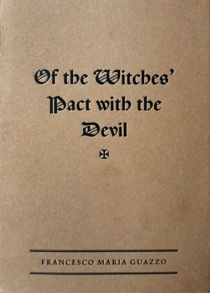
Of the Witches’ Pact with the Devil coverIn October of 2017, Three Hands Press in association with Mortlake and Company, presented Witch-Ikon, an exhibition featuring what was described as “contemporary imagery of witchcraft emergent from the occult, esoteric and fine art milieus,” with work by Marzena Ablewska-Lech, Tom Allen, Claudia Avila, Francisco D, Dolorosa de la Cruz, Rik Garrett, David Herrerias, Timo Ketola, Rory MacLean, Roberto Migliussi, Johnny Decker Miller, Liv Rainey-Smith, K Lenore Siner and Benjamin A. Vierling. In addition to a 48-page, full colour exhibition catalogue (not to mention a similarly-named publications of essays and art that is still forthcoming), Three Hands Press released this little volume and made it available at the gallery.

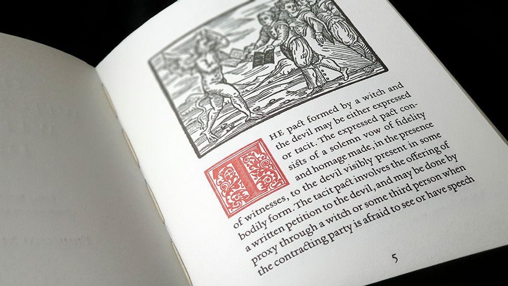
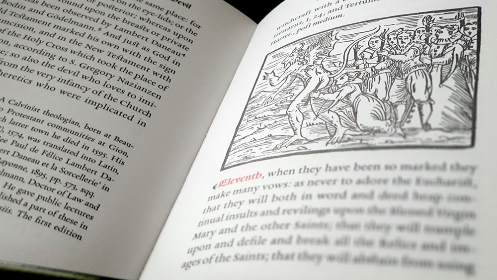
Of the Witches’ Pact with the Devil is an excerpt from the Montague Summers-directed translation of Francesco Maria Guazzo’s 17th century witch hunter’s manual Compendium Maleficarum; said here to be the seventh chapter of Book 1, but in all other versions consulted it was listed as Chapter VI. Whether it’s the sixth chapter or the seventh, as it titles suggests, this excerpt deals with one of those key moments of the sabbatic narrative, making it ripe with imagery, and one for which that imagery was given very real form with the accompanying legendary woodcuts that have graced the covers of a thousand black metal demo tapes.

Of the Witches’ Pact with the Devil chapter

Guazzo describes the pact between the witch and the devil as either expressed or tacit, with the former performed in the presence of the devil, and the latter as a written petition that may be submitted by a proxy if the supplicant is afraid to speak directly to their new master. Common to both forms are certain matters that Guazzo arranges under eleven headings, beginning with an initial denial of the Christian faith to facilitate the removal of the chrism and the rubbing off the mark of baptism, and ending with an oath to never accept the Eucharist, to destroy all other church relics and to proselytise for the devil.

Designed by Daniel A. Schulke with execution of type by Joseph Uccello, Of the Witches’ Pact with the Devil is printed in two-colour letterpress by Dependable Letterpress, giving the book some lovely tactile and olfactory qualities, with its subtle debossing of the body copy (still more pronounced in the titles, subtitles and images) and the whiff of inks. Uccello renders the body in a serif face that’s hard to pin down but has the right mix of readability and a hint of the archaic, while the page headers are in a lovely blackletter-style variant of the Espinosa Nova face. This rotunda style is also seen on the cover and is used for the in-body numbering of the stages of the witches’ pact, which are further offset from their companions by being printed in red. Proving, its versatility, the one drop cap in the copy uses an illuminated style of Espinosa Nova, while the crosses that dot the book as decorative ends are drawn from its glyph set. Five of the original woodcuts from Compendium Maleficarum are used as illustrations, including the infamous image of the osculum infame.

Of the Witches’ Pact with the Devil spread

Of the Witches’ Pact with the Devil is presented without comment (save for the original footnotes of the Summers translation), so it feels more like a curio or replica than a contemporary reification of praxis. This is something confirmed by the unique production, and its attention to detail. Unfortunately, the content has not been privy to the same eye, and it is an imperfect transcription, featuring a smattering of errata, with transposed letters, and missing or wrong words. It’s not rampant, but there’s enough of it for it to become noticeable and set you off looking for more.

French flap from Of the Witches’ Pact with the Devil

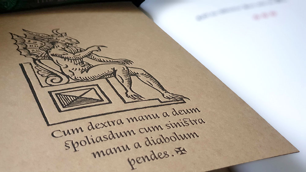
Of the Witches’ Pact with the Devil was made available in a softcover edition of 400 hand-numbered and hand-sewn copies, and a hardcover edition of 40 now sold out copies. Handbound by Klaus-Ullrich Rötzscher of Pettingell Bookbindery, the softcover is bound with a letterpress cover printed on brown card with French flaps, while the hardcover is in a full gilt leather cover with handmade endpapers. The French flaps of the softcover version featuring an image of the devil enthroned, extracted from one of the unused woodcuts, mirrored to face inwards on their respective flap, with a different Latin phrase beneath it; all with the same letterpress debossing of the cover and back elements.

Published by Three Hands Press

by

The Moribund Portal – Richard Gavin

No comments yet

Categories: folk, germanic, tantra, witchcraft, Tags:

The Moribund Portal coverBearing the impressively arcane subtitle “Spectral Resonance and the Numen of the Gallows,” Richard Gavin’s The Moribund Portal is a meditation on the symbolism of the gallows, and its place in folklore, spiritism and occult philosophy. From the opening paragraph, The Moribund Portal reads like what you would expect from a Three Hands Press title, and certainly moreso than another recent release. This involves, if we dare coin the phrase, a Schulkian type of sentence structure, gloriously beginning the proceedings with “Sites of archaic tragedy, iniquity, or turmoil can server the living as stations of unique spirit function.” Yes, indeed.

Running to just 90 or so pages and undivided by chapters, save for a clearly defined epilogue, or even subheadings, The Moribund Portal feels more like an extended essay than a true book. It is, indeed, what the title says, a portal that is formed by the image of the gallows, but which uses this morbid focus as a means of moribund egress to explore a variety of related themes. Untethered by the structure and clear signposts provided by subheadings, there’s a feeling of the thematic focus swinging, like a gibbet hanging from a gallows tree, as topics move from one to the other. Thus, the occupant of the gallows proves an apt leaping off point, if you’ll pardon the allusion, leading to discussions of the hand of glory, mandrake, dreams, while touching variously on Cain, Germanic mysticism, tantra, and perhaps most intriguingly, given its uniqueness, Canadian folklore. Gavin uses two examples from the latter as rather significant talking points: a tale of an enigmatic hanging from York (now Toronto) and the Québécois folk legend of la Corriveau.

Despite its length, The Moribund Portal is not necessarily a brisk read, due to Gavin’s style of writing. He writes with a considered, grandiloquent and formal delivery, but does so expertly, without falling into the traps that lesser authors do when ambition outstrips ability. Instead, Gavin’s presents a masterclass in how to write 21st century occult style, combining academic phrasing, sophisticated occult terminology (your ‘numens’ and ‘sodalities’ but alas, no ‘praxis’) and just the right sprinklings of archaism. Never overdoing any of these elements, and thereby disappearing into black holes of meaningless, it’s all tied together with perfect punctuation. Writing in such a deliberate way is often, I find, its own form of proofing, as the careful concatenation of words requires constant revision. For this reason, or not, there’s little to complain about here with spelling and punctuation, especially compared to other recently reviewed titles; with only one noticeable spelling mistake really jumping out. The result is a read that feels sophisticated and knowledgeable, rather than someone trying their damnedest to sound erudite or attempting to use a lexicon not naturally their own (you know, most occult authors).

The Moribund Portal spread

The Moribund Portal features a stunning image by Benjamin A. Vierling as the cover, while the typesetting is by Joseph Uccello, both Three Hands Press stalwarts. Like the portal of the title which is reflected in the framing design on the cover, The Moribund Portal is an atypical 9.5 x 6 x 1.5 inches, with its narrow dimensions making it fit easily in one hand when closed. This smaller width does make the binding a little tight, especially given its sub-100 page length, so it’s one of those volume where a little more effort than usual is needed to turn the pages and hold them open, leading to fatigue and the occasional shaking of hands to dissipate the ache.

Three Hands Press have released The Moribund Portal in three editions: as a softcover trade paperback limited to 1,700 copies; a limited hardcover bound in gilt tyrian purple, of 500 hand-numbered copies; and as a deluxe hardcover edition of 22 hand-numbered copies in full purple Nigerian goat with marbled endpapers and slipcase

Published by Three Hands Press.

by

The Wicked Shall Decay – A. D. Mercer

No comments yet

Categories: folk, witchcraft

The Wicked Shall Decay coverThis is the second book by A. D. Mercer to be reviewed here at Scriptus Recensera, and he marks himself as a bit of the old polymath with this title, bearing little relation to the Enochian milieu of the past review, or the as yet unread survey of Armanen runes. Bearing the subtitle “Charms, Spells & Witchcraft of Old Britain,” it also has the faux archaic and comma-addled sub-subtitle “A gathering of historical enchantments against Foul Spirits & Maledictions. Compil’d, & with an introduction by A. D. Mercer.”

In said introduction, Mercer mentions the black books of Scandinavia that contain folk magic cures and charms, and laments the lack of extant British equivalents; despite there being tantalising titles for such lost tomes like The Devil’s Plantation and The Red Book of Appin. The Wicked Shall Decay seeks to rectify this by bringing together the kind of spells, charms and incantations that might have been in such a book, drawing on a variety of publications on British folklore from the nineteenth and twentieth century.

The spells and charms are grouped together into broad categories such as the healing of wounds, protection and defence, and dealing variously with witches, the devil and ghosts. In addition to simple spoken charms and formulas of sympathetic magic, there are some examples of sigil and magic square work that draws from the grimoire tradition. Each entry is preceded by a title (with inconsistent capitalisation and punctuation) and each ends, by way of reference, with a bracketed three letter code indicating the source text, and a number pointing to, one hopes, the particular page on which it appears. There are some 36 publications in the bibliography, making for a wide pool of resources to draw from; though some feature more heavily than others. Mercer points out that he avoided Reginald Scot’s The Discoverie of Witchcraft or direct trial records, finding the former too obvious, while in the latter, he argues, any spells or charms may have just been made up by prosecutors for the charge sheet.

When it comes to longer sections in his own words, the problems with Mercer’s writing, noted in the review of his Liber Coronzom, recur, and are cruelly abetted with insufficient proofing by Three Hands Press. He writes in a cumbersome, extended manner, producing sentences that run on, losing their tense in the breathless length. The writing is flabby and tautological, redundancies abound, and words are reused within sentences when a synonym would be tidier. Proofing is so careless that George Ewart Evans, for example, can be called Evans and Even in the same paragraph; with an improper use of a possessive apostrophe too for good measure.

Given this, the reader may be filled with a little dread when Mercer says in his introduction that while he has, for the most part, retained the spelling and grammar of entries for the sake of authenticity, in some he has modernised them to aid understanding. Perversely, this attempt at aiding understanding sometimes seems to replace the original writers’ proper placement of commas with Mercer’s misunderstanding of punctuation, in which he infuriatingly uses them to mark the beginning of interrupting words and expressions, but not the end. Due to the prevalence of persistently poor punctuation, the reader finds themselves on guard for other errors in the transcription, and these crop up more often than they should, with words missing from sentences, whole phrases introduced that weren’t in the original, and formatting errors like accidental paragraph returns or individual lines that are combined into one without adjusting the sentence case. Without a thorough review of all entries it would be disingenuous to say that this sort of thing is true of all the content, but the cross-referencing of just a few examples throws up problems. One finds oneself descending down rabbit holes of fact checking, when one little thing looks wrong, only to find that yes, this has been transcribed wrong, yes, that little bit of Latin didn’t ring true because they’ve lazily mistaken an ‘e’ for a ‘c,’ and yes, that author’s name was Oliver Madox Hueffer, not Olivier Maddox Hueffer.

The same is true of general accuracy in citation. In at least one case, the three letter reference code points to a publication that is not given that or any code in the bibliography (possibly because Mercer subsequently assigned separate codes to the book’s two volumes and didn’t update the body), while in another, the spell bears a code for a book that, despite having those three letters, doesn’t appear in the bibliography at all. Then there’s at least one instance in which the example doesn’t appear in the referenced publication, neither on the cited page or, it would seem, on any of its pages (and just for fun, ‘may’ is misspelt ‘many’ in this entry too), while in others, the reference is there, but on a different page; 87 instead of 67, for example. Finding some references in their sources can create even more consternation, such as several that are referenced from Oliver Madox Hueffer’s The Book of Witches. Here, Madox Hueffer is actually quoting Johann Weyer and in neither Madox Hueffer’s book, or in Weyer’s original is there any indication that what is being recorded is a charm from Britain; nor does Reginald Scot referencing Weyer in his The Discoverie of Witchcraft make them any more British.

The Wicked Shall Decay spread with poorly vectored witches

The 168 pages of The Wicked Shall Decay are printed in a two colour offset on heavy stock, with titles, subtitles, dropcaps and dividers in a lovely muted red and the body in black. It is illustrated throughout with what the promotional blurb generously describes as 31 woodcut illustrations. Some of the images may have begun life as woodcuts but most if not all have been automatically vectorised in a programme like Adobe Illustrator and the source material in many cases obviously wasn’t high enough quality to warrant it. Some are particularly bad and have no place being in print, such as a the above derivation of Two Witches Cooking up a Storm (the titlepage from Ulrich Molitor’s 1489 De Lamiis et Pythonicis Mulieribus) which is here rendered almost into abstract oblivion, the faces and bodies of the witches disintegrating into clumsy, laughable facets. And then there’s something which one assumes is a tree on page 92, or the brittle, piecemeal Rod of Asclepius on page 147, or two equally bad traces of an Abracadabra hexagram, which could have been effortlessly recreated from scratch by anyone worth their salt. As it is, there’s little case for using many of these images as their selection and placement is often arbitrary; and even in a case where it’s kind of apropos, why the Eye of Providence in a section on the Evil Eye? Also, the style, depending on the quality and provenance of the source image, varies widely, with weight and quality of trace inconsistent throughout.

The Wicked Shall Decay spread with appalling tree, or something

The Wicked Shall Decay is interesting as what is effectively a reference list. It provides a glimpse of a variety of spells and charms, but given the sloppy transcription and referencing you would never want to trust it without going back to the source. If nothing else, The Wicked Shall Decay gave this reviewer the opportunity to spend perhaps far too many hours looking through the very texts from which it draws.

The Wicked Shall Decay is available in three editions with a trade paperback, a standard hardcover in carmine cloth with two-colour embossed wraps, and a deluxe edition of 44 copies in full earthen full goatskin, with marbled endpapers and slipcase, bound by The Key Printing and Binding of Oakland.

Published by Three Hands Press.

1 2 3 4 5 6 7