Categotry Archives: art

by

Source Magic: The Origins of Art, Science & Culture – Carl Abrahamsson

No comments yet

Categories: art, magick, Tags:

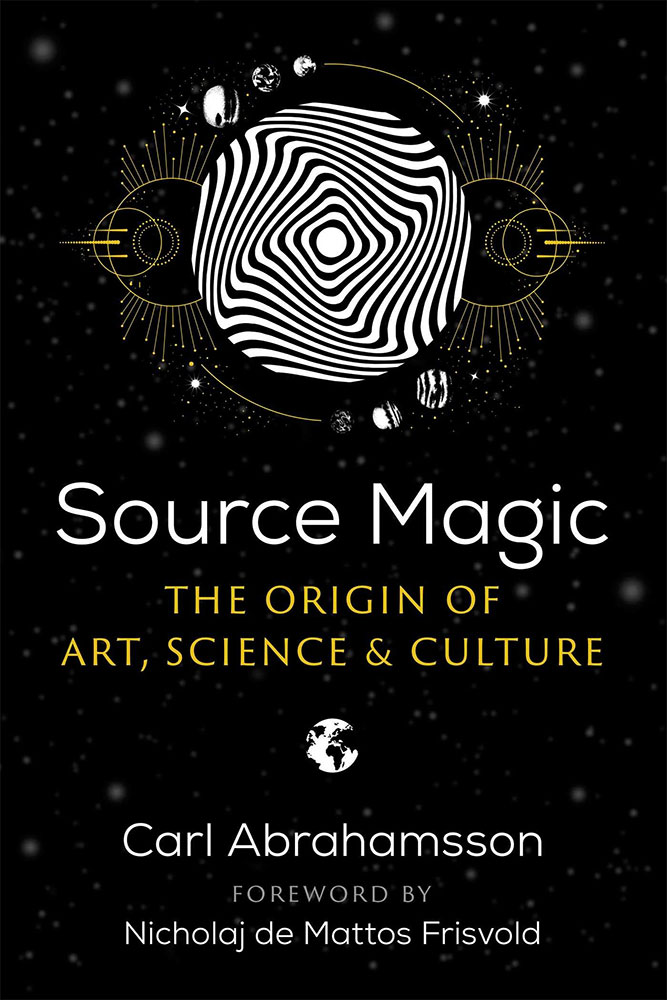
Source Magic coverCarl Abrahamsson’s Source Magic marks his third appearance for Inner Tradition, having debuted in 2018 with Occulture, a work which considered the intersection of the occult with art and culture, and then releasing a biography of Anton LaVey in 2022. This new title follows in the footsteps of Occulture by being released by Park Street Press, a lesser known Inner Traditions imprint which focusses on psychology, consciousness studies, and psychedelics. And like Occulture, this is a work concerned with the way in which magic has infused human history and culture, being, as Abrahamsson terms it, a node around which all human activities revolve. This premise is very much in Abrahamsson’s wheelhouse, allowing him to do what he often does and focus on particular, often recherché, little pockets of occulture that can then be expertly and enthusiastically contextualised within a greater whole. The point of difference, as Nicholaj de Mattos Friswold notes in a foreword, is an experiential one, with Abrahamsson zeroing in on various places or moments he has been personally involved with; experiences that he describes as being “malleable nodes of wide-eyed amazement” whose reception creates a constant influx of magical stimuli.

As part of this focus on the personal, Abrahamsson’s modus operandi is about discovering the magical and numinous within the everyday, of cultivating an accretion of significant experiences, be they editing, as he does, the journal The Fenris Wolf, a rather more exotic expedition to Tibet, or something seemingly more mundane, such as finding significance in a trashy Mondo film. As a result, Source Magic explores a variety of small yet vital fragments from within this holistic magical worldview, with each providing an opportunity for greater explorations of adjacent ideas. This fragmented nature also denotes the process behind this book, with many of the chapters having been previously published in magazines and journals, or presented as lectures.

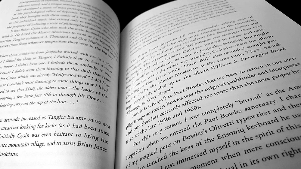
It is journeys that fittingly begin this collection, setting off with two entries that use as their equally fitting narrative, that most magical type of journey, the pilgrimage. In the opening We’re On the Road to Somewhere, the pilgrimage is one effectively to Ernst Jünger, with Abrahamsson detailing a trip through Tyrol from Wien to Upper Swabia, arriving at the Jünger-Haus in Wilflingen, before ending the journey in Zurich. The second pilgrimage is to Morocco, focussing heavily on the Master Musicians of Joujouka, who provide an interesting nexus betwixt Abrahamsson and related occultural touchstone such as Brian Jones, Genesis Breyer P-Orridge, Brion Gysin and the Beats. The essay’s title Panic Pilgrimage underscores a particular interest in the caprine trickster figure of Bou Jeloud, who is credited with teaching the Master Musicians their music, and who was assumed by Gysin to be a local variant of goat-footed Pan. In both of these entries, Abrahamsson writes with an enthusiasm that lifts the narrative far beyond mere travelogue, never missing a moment to muse on some great magical truth, or to inject a little humour, such as when he self-deprecatingly describes himself doing a “slightly hesitant, Swedish old guy dance” to the swirling, transportive music in Joujouka. In the first pilgrimage he is able to wax about the beauty of the land, buildings and the Schwarzwald, and then equally turn that enthusiasm and delight to Jünger, writing ecstatically of being mesmerised by the experience within the Jünger-Haus.

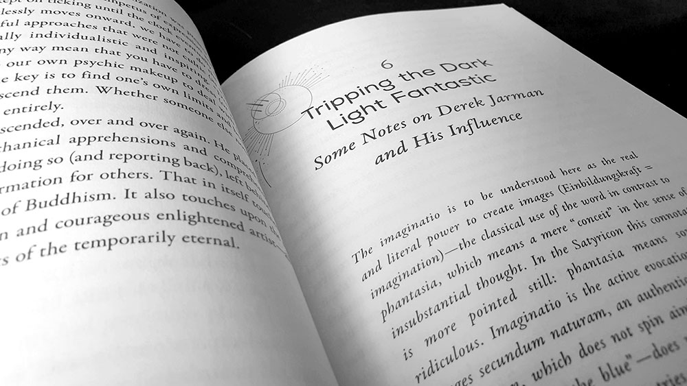
Like the twin pilgrimages that opened Source Magic, the next three entries are very much of a kind, sharing similarities and connections by being portraits of two significant occulture figures: Derek Jarman and his occasional collaborator Genesis Breyer P-Orridge. Gen receives two pieces, one originally written for The Brooklyn Rail arts journal, while the other is the introduction from Genesis P-Orridge: Temporarily Eternal: Photographs 1986-2018, a book of photos of he/r, taken and published by Abrahamsson. Both pieces bear witness to Abrahamsson’s three decade association with Gen, and given that both were written after he/r death, there’s something of a eulogistic, sometimes near hagiographic, tone. The first piece feels like a brief obituary at eight pages, appearing amongst a slew of other eulogies for Gen in The Brooklyn Rail a month following h/er death. It paints a personal picture of Gen and covers off major moments of h/er life, before ending with a prickly suggestion, judiciously not included in The Brooklyn Rail version, that anyone that might criticise or find fault with Gen is just a hanger-on who wouldn’t have had a career without them. The second entry tells a longer tale, documenting more fully Abrahamsson’s thirty year association with Gen, and commendably not feeling at all like a repeat of its shorter predecessor. Genesis then bleeds he/r way into the next chapter, Tripping the Dark Light Fantastic, a discussion of cinema that has as its foundation a meditation on Derek Jarman’s 1981 short film In the Shadow of the Sun, for which Throbbing Gristle provided the soundtrack.

Source Magic spread

The moving image once again features in a paean to the Mondo shockumentary films that Abrahamsson so adores, and then in a consideration of Patrick McGoohan’s classic television series The Prisoner. The latter doesn’t just lionise the series but places it within the context of its time, with the growth of psychedelic counterculture and its innate opposition to systems of control. Ambrahamsson ties this unruly spirit back to antecedents in New Thought movements, seeing The Prisoner as a Thelemic myth, or a Gurdjieffean wake-up-call.

There is a carefully considered sensibility to how the entries in Source Magic have been curated and sequenced here, with the earlier grouping of pilgrimages and the nexus of Jarman/Genesis finding a latter mirror in various pieces on Ezra Pound and Austin Osman Spare. The first focuses entirely on Pound, largely through his relationship with his long-suffering publisher James Laughlin, who had founded the New Directions publishing house on Pound’s advice. In the second, Abrahamsson compares Pound and Spare, delivering on the punning promise of the title, Spare Me a Pound, and highlighting some of the similarities between both men. Of particular note is their mutual use of ideogrammatic methods to achieve clarity in communication: Pound in his incorporation of Chinese characters (most notably in The Cantos), and Spare in his use of sigils and the alphabet of desire.

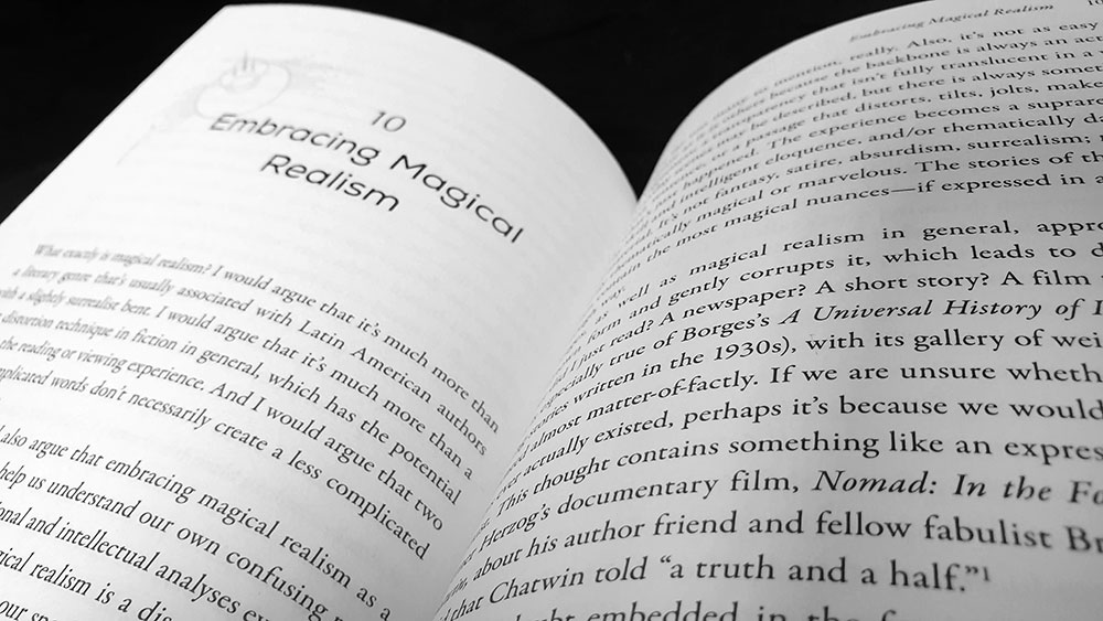
Some of the entries that make up Source Magic feel less concerned with specific artists or works, and instead focus more on philosophical or metaphysical concepts, with the artist and genres simply providing the essay’s foundation, a leaping-off point. A discussion of magical realism, for example, nominally namechecks familiar authors of the genre, most notably Jorge Luis Borges, but quickly pivots to a consideration of magical realism in, well, reality. Here, Abrahamsson notes how the modern online-informed life of the 21st century is often suffused with what is fundamentally magic as meme, mirroring the type of memetic magic templated by the occult groups such as the Illuminates of Thanateros and TOPY. In another, an opening mention of Abrahamsson’s occult journal The Fenris Wolf provides a gateway to a general discussion of the actual Fenrir of Norse cosmology.

Source Magic spread

Source Magic concludes with a reprint of an interview with Abrahamsson, conducted by Iris and Matthew Samways for the Canadian record label Flesh Prison, who released his cassette album Reseduction in 2021. It is an interesting but hardly essential read, running to five pages like an unexpected appendix.

In all, this is an interesting collection of essays, with, arguably, something for everyone, though conversely, not everything will be for everyone, with, in the case of this reviewer, the more metaphysical and psychological speculation having less impact than those grounded in a particular artistic practice. Source Magic is presented in a fairly no-frills manner, with text design and layout by Kenleigh Manseau, who uses Garamond as a body face and the understated Nexa as the display for chapter titles (with the equally restrained Trajan Sans as chapter numbers). This austerity is continued in the graphical side of things, with the book containing zero illustrations, something of a surprise considering how many of Abrahamsson’s themes concern the visual arts.

Published by Park Street Press
by

Echoes of Valhalla – Jon Karl Helgason

No comments yet

Categories: art, germanic

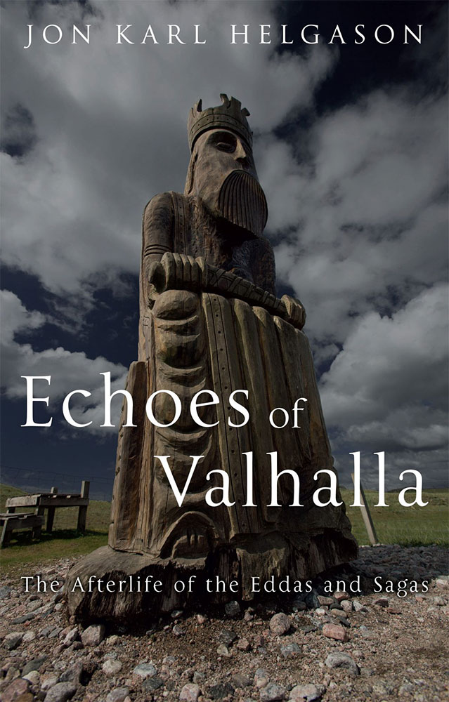
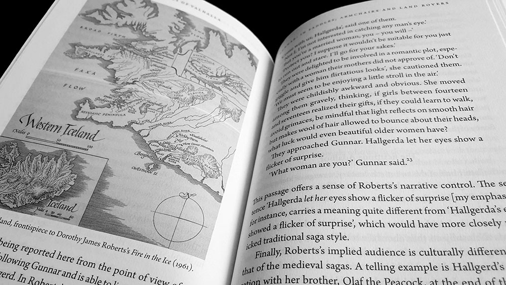
Echoes of Valhalla coverSubtitled The Afterlife of the Eddas and Sagas, Jon Karl Helgason’s Echoes of Valhalla has the dubious distinction of being the first book to be reviewed at Scriptus Recensera in which the opening paragraph references the dire and perpetually unfunny 1990s sitcom Friends. Helgason uses the show’s passing reference to a peripheral character who is nicknamed Gandalf as an example of how something with roots 1000 years ago could so suffuse popular culture that it now exists independently of its origins. In this instance, the name Gandalf can be traced back to the list of dwarf names found in the Old Norse poem Völuspá, where it sits alongside the names of twelve of the thirteen dwarves that join Gandalf and Bilbo Baggins on their adventure in J.R.R. Tolkien’s The Hobbit. Whether it is from reading Tolkien’s works, seeing the film adaptions of Ralph Bakshi or Peter Jackson, or even encountering the characters in the Lego video game versions of both The Hobbit and The Lord of the Rings, most people, even those versed in skaldic poetry and the Eddas, will inevitably think of some incarnation of Gandalf the wizard when encountering that name, rather than one of several primordial dwarves. This is exemplary of what Helgason finds fascinating, that texts written centuries ago in the isolated rural areas of his native Iceland have become part of “our (almost) universal cultural memory” and have seen reproduction in comics, plays, travelogues, music and film.

Given this evident fascination, what is presented here is not a pedantic discussion of how pop culture interpretations of Norse mythology differ from the source material. Instead, Helgason views these modern retellings as a continuation of a metafictional tendency in the treatment of Norse myth that dates back to at least Snorra Edda in which Snorri Sturluson’s retelling of the story of Óðinn’s theft of the mead of poetry allows us to read fiction about the origin of fiction, and its constant ingestion. Just as Óðinn ingests the mead of poetry, so, Helgason argues, Snorri and other post-conversion poets used an inventive ‘digestion’ of earlier texts to create mnemonic devices to better understand both the past and the art of poetry itself.

Echoes of Valhalla spread

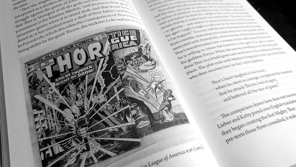
The first focus of this digestion is Þórr who finds his most obvious, though by no means only, comic representation in Marvel’s Mighty Thor, “the most exciting superhero of all time” as the cover of his debut in Journey into Mystery #83 injudiciously proclaims with two exclamation marks. Helgason shows how from the outset, this Thor had little reliance on his mythic predecessor, with a far great influence being found in similar figures in previous comics, all of which follow a familiar pattern. Indeed, the ur-text for Stan Lee, Larry Lieber and Jack Kirby were not the Eddas or skaldic poetry, but rather the very comics in which they were immersed, with a number of precedents for the idea of the Norse thunder god transplanted into the modern world, including some in which a human awakens, or becomes the embodiment of Þórr. Kirby had a hand in several of these, including a story in #75 of DC’s Adventure Comics (in which the villain Fairy Tales Fenton masquerades as a magical hammer-wielding Þórr to rob banks), and an issue of Tales of the Unexpected from 1957 in which a gold-digger discovers Þórr’s hammer and considers robbing banks with it, before its owner turns up and claims it back.

Echoes of Valhalla spread

In the second chapter, Helgason takes a significant chronological leap backwards and returns to Snorri’s own treatment of this topos, considering in-depth the ambiguity surrounding his role as author. Helgason mentions how Snorri is rarely physically credited as the author on many of the works he came to be associated with, and highlights his role as a compiler, and therefore as someone who is but one link, albeit a significant one, in a chain that extends from the uncredited skalds to modern comic book writers (a class also historically subjected to working anonymous and receiving insufficient credit).

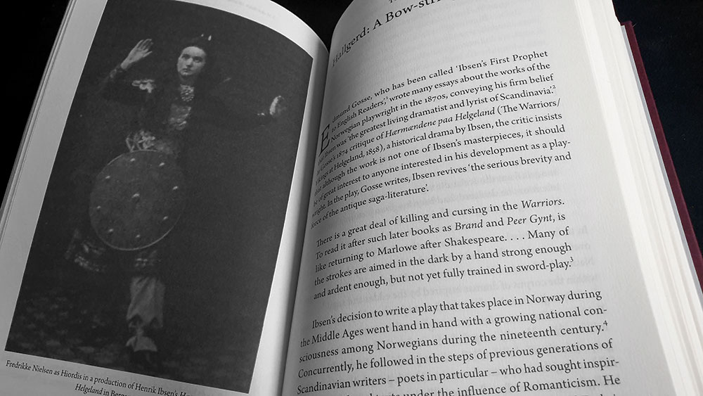
Focus then turns to the stage, beginning with a consideration of Henrik Ibsen’s 1857 play Hærmændene paa Helgeland, set during the post-conversion time of Erik Blood-axe, with Helgason noting the through-line between its heroine Hjørdis and another of Ibsen’s characters, the titular Hedda Gabler, whom he would immortalise decades later in 1890. In slightly less detail, Helgason also looks at the relevant works of Gordon Bottomley (The Riding to Lithend) and Thit Jensen (Nial den Vise), before moving on to the fourth chapter with its discussion of travel writers, in which their explorations of Iceland more often than not went hand in hand with a fascination with the sagas, their characters and locations.

Echoes of Valhalla spread

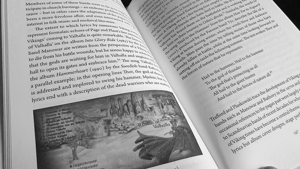
With the fifth chapter and its consideration of music, Helgason begins with references to Led Zeppelin, attempting to position them as a link between two diverse musical examples of the afterlife of the eddas: Norse-inspired classical music as typified by Richard Wagner’s Ring Cycle, and contemporary Viking metal. Helgason centres this discussion on the motif of Valhalla, showing how the perhaps overstated idea of a glorious death and equally glorious afterlife has held a particular and enduring attraction for musicians, often becoming shorthand for conceptions of Norse mythology in its entirety. Unfortunately, just as such an idea limits the complexity of myth, so applying that model to analysing an art form simplifies its assessment and as a result, this is a relatively brief survey of Viking metal. There’s no real noting of the history, no mention of offshoots like the Norse ritual music of Wardruna and their imitators, and only a few bands are mentioned by name, with one of these being a little known power metal band from Mexico, Mighty Thor, whose outsize presence is cemented by them being the only band represented here in photos, twice (one a frankly ridiculous promo photo and the other a tiny, practically pointless album sleeve). While a comprehensive history of the genre isn’t to be expected, the level of detail seems slight when compared to how the previous chapters have addressed their respective subject matter, and there is much more than could have been worth discussing in a deeper dive.

Echoes of Valhalla spread

Finally, Helgason turns to cinema, once again beginning with a quirky reference, in this instance to the Monty Python-aligned film Erik the Viking, before taking a deep dive into Viking-themed films, the most notable of which went with the stunningly imaginative title The Vikings. There’s Roy William Neill’s so-named silent film from 1928, and Richard Fleischer’s sword-n-sandals-era The Vikings from 1958. Although the latter could be said to paint an implausible image of Norse Vikings, Helgason returns to his central premise, wryly noting that the same could be equally true of the sagas and eddas themselves.

In all, this is an enjoyable read, with Helgason having an amiable style and clear narrative voice. Not all sections will necessarily appeal to everyone, with, for exampl, drama and travelogues being somewhat obviously of little interest to this reviewer with her scant summary thereof. Echoes of Valhalla runs to 240 pages and is bound in red with grey endpapers, all wrapped in a nice glossy dust jacket.

Published by Reaktion Books

by

Minóy – Edited by Joseph Nechvatal

No comments yet

Categories: art, music, Tags:

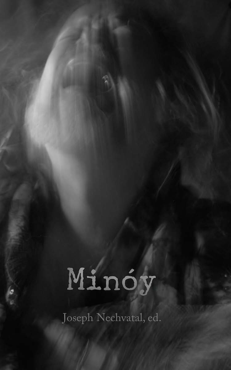
Minóy cover (image by Maya Eidolon)Published in 2014 by the Punctum Books imprint Dead Letter Office (home to “work that either has gone “nowhere” or will likely go nowhere”), this is a suitably appropriate paean to prolific sound artist and noise musician Stanley Keith Bowsza, better known as Minóy. A significant figure in the mail art and noise scene of the 1980s, Minóy produced over a hundred works before abandoning music in the early 1990s. Following his death in 2010, the collection of Minóy master tapes was entrusted to musician, past collaborator and long-time fan PBK (Phillip B. Klingler) who now curates the reissuing of these releases via Bandcamp.

Being a Dead Letter Office release, Minóy is not a long work and is comprised of essays almost entirely by editor Joseph Nechvatal, with the exception of one by Amber Sabri. Sabri’s piece is a prelude, in turn, to the visual component of Minóy, featuring a selection of images she took of Bowsza in the 2000s. This creates an interesting contrast, as Nechvatal’s writing is frequently dense and academic, while Sabri’s memoir is, by its nature, more personal and informal, and her images provide the only visual evidence within of the book’s subject.

Nechvatal kicks things off with the gloriously verbose title that is The Saturated Superimposed Agency of Minóy, which provides a thorough biography of Minóy and his work, before descending into considerably more philosophical territory. He draws attention to the echoes of La Monte Young in Minóy’s use of length as a compositional technique, arguing that the extended length allows deep subjective perceptions of the present moment to come to consciousness, thereby offering “a sonically ontological vision of the world as superimposition, one that shows us in place inside of a saturated world.” This idea of noise in general and Minóy’s in particular as a queer-like force that acts in resistance to conformity and mundanity, is one that permeates Nechvatal’s writing here. He doesn’t employ the lexicon of queer theory, though, using instead his own language of hypernoise theory, often referring to the ability of Minóy’s music to create an interplay of the human and the nonhuman.

Nechvatal concludes The Saturated Superimposed Agency of Minóy with an addendum in which he provides reviews of a mere eight of Minóy’s works, culled from a variety of sources and writers, principally Sound Choice but also Lowlife and Option magazines. For those unfamiliar with Minóy’s output, these give a sense of the soundworlds he was creating, and more importantly, how they were perceived by his contemporaries.

Image from Minóy as Haint as King Lear by Maya Eidolon

In Whatever Happened to the Man Named Minóy? Sabri writes a memoir of the man she knew, not as Minóy but as My Life as A Haint. By becoming a haint, a term used in the vernacular of the southern United States to refer to a ghost, apparition or lost soul, Bowsza drew a line under the Minóy that had obsessively created music for a decade and instead, now largely bed-ridden with physical and mental illness, turned to digital art as a form of expression. There’s something in the use of the word haint that evokes Mishima’s description of slipping through life as a ghost, sitting on the outside and divorced from convention. This is evidenced in Bowsza’s work as both Minóy and as Haint, and his personal life, in which he was divorced from confines both societal and temporal, with persistent agoraphobia and a tendency to sleep little and work long (sometimes staying awake for days on end in manic marathons of creativity).

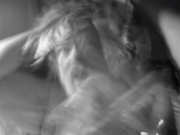
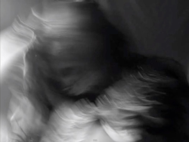
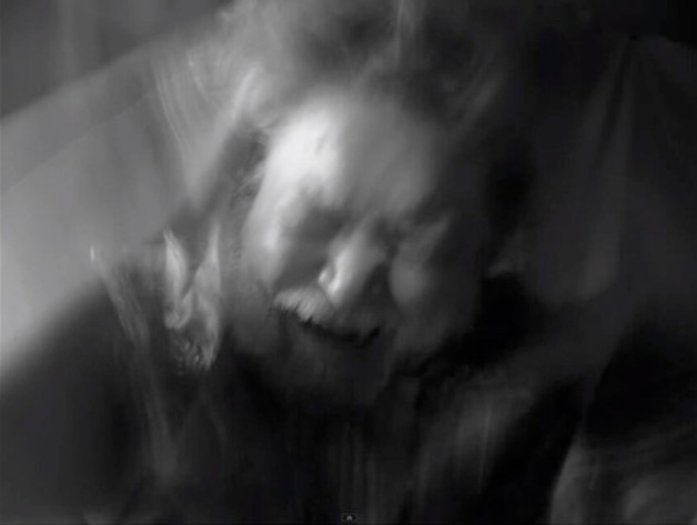
Sabri’s photo essay, credited to her glorious pseudonym Maya Eidolon and created in collaboration with Bowsza and his partner Stuart Hass, is tortuously called Minóy as Haint as King Lear and shows Minóy/Haint as Shakespeare’s titular character in 60 black and white images, presented two to a page. Framed horizontally and largely with only head and shoulders showing, the images convey a sense of psychotic ferocity, with Bowsza moving in and out of great washes of long-shutter speed blur, abstracting into clouds of movement until briefly emerging again, as if from water, with recognisable, anguished features. While the images convey in strict representational terms of sign and signifier what one would expect the whirl psychosis to look like given form, there are other questions here, concerned primarily with identity and its loss. Sabri’s title conveys this with its cast of three characters, and within these images the trinity of Minóy, Haint and Lear all appear to be asking Lear’s own question: “Does any here know me? This is not Lear. Does Lear walk thus? Speak thus? Where are his eyes? Either his notion weakens, or his discernings are lethargied – Sleeping or waking? Ha! Sure ’tis not so! Who is it that can tell me who I am?” Nechvatal’s response to Sabri’s images makes similar observations, arguing that rather than seeing Bowsza’s performance for the camera as “a descent into the thick eerie nonhuman,” it is instead an illustration of “a very specific way of living mad in the intensified flow of superimposed becoming” before tying the ferocity of the images back to the musical leitmotifs of Minóy: “we can almost hear in these images his Lear-like scream into an unbounded white noise.”

Image from Minóy as Haint as King Lear by Maya Eidolon

As befits Minóy’s elongated musical forms, Nechvatal continues his own musing on Minóy with an addendum, The Obscurity of Minóy, which, it transpires, is but the first of several afterwords. Like the never-ending ending to the cinematic incarnation of Return of the King, this continues with the amusingly-acknowledged After After Words of The Aesthetics of an Obscure Monster Sacré and the After After After Words of Hyper Noise Aesthetics. Indeed, these after (after after) words from Nechvatal take up more space than his main contribution, allowing him to take flight with his philosophical notions of noise.

Now we must turn to the de rigueur justification for reviewing a book on a noise musician on a site ostensibly concerned with occult titles. While there is little in Minóy’s themes, both musical and titular, that suggest the magickal or the mystical, it is the response to this music that offers almost inevitably an interpretation arcane and anagogic. PBK’s documented enthusiasm for Minóy’s work after first hearing it has something of the religious and ecstatic about it, memorialised here with his description of it as “dream-like, nightmare-like, but also sometimes spiritual.” Similarly, Nechvatal’s use of philosophical and theoretical models inevitably leads to language that is redolent of the exploration of the unconscious and the internal, of intersections betwixt the mundane and the mystical. Like PBK’s description of Minóy’s music as both nightmarish and spiritual, Nechvatal frequently invokes the figure of the monstre sacré, using it a description of Minóy himself, and often of noise music in general.

Image from Minóy as Haint as King Lear by Maya Eidolon

If there is a voice that’s missed here it’s that of PBK, whose recently adopted role of Minóy archivist and legacy documenter has made him a significant player in the current revival of interest in his oeuvre. While PBK is heard here and there, variously quoted and paraphrased in Nechvatal’s pieces, there is nothing of whole cloth by him here, which seems a shame.

A similarly-titled album was released to coincide with the Minóy book, featuring nine compositions from between 1985 and 1993. Drawn from recently discovered archival material, the selection was made by Nechvatal, in collaboration with PBK, with the latter remastering the tracks. Given the long-form nature of much of Minóy’s work, PBK and Nechvatal had the difficult task of finding complete works that were varied enough and short enough to fits on a single CD and still be representative of his music. The CD version of Minóy is still available at time of writing but a fittingly limited edition cassette run is sold out.

Published by Dead Letter Office/Punctum Books

by

Minerva Britanna – Henry Peacham

No comments yet

Categories: alchemy, art, esotericism

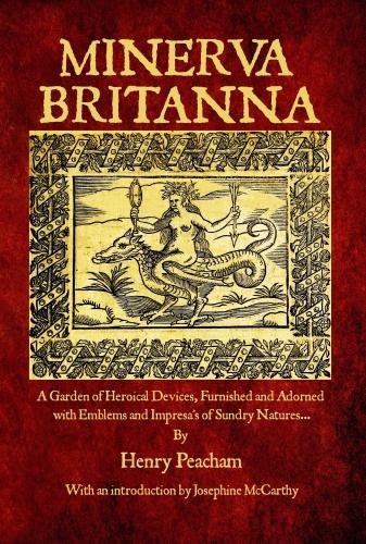
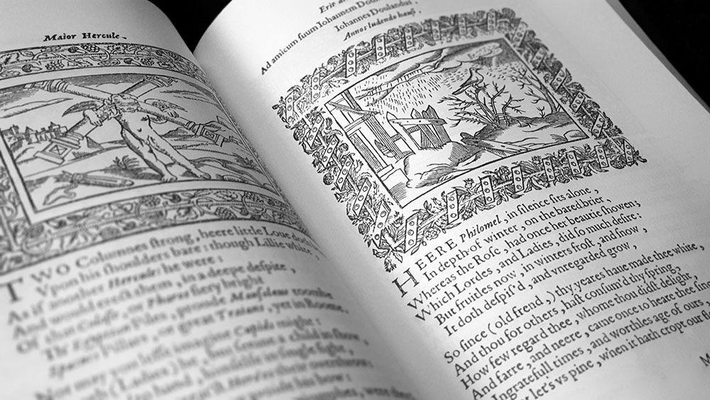
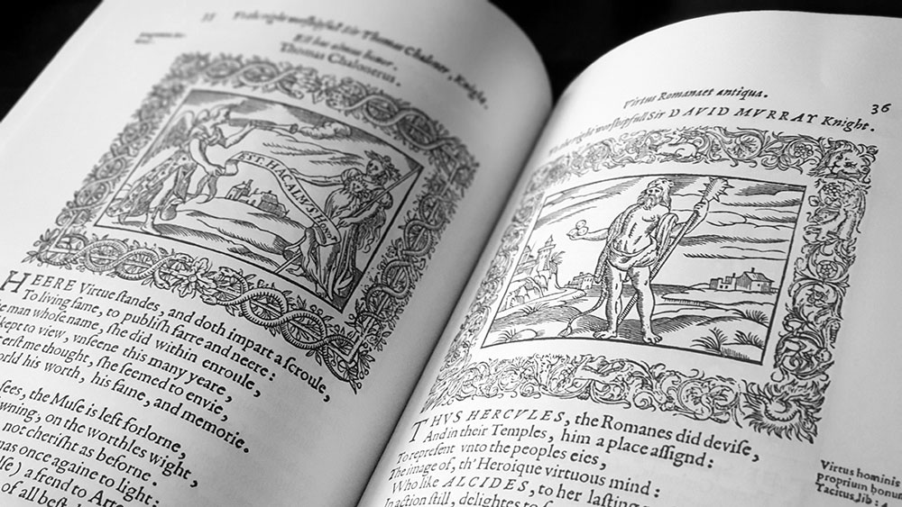
Minerva Britanna coverIf you’re wondering what Henry Peacham’s Minerva Britanna is all about, a clue may, or may not, be found in the subtitle which describes it as “A Garden of Heroical Devices, Furnished and Adorned with Emblems and Impressas of Sundry Natures.” Minerva Britanna belongs to a category known as the emblem book in which allegorical illustrations (pictura) sit alongside a motto, usually in Latin (superscriptio), and an explanatory text ranging from a few lines of verse to pages of prose (subscriptio), creating complex patterns of often didactic signi?cation. The first emblem book, the sixteenth century Emblemata, first of its name, by Andrea Alciato, created a popular template and was followed by a raft of similar works over the following century, with Michael Maier’s Atalanta Fugiens being perhaps the most well-known of them. Peacham’s emblem book, published in 1612, 81 years after Alciato’s Emblemata, is reproduced in its entirety here, with little comment other than a several page introduction by Josephine McCarthy.

Peacham, in addition to being a draughtsman, player of tennis and falconer, could be described using the Artistotelian term graphice. Defined by Peacham himself in his Gentleman’s Exercise as someone who specialised in the “use of the pen in writing faire, drawing, painting, and the like,” it marked him as someone admirably able to execute both the written and illustrated aspects of Minerva Britanna. Consisting of 204 emblems, Minerva Britanna was an expansion on two earlier attempts at creating emblem books, one for King James and one for his son, both based on the king’s 1603 treatise on government Basilicon Doron. Though neither book was finished, 68 of the Basilicon Doron emblems found new life in the pages of Minerva Britanna.

Minerva Britanna emblems

McCarthy argues that whilst Minerva Britanna contains some elements of a Neoplatonist-type ascent, in which the soul aspires towards union with the ineffable, it is principally a text of faery magic, mixed with Elizabethan codes, Hermetic wisdom and kingly advice. For McCarthy, it is a book concerned with sacred kingship and its responsibilities, of the land and the sacred female power within it, something made clear with the title’s invocation of the goddesses Minerva and Britannia, matrons of wisdom and the land respectively. It is McCarthy’s contention that nineteenth century occultists, who have had an enduring influence on contemporary occultism, removed magic from the land, enclosing it in vaults and temples, and that the material in Minerva Britanna reflects a vision of magic truer to what was once common practice, one considerably more connected to the worlds of faery and the underworld. By using Minerva Britanna, practitioners are able to connect with this archaic strain of magic again, becoming reacquainted with the wildness, playfulness, puzzles and the shadow of the Faery Queene. Unfortunately, McCarthy doesn’t give any specific examples of emblems that may reflect this stream of faery magic or support her contention that Peacham was an initiate or at least a follower of its mysteries.

While this edition of Minerva Britanna is not presented as practical and complete workbook, McCarthy briefly offers several ways in which people can utilise Peacham’s emblems in magic. She suggests that the images can be used as a divination deck, divided into three main magical themes that facilitate connections with the sacred land, the faery realm and underworld prophecy. Following the book’s motto of Mente Videbor (‘by the mind I shall be seen’), McCarthy also describes using the emblems as persistent visual aids that then impinge on the subconscious in dreams or unexpected moments, sparking cathartic moments of recognition and realisation.

Minerva Britanna Mente Videbor

Although there are 204 emblems in Minerva Britanna they are by no means the sole creation of Peacham, denoting the derivative nature of the English strand of the emblem tradition as a whole. Eighty-four of the images draw from the works of such authors as Alciati himself, Theodore de Bèze, Joachim Camerarius, Camillo Camilli, Luca Contile, Paulo Giovio, Claude Paradin, Guillaume de La Perrière, Nikolaus Reusner, Cesare Ripa, Girolamo Ruscelli, Jacobus Typotius and Geoffrey Whitney, with fifteen based on Gerard de Jode’s engravings in Laurens van Haecht Goidtsenhoven’s  Mikrokosmos = Parvvs mvndvs from 1579. Unlike de Jode’s fine engravings, Pencham’s emblems were rendered as woodcuts (following composition cues from Camerarius, Camilli, Ruscelli and Typotius), substantially removing the subtlety found in the images of Mikrokosmos, but adding a simplicity and immediacy.

Minerva Britanna emblems

Lest this seem like an accusation of plagiarism as we understand it today, Peacham acknowledges his debt to his antecedents in his introduction, telling the reader that he has “imitated the best approved Authors in this kind: as Alciat, Sambucus, Iunius, Reusneru, and others…”. Just as translation was seen as potentially creating a new work (and Peacham free translated Goidtsenhoven’s text for the emblems that draw from Mikrokosmos), Peacham was adhering to Renaissance ideals of imitation which were divided, in ascending order of worth, into sequi (‘following’), imitari (‘imitating’) and aemulari (‘emulating’). While sequi more closely mirrors our definition of plagiarism, the aemulari of Peacham aims to not only follow the original but to transform and surpass it. For an in-depth discussion of this theme, see Mason Tung’s From Theory to Practice: A Study of the Theoretical Bases of Peacham’s Emblematic Art (1997).

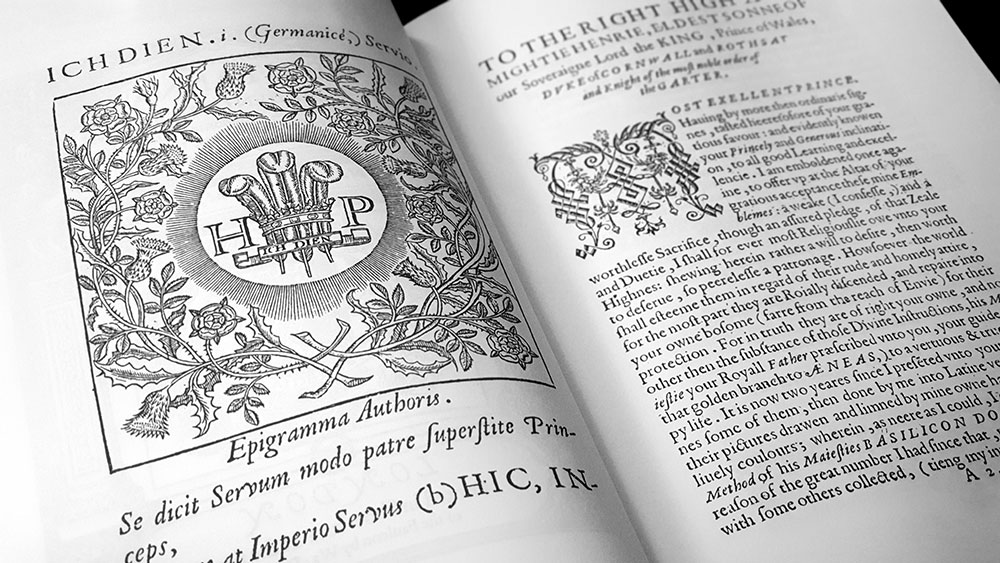
Minerva Britanna emblems

The imagery in Peacham’s emblems is as diverse as his inspirations, ornately framed and usually staged within the same seemingly eternal landscape found in similar alchemical and hermetic illustrations. The occupants of these archetypal vistas are often animals or human figures, though in others, heraldic elements come to the fore and weapons, armour, scrolls, crests and disembodied limbs float without context in the air. As one would expect, the book’s cast of characters is largely drawn from classical mythology and history, with Peacham acknowledging as his sources the Greek Anthology, the works of Horace, Ovid’s Metamorphoses, Pliny’s Natural History and Aesop’s Fables. There are also nods to figures contemporary with Peacham and a few moments that can be interpreted as being indebted to Edmund Spenser’s conception of fairyland in The Faerie Queene; such as the Shadie Wood of Una replicated in the Nulli penetrabilis emblem, with its “uncouth pathes, and hidden waies unknown… by banks of Acheron.” Spenser’s work has much of the emblem about it with its layers of allegory and rhetoric, as well as the poet’s ability to succinctly describe scenes and characters in a comparable manner. Despite this minor intersection between Peacham and Spenser, and other than the Arcadian gloss that is sometimes given to visions of the fae, there is little amongst the imagery of Minerva Britanna that seems obviously faery.

The subscriptio that follow each picture, consistently presented as two verses ending in a couplet, creates a verbal interplay with the preceding iconic elements. Whether the interplay is integrative or diversive, the two elements are intended to work as one, strengthening each other, with the ‘moral’ then being drawn in the final couplet or lines, like a punchline or the last line of a proto-meme.

Minerva Britanna dedication

It is worth noting that Minerva Britanna is in the public domain and several complete, high resolution scans are available on archive.org. While McCarthy’s introduction makes for interesting reading, its brevity does not make it indispensable, and so the real value of this edition is for those who want printed versions of the work, rather than a PDF. The emblems here have been digitally restored for reprinting by Michael Sheppard who performs an admirable job, removing the background texture of the original manuscript but leaving the lines clear and sharp, and unmarred by too much contrast. This edition of Minerva Britanna mirrors the original’s dedication to King James’ son Henry, the Prince of Wales, with a dedication to the current holder of that title who is described as “HRH Charles, Prince of Wales, Duke of Cornwall, Duke of Rothesay, King in Waiting, and beloved of the Faery Queene.”

Published by Quareia Publishing

by

The Fenris Wolf 9 – Edited by Vanessa Sinclair & Carl Abrahamsson

Categories: art, chaos, esotericism, hermeticism

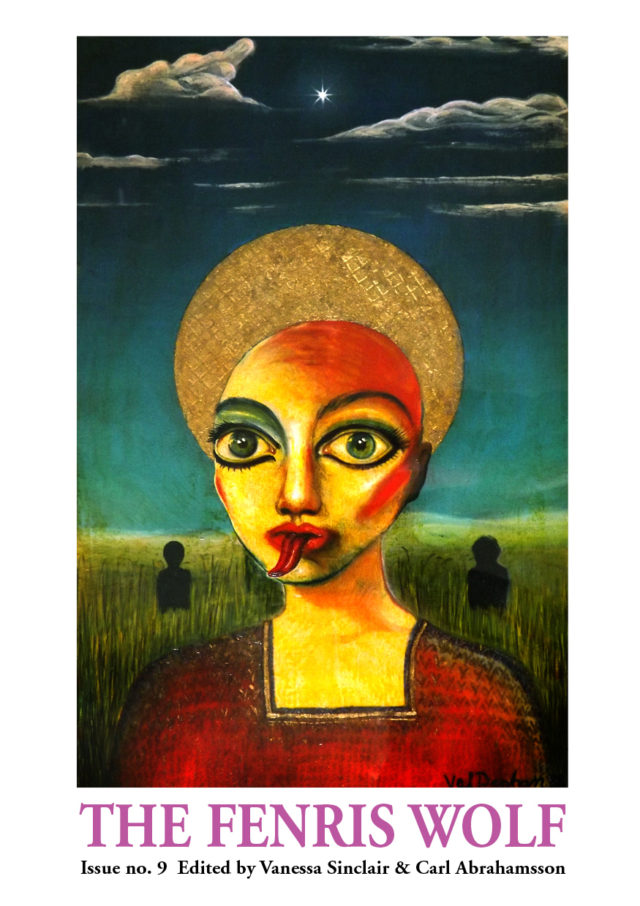
The Fenris Wolf 9 coverAdorned with stunning, numinous cover art by Val Denham, this is the latest issue of Carl Abrahamsson’s irregularly published esoteric journal and contains material from the 2016 Psychoanalysis, Art & the Occult conference held at the Candid Arts Centre in London. The Fenris Wolf has come a long way from its first issues, as evidenced by a much-loved copy of the third volume from 1993 in the shelves at Scriptus Recensera: its blue perfect-bound spine now sun-faded to a yellowy grey, pages printed with somewhat erratic toner integrity, and images reproduced with very noticeable halftone dots, as was the style of the time.

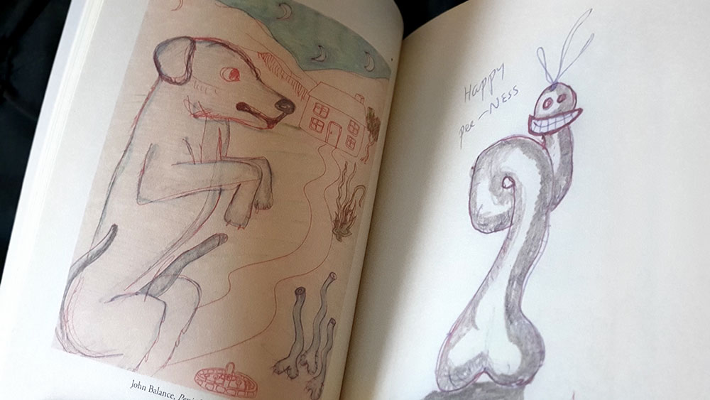
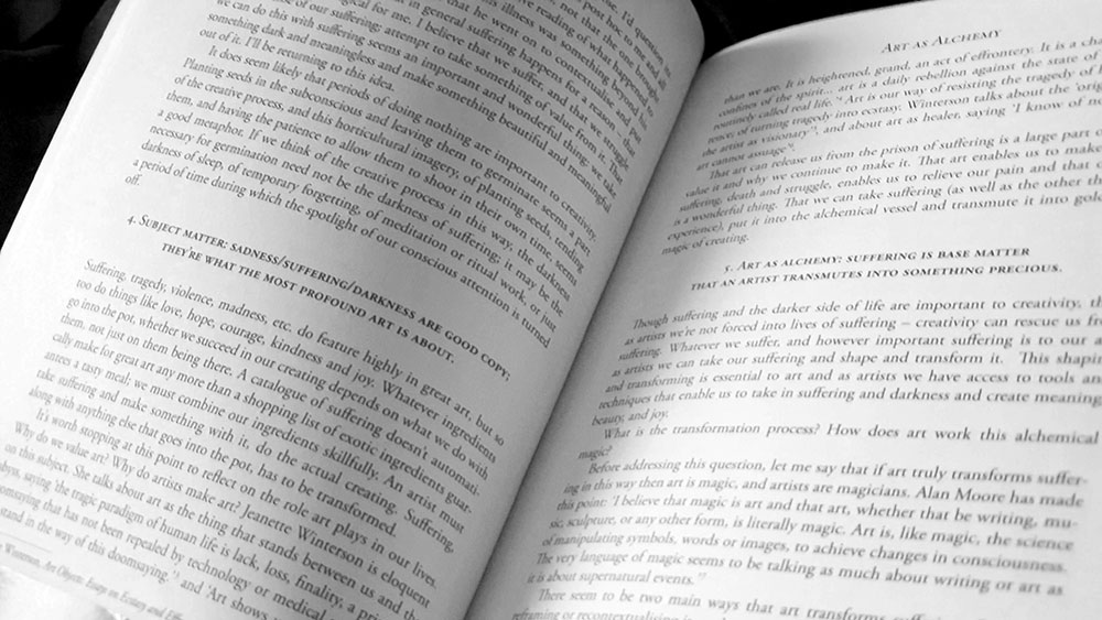
As one would expect given the title of the conference, this issue of The Fenris Wolf has a particular focus on the intersection between psychoanalysis and the occult, with art being often the child thereof. Visual artist and writer, Katelan Foisy, kicks things off with an invocation to the spirits and history of the host city, documenting everything in its history, starting with the Roman founding of Londinium, although ending abruptly in the 1960s, as if anything that happened after Swinging London didn’t amount to much. The first essay, Art as Alchemy, proper brings art to the fore with folk musician Sharron Kraus discussing the cliché of the tortured artist, and questioning whether there’s any truth to that conceit. One such alchemical artist is John Balance of Coil, who is considered here by Graham Duff, not for his musical works but rather his considerably lesser known paintings and drawings. This is an affectionate and generous survey of Balance’s, how do you say, naïve oeuvre, with Duff importing a lot of intent and meaning to what in many cases are doodles of, well, doodles.

The Fenris Wolf 9 spread with work by John Balance

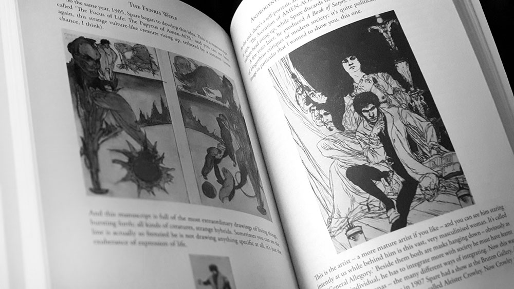
Given the subject matter, two names that spring up repeatedly within the pages of this volume are Sigmund Freud and Austin Osman Spare, with Carl Jung and David Bowie along for the de rigueur ride. The contrast between the dogmatically pragmatic Freud and the mystical Jung is something mentioned across contributions, with Gary Lachman asking in title and body, Was Freud Afraid of the Occult, and Steven Reisner covering similar ground in On the Dance of the Occult and Unconscious in Freud. Meanwhile, in matters of the spiritual and artistic, Spare is a natural touchstone for Balance in Duff’s piece on him, and he can also be found name-checked throughout this volume. The largest consideration of AOS, though, comes from Robert Ansell of Fulgur Press in Androgyny, Biology and Latent Memory, in which he conversationally talks of themes of the androgyne within Spare’s works, drawing from individual pieces, as well as most notably, The Focus of Life.
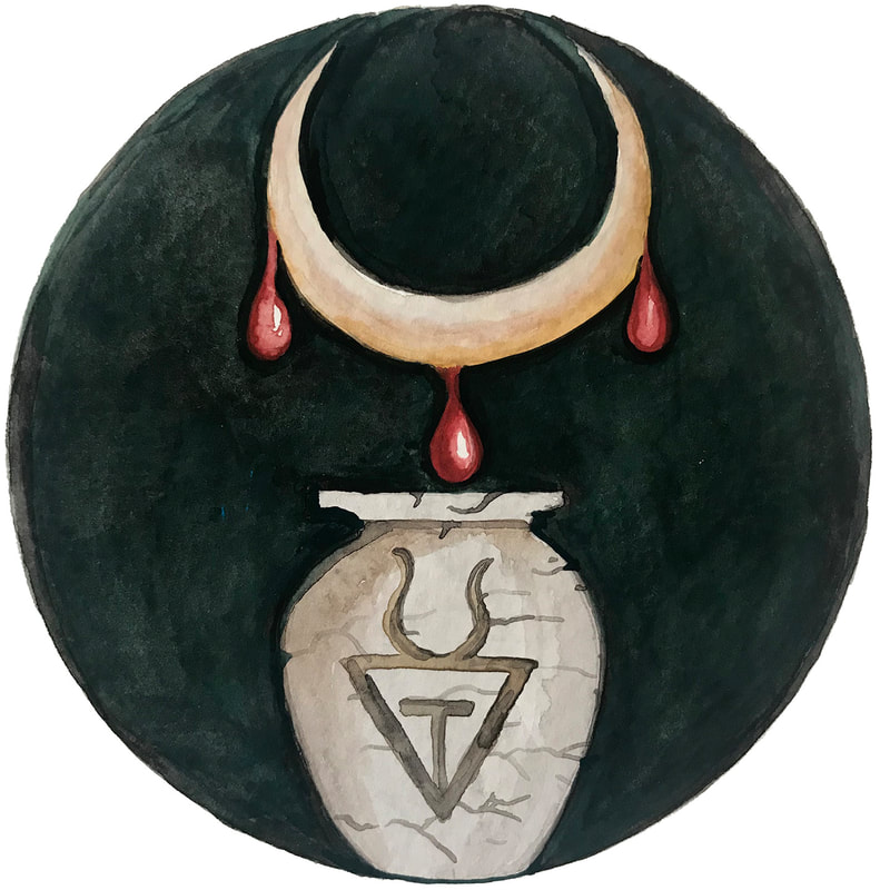
The Fenris Wolf 9 spread with work by Austin Osman Spare

The line-up of the Psychoanalysis, Art & the Occult conference, as befits its title, drew on artists, occultists and psychologists; with some lucky presenters like editor Vanessa Sinclair going for the trifecta. Perhaps the most, how you say, clinical account comes from Ingo Lambrecht whose Wairua: Following Shamanic Contours hits closest to this reviewer’s geographical location. Lambrecht discusses the use of Te Whare Tapa Wha as a M?ori model for mental health in which the wharenui of the title is comprised of four supporting cornerstones: tinana (physical), hinengaro (mental), wh?nau (family) and wairua (spirit). Wairua is defined here as being an abyss of unmanifested potential comparable to the Ain Soph in Kabbalah, the notion of Zen, and the Via Negativa of Meister Eckhart. Lambrecht shows how a model such as Te Whare Tapa Wha can sit alongside a more materialist psychological one, allowing for an acknowledgement of the sacred and unheimlich. It is worth noting that this is not the only consideration of things from an Aotearoa perspective and artist Charlotte Rodgers in her Stripped to the Core suggests that growing up in a then-isolated New Zealand gave her a magickal edge of sorts.

The Fenris Wolf 9 spread

The more satisfying contributions in The Fenris Wolf 9 are less the considerations of psychology and psychoanalysis and rather those that focus on art and how that intersects with the latter. This is particularly so in instances where artists consider their own work. In a far too brief piece, ending just as you expect it to go further, Ken Henson discusses what as he refers to as the American Occult Revival in his work, connecting his own processes with nineteenth century mesmerism and spiritualism; though it is largely only a singular piece of work, Miss Maude Fealy as Hekate, that he considers in these far too brief pages. In her Proclaim Present Time Over, Val Denham describes how dreams influence her life and work, both visual and aural, presenting the process, as intimated by the William Burroughs and Brion Gysin inspired title, as a magickal act that draws creativity from the subconscious. This is something also explored by Katelan Foisy and Vanessa Sinclair, who are similarly indebted to Burroughs and Gysin and in particular the use of techniques, such as cut-ups, that tap into magickal creativity by disrupting linear time and narrative. Though it is hard to always tell for sure which of the two collaborators are speaking, Sinclair appears to begin first, giving a thorough discussion of the use of cut-ups, emphasising a psychological paradigm concerned with memory as befits her doctorate in psychology, while Foisy takes a more biographical route, describing a series of events and synchronicities concerning the channelling of Burroughs through creative outputs.

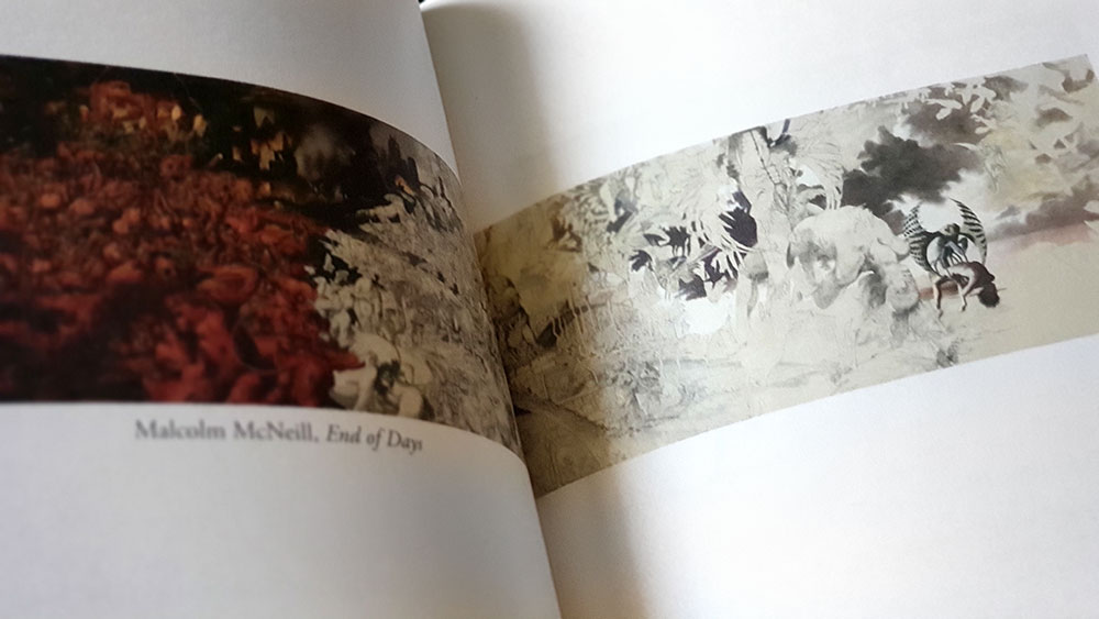
The Fenris Wolf 9 spread with work by Malcolm McNeill

This combination of magickal techniques that incorporate the horological and oneiric makes a claim for the preeminent experiential expression of the occult within these pages, drawing on a heady mix of influences from Burroughs, Gysin and Spare. This makes The Fenris Wolf 9 feel very, well, Fenris Wolf, pulling on the same TOPY, chaos magick, Beats and counter cultural strings that can be seen in the journal’s earlier issues. In addition to the examples provided by Sinclair and Foisy, the use of cut-ups reoccur in Fred Yee’s self-evidently-titled Cut-up as Egregore, Oracle and Flirtation Device, in which he namechecks Sinclair and Foisy as teachers and inspiration, reiterating many of their points and techniques. Similarly, the use of dreams already explored by Denham is appraised again by Derek M Elmore, in what is inevitably another consideration of Spare with Dreams and the Neither-Neither. Here, Elmore looks at the themes of love, sex, obsession, unconscious, dreams and death, comparing Spare’s conceptions of them with those in the published works of Freud.

The Fenris Wolf 9 spread

The ninth volume of The Fenris Wolf is a weighty tome at just under 250 pages, with type set in a small point size serif face, surrounded by large margins and a fairly generous footer. Predominantly text-based, in-body illustrations are limited to a few examples where appropriate, while a section of full page images provide examples of the work of Balance, Henson and Malcolm McNeill. Writing quality is overall high, with the dryness of some contributions (and the tiresome spectre of Freud) being offset by the more interesting, chaos and Beats-flavoured ones.

Published by Trapart

by

Fiddler’s Green: Peculiar Parish Magazine (Volume 2, number 2) and two leaflets

No comments yet

Categories: art, folk

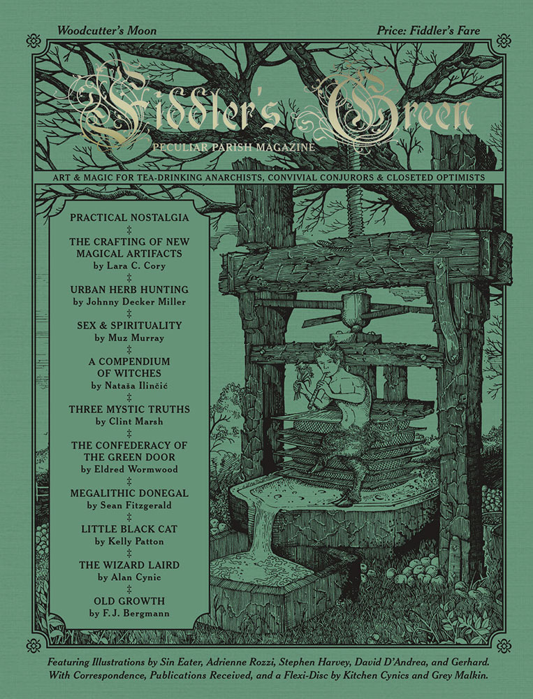
Fiddler's Green Woodcutter's Moon coverHere at Scriptus Recensera we have never reviewed a magazine twice, but provided with two leaflets by Fiddler’s Green, along with the most recent issue of the Fiddler’s Green Peculiar Parish Magazine itself, we couldn’t say no. So let’s begin with the two leaflets in question, Nine Defenses Against the Basilisk from Fiddler’s Green’s Clint Marsh and artist Alexis Berger, and Our Bogeys, Our Shelves, from Marsh and artist Jeff Hoke.

These leaflets act as a condensed form of everything embodied within Fiddler’s Green as a whole, and the magazine in particular, taking that finely crafted feel down from 50 or so letter-size pages to just twelve notebook-sized ones, bound in various types of lovely quality card. They retain all the characteristics and aesthetics of larger Fiddler’s Green publications and, if anything, seem to emphasise those qualities of small press quaintness and, indeed in the most positive way, tweeness. Each leaflet takes the type of extended meditation on a theme one might find within the pages of the magazine, but gives, by its very nature, a singular focus, notably with added illustration from select artists.

Nine Defenses Against the Basilisk spread

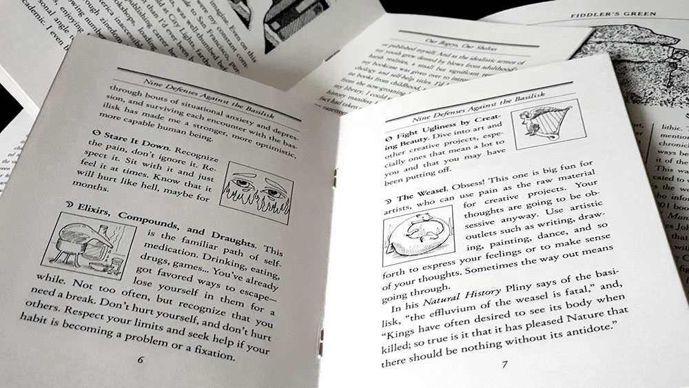
Originally published in the first issue of Fiddler’s Green, Nine Defenses Against the Basilisk approaches said creature as effectively a metaphor for anxiety and similar social disorders where those experiencing them may feel petrified immobile by its terrifying gaze. Marsh draws on ancient methods of dealing with the chimerical creature as a cipher for coping with anxiety, each accompanied with a dainty little illustration from Alexis Berger. There’s perhaps the most famous method, using a mirror, which is reinterpreted as reflecting on either the way in which people are wrong about you, or turning the mirror on yourself to see your role in whatever is happening. Similarly, the weasel, that eternal foe of the basilisk, is reimagined as the active mind, combating the oscitancy with creativity.

Fiddler's Green leaflets

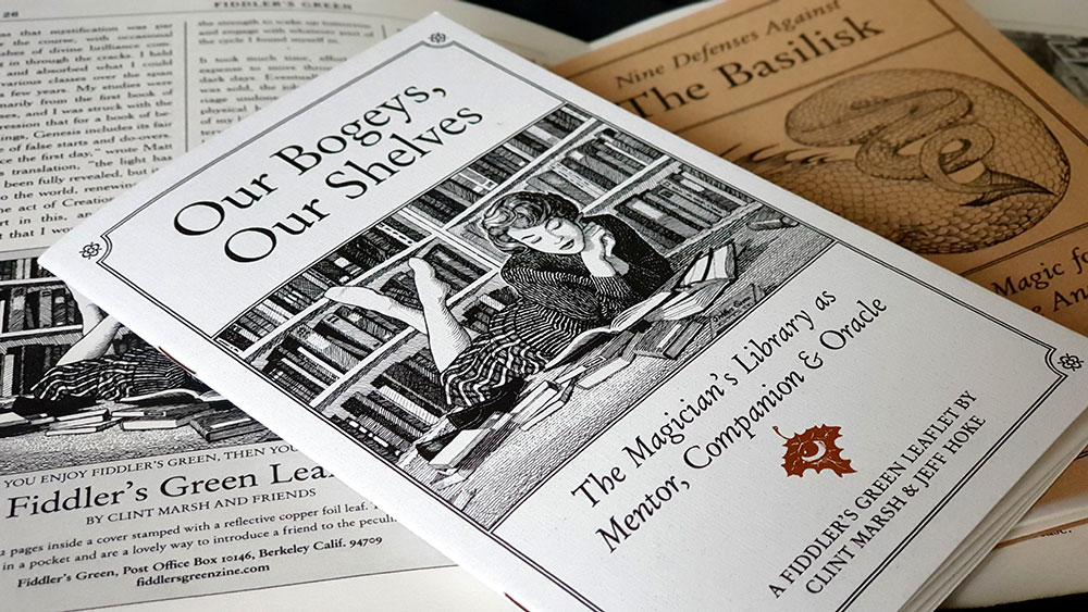
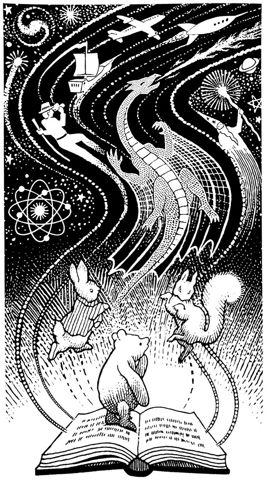
With the subtitle The Magician’s Library as Mentor, Companion & Oracle, the focus of the second of the two leaflets here is fairly obvious, being a meditation on the power of the written word through techniques such as bibliomancy. With its punning title, Our Bogeys, Our Shelves speaks to a love of books, a sentiment frequently found in the parish of Fiddler’s Green and something which is highlighted here in Hoke’s accompanying illustrations, including a particularly charming one featuring Winnie the Pooh, Peter Rabbit and other friends from fiction.

Book illustration by Jeff Hoke

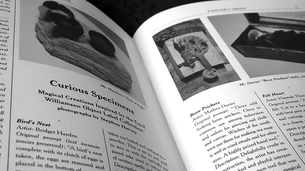
Turning to the Fiddler’s Green magazine itself, this latest issue, subtitled Woodcutter’s Moon, continues the past winning formula, combining musing on a variety of perpetually gentle and genteel topics, bundled within a consistent aesthetic that, more often than not, employs lines both hand drawn and etched. Cecil Williamson’s Museum of Witchcraft and Magic in Boscastle provides an early focus here, with Lara C Cory giving a pleasant overview of the museum and introduces a related project curated by artist collective Folklore Tapes called The Art of Magic. Over thirty artists were invited to respond to a selection of Williamson’s idiosyncratic museum index cards, with the project culminating in an exhibition at the Horse Hospital in London. A survey of six of the pieces in this exhibition follows Cory’s main piece, providing images of each work, the inspirational source quote and an efficient and economical description of the final pieces.

Spread with work from the Art of Magic exhibition

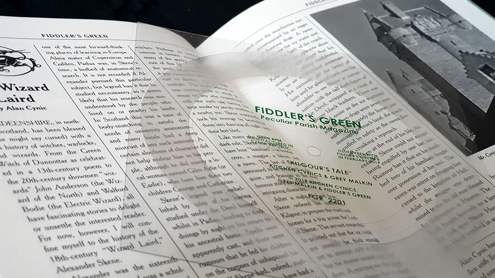
This sense of a congenial meandering is continued into the next piece, Musings of an Urban Herb Hunter, written and illustrated by Johnny Decker Miller, who we have had cause to say nice things about in these pages before. Elsewhere, the wandering takes in the megaliths of Donegal with writer and illustrator Sean Fitzgerald, while Eldred Hieronymus Wormwood speculates delightfully on a mysterious green door deep in a labyrinthine bookshop in London. One final example of matters of spirit and place comes from Alan Cynic, who records folk and psych music as Kitchen Cynics. Cynic discusses the legend of Alexander Skene, the 18th century Wizard Laird of Skene, northern Scotland, who was once seen, so legend goes, conversing with the devil by his coachman Kilgour. Along with Grey Malkin on mellotron and electric guitar, Kitchen Cynics have written and recorded the song Kilgour’s Tale based on this scene, and it accompanies this issue of Fiddler’s Green as a lovely flexi disc.

 Spread with article and flexidisc from Alan Cynic (Kitchen Cynics and Grey Malkin)

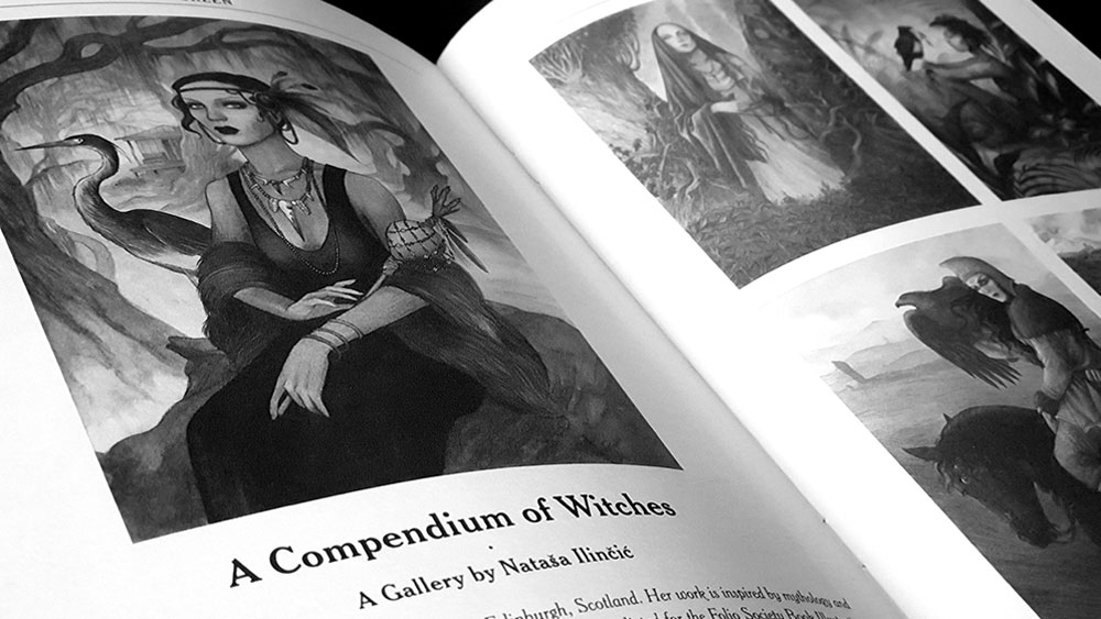
While Fiddler’s Green is always heavy on the words, there are often sections that take a more specifically visual focus, and in the case of this issue it is found in a showcase of work by Nataša Ilincic. Based in Edinburg, Ilincic has a style in which divine and semi-divine figures are often the focus, and this is true of the work here, with excerpts from her new book A Compendium of Witches, featuring portraits and personal stories of 29 witches from around the world. Reproduced here in black and white, rather than their rich, earthy palette, this glimpse still shows the strength of Ilincic’s style, creating figures with personality and power.

 Spread with work by Nataša Ilincic

As ever, the layout in Fiddler’s Green is exceptional, with its three-column format awash in archaic flourishes, and where even the adverts from other businesses and services seem to belong, so often integrated into the entire aesthetic. Fiddler’s Green is published occasionally by Wonderella Printed and can, along with their other exquisite publications, be ordered from Fiddlers Green.


The soundtrack from this review is the album Ferndancers by Kitchen Cynics

by

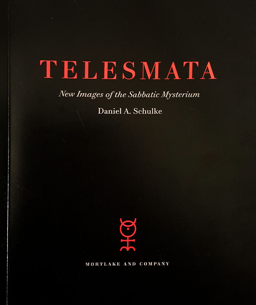
Telesmata: New Images of the Sabbatic Mysterium – Daniel Schulke

No comments yet

Categories: art, sabbatic craft, witchcraft, Tags:

Telesmata catalogue coverHeld in November of 2018, in Mortlake and Company’s Seattle gallery space, Telesmata was an exhibition of work by Daniel Schulke, with its subject matter encapsulated in the subtitle promising new images of the Sabbatic Mysterium. The catalogue of the exhibition is presented in a 180 by 250mm, perfect bound format, with a substantial page count of 48. It should be noted that not all of the images shown in Telesmata are featured in this catalogue, but they are available in an online gallery on the Mortlake and Company website.

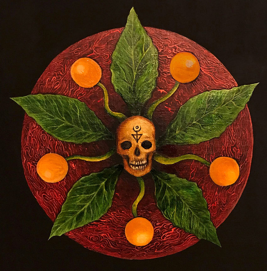
My first encounter with Schulke’s artwork was in the icon-like images of his Viridarium Umbris: The Pleasure Garden of Shadow, all high contrast black and white tones, with forms both human and arboreal featuring prominently. The most obvious continuation of this work is Daimonic Intelligence of the Mandrake, an oil on canvas work, used on the posters for the exhibition, which reprises an image found, rendered in lines of ink, in the opening pages of Viridarium Umbris. On a whole, though, that pen and ink style is absent from the work of Telesmata but there are familiarly-formed figures, and naturally, the themes remain the same.

Daniel Schulke - Daimonic Intelligence of the Mandrake

It is oils that dominate here, with only two submissions in watercolour on paper (representing female and male sacrifices to the Sabbatic Egregore Ozzhazæl respectively). The themes of most of the paintings will resonate with anyone familiar with the Sabbatic strand of witchcraft, predominantly illustrating ritual formulae: figures swirl around the field that is The Blood Acre in one, the phallic arcanum of the Stone God is illustrated in another, while Eokharnast, the first horse, appears with a corporeal, humanoid projection in a painting from 2018.

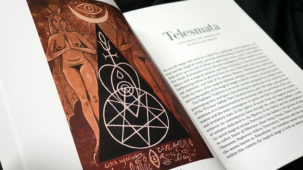
Telesmata spread

Schulke works largely with flat plains, his figures often appearing against muted or entirely black backgrounds, but when they do appear in landscapes, they recall the work of Christos Beest with their sense of hermetic numinosity, heavy with import due to their isolation within the land. His female figures in particular recall those from Viridarium Umbris, all almond eyes and perpetual nubile nudity, but now enfleshed in painterly skin.

Daniel Schulke - Female Sacrifice unto Ozzhazael

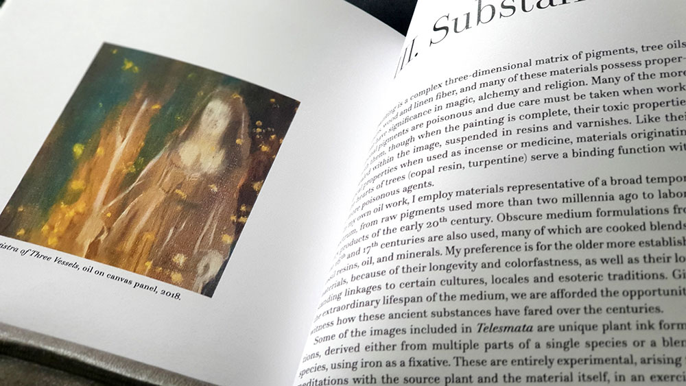
Perhaps the most striking and evocative of the images presented here are ones in which Schulke has used plant-derived materials as the sole medium (with iron as a fixative). He explains that the works are entirely experimental, coming from meditations on the source plant, thereby creating an image of the plant’s spirit. Included in the catalogue are representations of the daimons for eucalyptus, walnut, oak and unspecified tannins, with each bearing arboreal faces within twisting, phantasmagorical forms that are decorated with voluted bark-like markings.

Daniel Schulke: Ink Daimon: Tannins

As its 48 pages suggest, this catalogue takes the opportunity to do more than simply document the work, and said work is preceded by a significant introduction from Schulke, and proceeded by another brief text on materials. In his introduction, Schulke talks of the way in which painting is a fundamentally magical act, creating images that are by their very nature occult, due to the way in which layers are built one upon the other, both revealing and concealing. For him, then, a magical image is a ritual object in an immediate sense, but also one that reflects an accumulation of knowledge and experience.

Telesmata's concluding third section, Substance

In the concluding third section, Substance,  Schulke underscores the magical process behind painting with a meditation on the way in which it alchemically blends together various ingredients, not just in the pigments, but in the material on which they are applied, creating a matrix of tree oils, resins, wood and linen fibre. He concludes this point with a brief herbal (and whatever the mineral equivalent would be), consisting of nineteen types of plants, stones and metals that can be used for painting.

Published by Three Hands Press in conjunction with Viatorium Press
by

The Book of Q’ab iTz – David Herrerias

No comments yet

Categories: art, sabbatic craft, Tags:

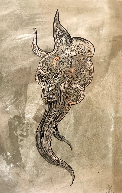
The Book of Q'ab iTz coverSince forming in 2018, Atramentous Press have quickly built a significant catalogue of releases, with this being their fourth title already. The Book of Q’ab iTz is one part magickal record, one part art portfolio, with the latter being what author David Herrerias is best known for. Mexico-born, Sweden-based Herrerias has created cover art in his distinctive wispy style of oils for black metal acts such as Irkallian Oracle, Akhlys and most spectacularly, Nightbringer, as well as featuring in occult publications from Three Hands Press, Anathema Publishing and others.
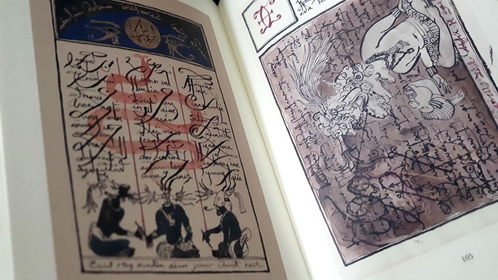
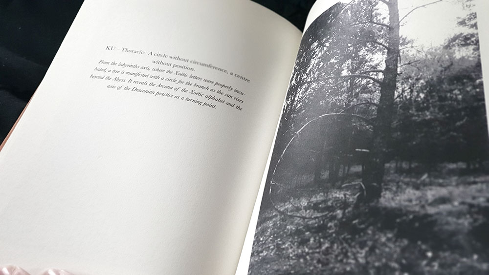
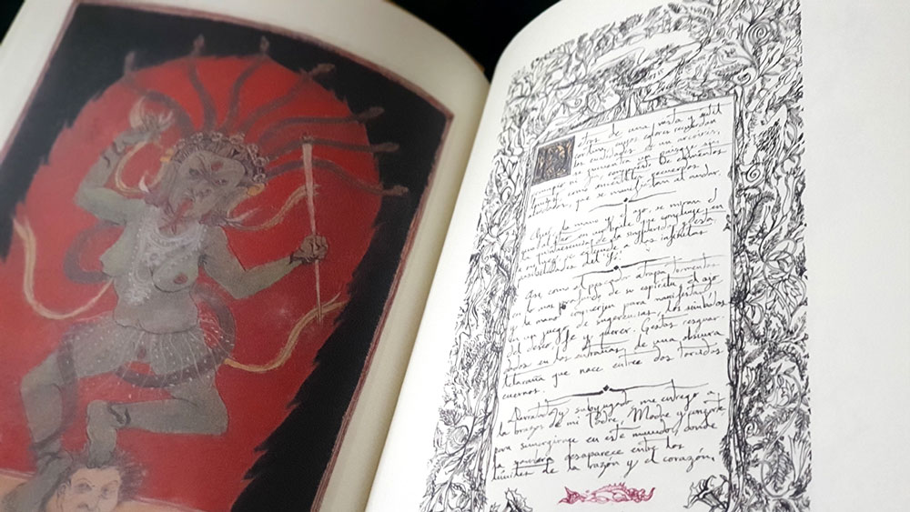
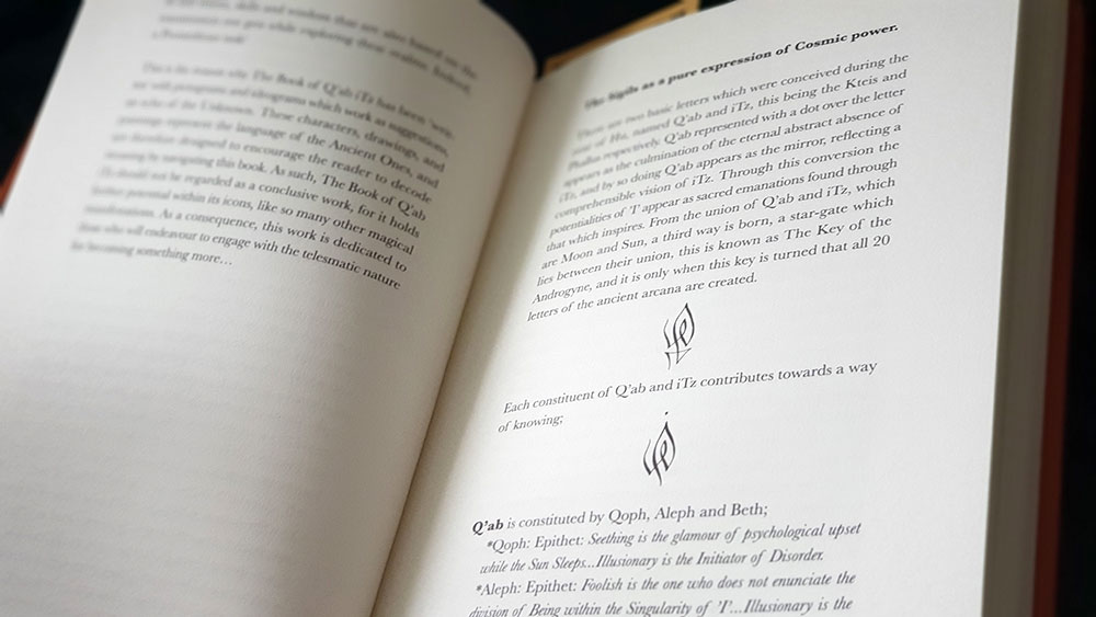
The Book of Q’ab iTz is divided into two sections: a written preamble that takes up a little under half of the work, and the Book of Q’ab iTz proper, which consists predominantly of illustrations by Herrerias. This latter section is, in turn, divided into two codices, presenting formulae of the Androgyne, and of the Xoëtic Alphabet respectively. The written preamble does two things: first, it presents an explanation of the modalities out of which the illustrative content emerged, with Herrerias describing his approach based on the Sabbatic Tradition as found in Andrew Chumbley’s Dragon Book of Essex, Qutub and Azoëtia. These are presented as either instructions to the reader, or as diary recollections of Herrerias’ own work. This preamble also  provides something of an explanation for the illustrations, with an exegesis, still somewhat veiled in obnubilating occult language, of the symbolism and the themes. Unfortunately, as all this written comment occurs in the first half of the book, it somewhat divorces it from the corresponding images, and the correlation between the two sections can be forgotten as you move forward (or subject to a constant flicking betwixt pages and the marking of places with fingers).

The Book of Q'ab iTz spread

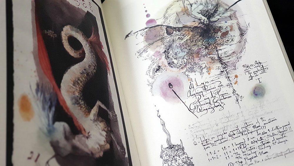
The images of Codex I, Formula of the Androgyne, are presented in a variety of usually dense and detailed styles, with a heavy calligraphic element being perhaps the most common motif. Here, Herrerias writes in a lovely, florid hand, often layering the text over images, or otherwise creating dense surfaces of typographic colour. While hard to read, even if you do speak Spanish, the text from some of these images is translated and printed, without explanation, in a section before the main images. Other than this curlicued text, the artwork here contains as its main feature a prevailing theme of the corporeal, featuring a variety of human bodies and individual body parts, usually dissolving or evolving into various forms. Phalluses and multiple sets of breasts abound, including several appearances by the winged-penis that is the fascinum, featuring, sometimes overtly, others covertly, in a variety of images.

David Herrerias: The Book of Q'ab iTz spread

In Codex II, the images differ little in overall style, but there is an increasing emphasis on the incorporation of Mesoamerican motifs, with the usual pallet of western occult imagery being joined by figures that would not be out of place in Mayan codices. This relates to Herrerias’ integration of his Mexican cultural background incorporation into the Ophidian and Sabbatic path, with most notably the Tlacuache (Opposum) and the Tecolotl (Owl) featured throughout as significant totemic forces that mark the “moment of experiential ecstasy at the Witches’ Sabbat.” This is, perhaps, the most interesting element of The Book of Q’ab iTz as it provides a unique innovation of the array of symbols, and one that, if initially incongruous, begins to have a certain appeal.

David Herrerias: The Book of Q'ab iTz spread

While presenting a body of work that is consistently his own, Herrerias employs a variety of styles for which, in some cases, there are some clear touchstones and precedents. Chumbley seems the most obvious, in particular the use of facetted plains and jagged, eldritch tendrils that have always been evocative of Lovecraft’s references to unsettling non-Euclidian geometry. Austin Osman Spare also lends a pretty indelible mark on the work, most immediately with Herrerias’ use of intense self-portrait in which he stares out at the viewer, recalling the same gaze from Spare in a multitude of images. Similarly, a totemic painting comprised of three faces stacked one upon the other seems like an obvious riff on Spare’s Mind and Body from 1953, while anytime human figures merge and dissolve into amorphous shapes, or steles combine frontalist godforms, sigils and mystic letters, it’s hard not to think of Spare’s oeuvre.

The final selection of artwork in The Book of Q’ab iTz moves Herrerias away from the pen and brush and towards the lens, with a series of black and white photographs documenting the formula of the Xoëtic Alphabet. Each of these darkly-toned images is accompanied on the preceding page by a brief, if cryptic, explanation of each stage in the process.

David Herrerias: Formula of the Xoëtic Alphabet

Given the effort that has gone into a title like this, from the choice of stock to the quality of printing, not to mention the hours spent by Herrerias in creating the images, it’s a shame more of the same wasn’t applied to finessing the text. There are deficiency in both editing and proofing, with the lack of the former meaning you can have a single sentence that runs to seven lines, while the absence of the latter sees the conflation of ‘its’ for ‘it’s’ and general spelling and grammatical mistakes. While Herrerias does admirably for someone whose first language, one assumes, is not English (and some areas are better than others), it would have been a kindness to have a more rigorous editor to tighten the run-on sentences, lipo the other bits of literary flab, and keep the tenses making senses.
David Herrerias: The Book of Q'ab iTz spread

The Book of Q’ab iTz has been released by Atramentous Press in four editions: standard hardback, the Somatic special edition, the Telesmatic deluxe edition, and a trade paperback. The standard edition of 333 exemplars has a natural terracotta cover with central insignia and printed spine, binding approximately 120 pages of a weighty 150 gsm Munken Rough stock and natural heritage blue endpapers. The Somatic edition of 33 wraps the same in a goatskin cover, with gold foil insignias blocked to cover and rear, five foiled ribs on the spine, enclosed in a felt-lined cloth slipcase. Finally, the thirteen exemplar Telesmatic edition binds the above in polished goatskin cover, but houses it in a full leather solander box with a foil blocked title on the front and ribs to spine, and comes with a sigillic talisman by Herrerias on nagual-made paper from Mexico.

Published by Atramentous Press

by

Sabat #3 and #4 – Edited by Elisabeth Krohn

No comments yet

Categories: art, witchcraft

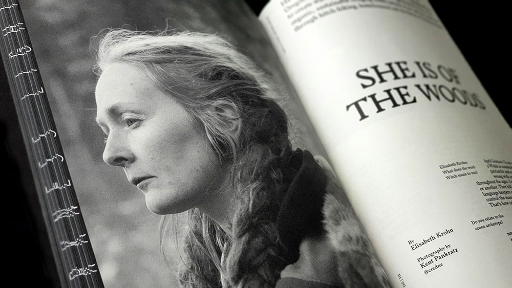
Sabat #3 coverSabat is a magazine irregularly published by creative director and editor Elisabeth Krohn. We’ve chosen to review two issues because the latest is a slightly atypical, harder to parse, volume that could be summarised in one or two paragraphs, whereas the previous issue from 2017 is a weightier work worthy of its own singular review.

The third volume of Sabat is referred to as the crone issue, and brings a natural end to the sequence of maiden and mother showcased in the previous two issues. This theme of the crone has a variety of interpretations, due to the substantial list of contributors across its 160 pages, with thirteen writers, twenty-two photographers and twelve artists. In matters of writing, standouts include contributions from Myroslava Hartmond, Pam Grossman, Sonya Vatomsky, and Gabriela Herstik.

Hartmond gives a brief account of the 1960s radical feminist group W.I.T.C.H. (an abbreviation of Women’s International Terrorist Conspiracy from Hell, a name you can believe in) and their intersection between actual witches in a symbolic and to a lesser extent, theoretical sense; with the group’s manifesto describing witches as the “original guerrillas and resistance fighters against oppression.” Meanwhile, Grossman provides the most immediate discussion here of the crone in a broad mythological sense, identifying various figures who have appeared as crones from classical myth to Margaret Hamilton as the cinematic Wicked Witch of the West. In a delightful feint, she begins discussing Hekate (a figure not classically depicted as a crone, a popular modern pagan misconception), only to acknowledge this and suggest that this perceptual evolution of maiden to crone is as valid as anything set in the slip of myth.

Sabat #3 spread with feature on April Graham

As a focus on one particular crone, Vatomsky decodes the Slavic figure of Baba Yaga, depicting her as a figure of great power and agency, and arguing that characteristics such as these and others have been lost in her translation into the West. For that touch of pop culture, Herstik considers the women of the Addams family (Wednesday, Morticia and the supremely crone-ish Grandmama) as expressions of the divine feminine; ably illustrated by Vanessa Reyes in two full page ink drawings.

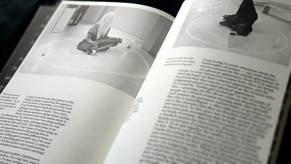
Interviews feature heavily in Sabat #3, with almost all of them beginning with the mantra-like inquiry ‘what does the word Witch mean to you?’ These straddle that divide/intersection of praxis and performance, with some focusing on practitioners (such as queer feminist witch and anti-ageist activist Dulcamara, or Blue Mountains witch April Graham), and others on artists working in jewellery, music and performance art. Sara Gewalt is a jeweller, sculptor and photographer studying, at time of writing, at Konstfack University, who has worked with bands such as Degial and Watain, but is here interviewed with a focus on her Totem necklaces of bone-shaped ceramic. Camille Ducellier is a French multimedia artist with a strong queer and feminist focus, principally working with film and sound. At the time of interview, she was beginning to adapt her sound piece La lune noire (based on the astrological idea of Lilith as a black moon and originally broadcast by France Culture, in 2016) into a full sound installation. Miki Aurora is a Vancouver based performance artist who describes herself as an “artist, filmmaker + occultist designing workings that fuse cyberfeminist theory with chaos practice,” and who uses the modalities of ritual for performance art pieces.Sabat #3 spread with interview with performance artist Miki Aurora

While Norway-born, London-based editor and founder Krohn provides creative direction and clearly has a singular vision, the art direction and its execution falls to designer Cleber Rafael de Campos; half a world away in Brazil for the first two issues, but back in London for the third. It is easy to see why the third issue of Sabat was awarded a silver placing at the 2018 European Design Awards, with its 164 pages that look very, how you say, designery. It’s also very witchy, but not always in the most conventional sense. No rustic gentleness here, no wispy filigree, but also, it must be said, no grim sabbatic tropes, no goats and stangs and other signifiers of Traditional Witchcraft with the capital T and the capital W.

What does dominate, though, is female imagery, with the female form appearing in a variety of situations, some more witchy than others, but always well executed. While there are some male photographers amongst the contributors here, there feels a distinct lack of the male gaze across the imagery. It is the photography that creates some of the most impact here, whether it’s the portraits of featured artists and practitioners, or the little fashion spreads and photographic essays that often seem unannounced and unexplained, and as such, are just effortlessly cool. It’s these that help Sabat feel different, giving it its import and focus, and makes it live up to the association with the #WitchesofInstagram hashtag.

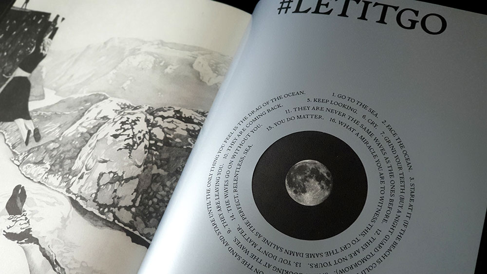
Sabat #3 spread with #letitgo feature

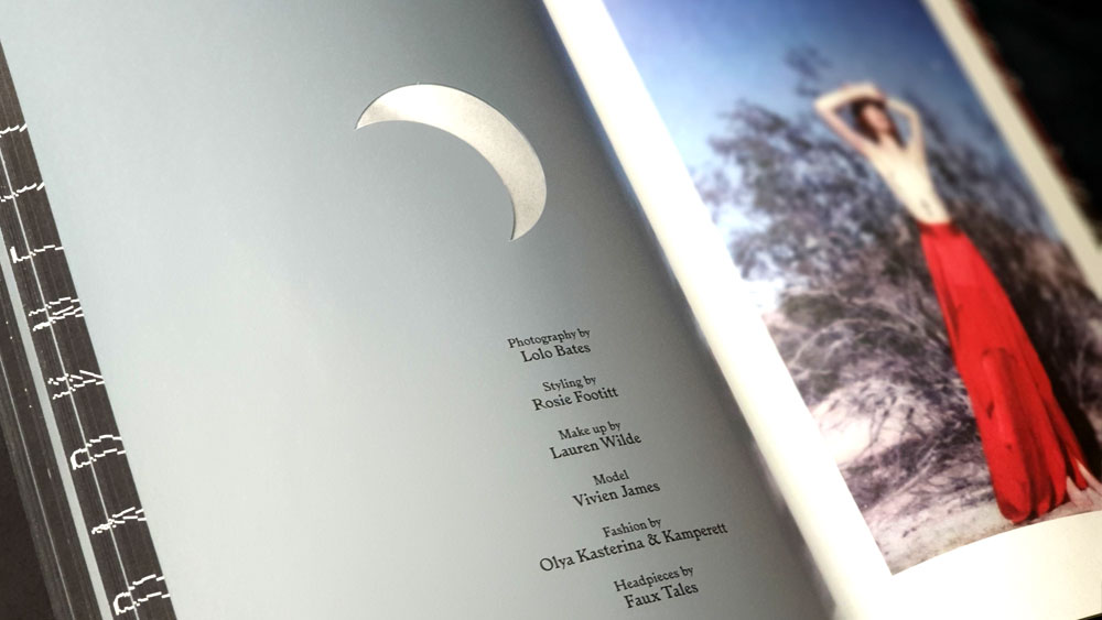
Campos has an equally bold and contemporary design style, employing some core layout elements throughout Sabat but also changing things up with format-disrupting injections where necessary. Printed for the most part on a dull matte stock that gives everything just the right touch of gravitas and muted cool, this is broken up with glossy silver title pages featuring die-cut crescents and discs that provide windows backwards and forwards to other pages as the moon moves through its phases, punching holes through the text of the titles. This lunar sojourn reaches its culmination with a full moon, where graphic designer Dario Gracceva takes the typographic reins around the theme of #letitgo for several pages. In another case, the same silver pages are left without a lunar die cut, but images from the surrounding photo essay are lightly printed on them, appearing ghostly and making the page itself seem almost translucent. Elsewhere, subtle embossing (or debossing, depending on what side of the leaf you’re looking from) of text over images can be almost missed, but once discovered, enhance the tactile experience of Sabat.

Sabat #3 spread with photoshoot of Vivien James by Lolo Bates

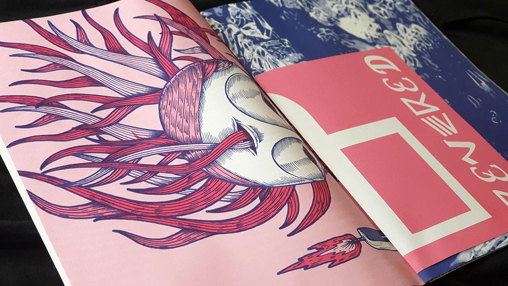
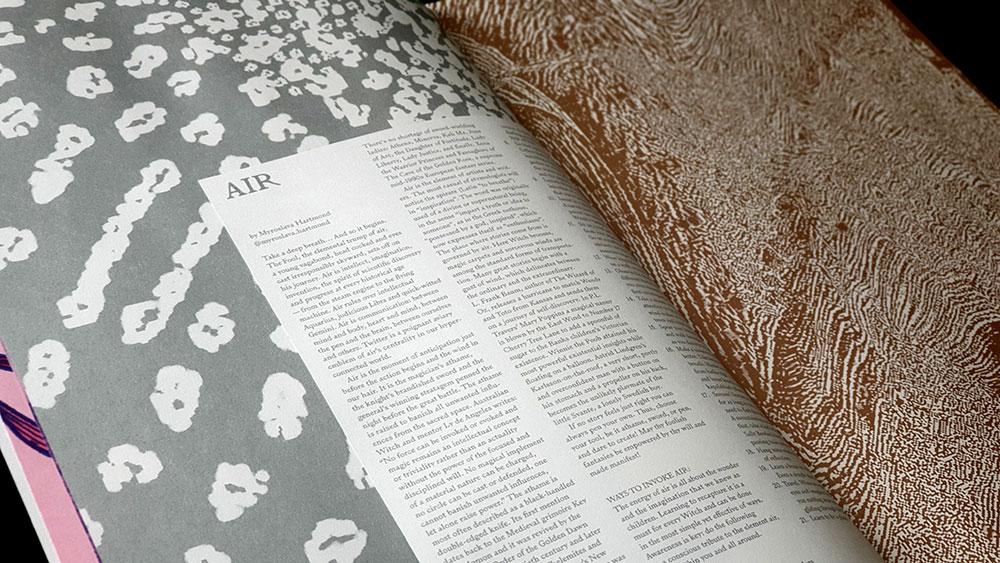
With the trilogy of maiden, mother and crone completing with the third issue, the fourth volume of Sabat takes as its theme the elements and uses this as an opportunity to try a significantly different approach to its predecessors. Rather than the dense, perfect bound format of the previous issues, Sabat #4 consists of five large format posters and an unbound booklet of six A3 sheets folded to A4. The posters vary in size from A2 to a folded A1, with the styles feeling more like a work from a design annual, rather than anything overtly witchy. These are presented folded and held together by a string, with the individual A3 leaves of the booklet interspersed throughout.

Sabat #4 spread with large scale poster and unbound booklet leaf

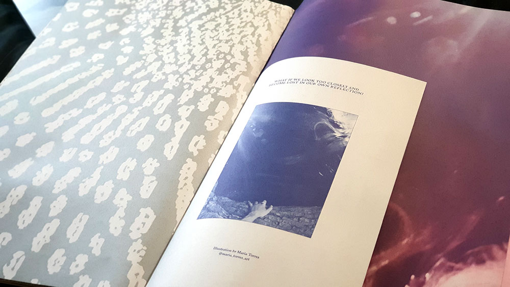
The written content for Sabat #4 takes the form of five one page meditations on each of the elements, delivered by Myroslava Hartmond, Pam Grossman, Sonya Vatomsky, Kristian J. Solle and Sabina Stent; some of whose names will be familiar from previous issues. Given the format, the list of artists for this issue is equally short, and features Nikolai Diekmann, Anne Sophie Ryo, Anniinna Anna Amanda, Elisa Seitzinger, Maria Torres and Ossian Melin.

Sabat #4 spread with large scale poster and unbound booklet leaf

Maybe it shows a lack of imagination on my part, but I’m not sure what to do with it all. Do I disassemble it and try to find wall space to Blu Tack them to amongst a myriad of bookcases? Or, having at least read the written content, do I leave it as a somewhat unsatisfyingly unexplored, hard-to-store art portfolio, with, no matter where it ends up, the corners getting increasingly bent and worn; as is already beginning to happen. At the risk of sounding uncharacteristically plebeian, I just don’t get it, and when both issues cost the same price, I find myself happier holding something with the certainty of 160 beautifully designed, perfect bound pages.

Sabat #4 spread with large scale poster and unbound booklet leaf

Published by Sabat Magazine

by

Zazen Sounds #5

1 comment

Categories: art, esotericism, magick, music

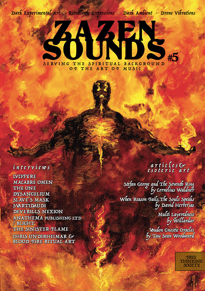
Zazen Sounds #5 coverZazen Sounds is both a record label and the name of this small sub-A5 magazine published by Acherontas V.Priest of the similarly named black metal band Acherontas, and the dark ambient project Shibalba. The magazine’s goal appears as a legend beneath the title on the cover, “serving the spiritual background of the art of music” and to this end it combines interviews with predominantly black metal musician and occult artists and publishers, plus a few articles about matters magickal.

Being my first encounter with this magazine, the thing that strikes you immediately about this fifth issue of Zazen Sounds is the look, which creates the chronometrically-disorienting feeling of reading a ‘zine from decades ago. While it may not have the physical cut-and-paste construction of yesteryear, there’s a rough and ready quality to the layout that all the digital tools of today haven’t corrected. Things are also really tight, but more about that later.

The bands featured in interviews here are an interesting bunch with different styles but some certain commonalities. It’s here that the old-zine feel is confirmed, with references to various Satanic and magickal groups known primarily for their time in the early-to-mid nineties, such as the Order of Nine Angle and the Order of the Left Hand Path. Just as some of the black metal aesthetics on display here don’t seem to have moved on much from that period, so these references to older magickal groups feel almost nostalgic for a simpler, and yet more mysterious time. This is affirmed when some of the artists, betraying their age, wax lyrical about the pre-internet days of tape trading and the returning of stamps, while lamenting some of the characteristics of the modern age.

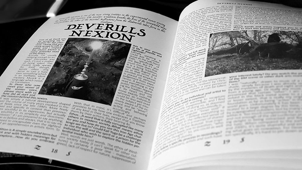
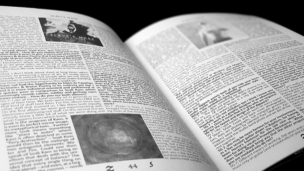
This interview line-up consists of Lvcifyre from London, Germany’s Dysangelium, Finland’s Slave’s Mask and Iceland’s glorious Svartidauð, while the Greek-born/London-based Macabre Omen kind of get double-billing with Alexandros Antoniou interviewed twice, both as a member of Macrabre Omen and as his project The One. For the non-metal side of music, there’s an interview with Liesmaic of the delightful Deverills Nexion, which naturally sees some of those references to the ONA; and showing their roots in black metal, some de rigueur bemoaning of the genre’s current state compared to nineties glory days.

Zazen Sounds #5, Deverills Nexion spread

The language in some of the interviews is what you would, perhaps unfairly, expect from black metal bands, a little vainglorious, a little pompous, all caught in the bind of having to say things without coming across as too enthusiastic or risk having the little masks of occult obscuration fall. As a result, it’s something of a relief to take a break from the turgid prose with the first of the article contributions here, a piece on Voudon Gnostic oracular systems by Sean Woodward. This is a refreshingly well-written piece, though it does descend into a swamp of gematria words and values later on, which can make your eyes glaze over if you’re not that way inclined.

The other articles in this issue are an exploration of the German poet Stefan George by Cornelius Waldner, and two pieces that one could describe as discussions of personal process. In the first, When Reason Fails, the Soul Speaks, painter and illustrator David S. Herrerías, who may be familiar for work in both occult publications and on metal albums (with a book forthcoming from Atramentous Press), gives thoughts on art as a magickal method and a way of connecting to and exploring the unconscious. Meanwhile, Multi Layeredness by Tay Köllner Willardar Xul-Lux considers just that, the idea of layers as a principle that can be applied to either magick, music, or any other form of art.

In addition to the interviews with musicians, Zazen Sounds has interviews with Finnish record label The Sinister Flame, and with two Canadians, occult publishers and artists respectively. Gabriel McCaughry of Anathema Publishing talks largely about his exquisite publishing imprint (and a little about his black metal band Blight), while in the longest interview in the magazine at 13 pages, Chris Undirheimar of Blood and Fire Ritual Art covers, naturally, a variety of topics relating to his art, philosophy of life and working out. His rather spectacular painting Loki Thursakyndill also graces the cover and (in mirrored form) the back of this issue.

Zazen Sounds #5, Slave's Mask spread

The layout in Zazen Sounds doesn’t exactly make it conducive to reading, nor does it do the content justice. While titles and lead text are rendered nicely enough in an archaic serif face (all caps for the titles, italic for the lead), the body copy is crammed into fully justified, heavily-hyphenated columns of a monotonous and somewhat incongruous sans serif. Paragraphs are treated inconsistently, sometimes within the same section, and can have either a first line indent or no indent at all. Interviews suffer the worst as questions and answers sit snuggly next to each other, differentiated only by the bolding of the former, creating impenetrable walls of dense typographic colour. Also, some sections don’t end on their own page, and instead the remainder flows onto another page, making the following interview start up to a quarter of the way down. This contributes to everything feeling claustrophobic, and it doesn’t need to, as a little adjusting of the layout for more space, such as the removal of small or often redundant images, would have allowed things to breath. Then there’s a lack of attention to detail that sees a couple of images pixelated into illegibility, little to no proofing and editing on the contributions from non-native-English-speakers in particular, and one interview that accidentally repeats a page worth of questions and answers, woops. It’s a shame as this lack of rigour distracts from the content, and just a little polish would have helped live up to that noble aspiration of combining music, magic and art.

Zazen Sounds on Facebook

1 2